一枚橡皮章,蓋出一座城的輪廓
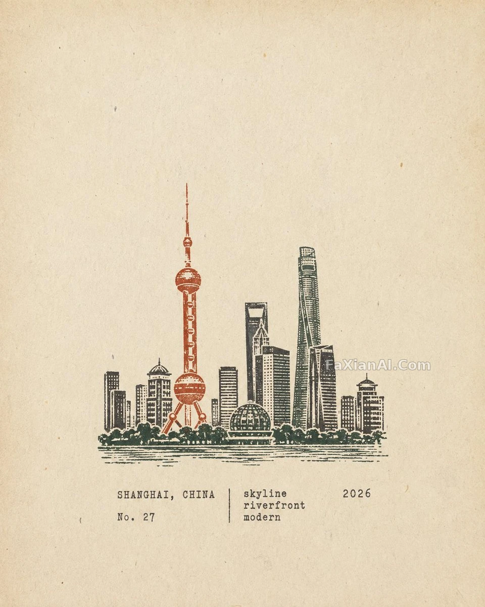
留白鋪滿舊紙感,中下方一枚多色刻章,剋制到只剩識別度。
✍️ 識別度靠減法堆出來,不是加法——去掉人群車輛和重複窗戶,只留下能一眼認出地方的那幾筆輪廓。印章佔畫面三成左右,多一分就搶戲,少一分又認不出來。
📋 提示詞 YAML 分段式2637 字元
Output each scene as its own separate poster -- never merge scenes into a collage.
Format: strict 4:5 portrait. Cover the full frame in warm off-white aged paper -- subtle fibers, natural grain, light wear, matte tactile texture -- and keep generous blank whitespace.
Stamp artwork: a compact, multi-color carved rubber stamp depicting the location's most recognizable features -- distinctive architecture, mountains, terrain, vegetation, roads, shorelines, skyline, or key foreground shapes. Simplify aggressively, keeping only the visual information needed to instantly recognize the place and scene; strip out crowds, vehicles, repetitive windows, dense buildings, fragmented vegetation, decorative details and irrelevant background elements.
Position the stamp lower-middle, occupying about 30-38% of the frame height, with ample whitespace around it -- compact and understated, not a full landscape illustration, painting, logo or oversized graphic.
Let the subject decide the layout:
- Architecture -> distinctive silhouettes, roofs, domes, arches, towers and main structures.
- Mountain settlements -> simplified terraced buildings that follow the terrain.
- Coastal scenes -> mountains, settlement layers, shoreline and a few sparse water marks.
- City panoramas -> the main skyline, one iconic structure and distant mountains.
- Natural landscapes -> the primary mountains, trees, shorelines and the direction of roads.
Ink and texture: 2-4 muted spot colors drawn from the scene itself -- carbon black, deep green, brick red, ochre, slate blue or taupe, for example. Print every color as its own hand-stamped layer carrying real carved-rubber flaws: engraved marks, uneven lines, chipped edges, dry-ink gaps, paper showing through, granular ink, uneven pressure, ghosting and a subtle 1-2 mm misregistration. It has to read as an actual rubber stamp pressed into aged paper -- never a smooth vector, a filtered photo or a digital logo.
Typography, set in the whitespace below or beside the stamp in a small, restrained, slightly imperfect typewriter face -- minimal, accurate, documentary:
- the location's English name
- No. [number]
- three short English keywords
- the year 2026
Mood: quiet, tactile, restrained, regional, observational, collectible -- like field notes kept by an architect, a travel writer or a naturalist.
Avoid: circular seals, Chinese red seal stamps, postage perforations, wax seals, stickers, souvenir templates, generic city icons, smooth vector logos, cartoon styling, 3D rendering, glossy gradients, plastic textures, oversaturation, excessive detail, excessive text and decorative clutter.
📋 中文譯寫版 自然語言827 字元
每個場景單獨輸出成一張海報——絕不把多個場景合併成拼貼畫。
格式:嚴格4:5豎版。整個畫面覆蓋暖米白色做舊紙張——細微纖維感、自然顆粒、輕微磨損、啞光觸感——並保留大量空白。
印章圖案:一枚緊湊的多色雕刻橡皮章,描繪該地點最具辨識度的特徵——獨特建築、山脈、地形、植被、道路、海岸線、天際線或關鍵前景輪廓。大幅簡化,只保留能讓人一眼認出地點與場景所需的視覺資訊;去掉人群、車輛、重複窗戶、密集建築、零碎植被、裝飾細節與無關背景元素。
將印章放在中下方位置,佔畫面高度約30%到38%,四周留有充足空白——保持緊湊剋制,不是完整的風景插畫、繪畫、徽標或超大圖形。
讓題材決定佈局:
- 建築類 → 獨特輪廓、屋頂、穹頂、拱門、塔樓與主體結構。
- 山地聚落 → 順著地形排布的簡化梯田式建築。
- 海岸場景 → 山體、聚落層次、海岸線,加幾筆稀疏的水紋。
- 城市全景 → 主天際線、一座標誌性建築和遠處山巒。
- 自然風景 → 主山體、樹木、海岸線與道路走向。
油墨與質感:從場景裡取2到4個低飽和專色,例如炭黑、深綠、磚紅、赭黃、石板藍或灰褐。每個顏色單獨一層手蓋,帶真實橡皮雕刻的瑕疵:刻痕、線條不勻、邊緣崩口、幹墨缺口、紙色透出、顆粒狀油墨、壓力不均、重影,以及1到2毫米的輕微套色錯位。必須看起來是真的橡皮章按在舊紙上——絕不能像平滑向量圖、濾鏡照片或數字標誌。
文字排在印章下方或側邊的空白處,用小號、剋制、略帶瑕疵的打字機字型,簡潔、準確、像檔案記錄:
- 地點的英文名
- No. [編號]
- 三個簡短的英文關鍵詞
- 年份 2026
情緒:安靜、有觸感、剋制、有地域性、觀察式、有收藏感——像建築師、旅行作家或博物觀察者隨手記下的田野筆記。
避免:圓形印章、中式紅色印章、郵票齒孔、火漆印、貼紙、旅遊紀念品模板、泛泛的城市圖示、光滑向量標誌、卡通風格、3D渲染、光面漸變、塑膠質感、過飽和、細節過多、文字過多和裝飾堆砌。