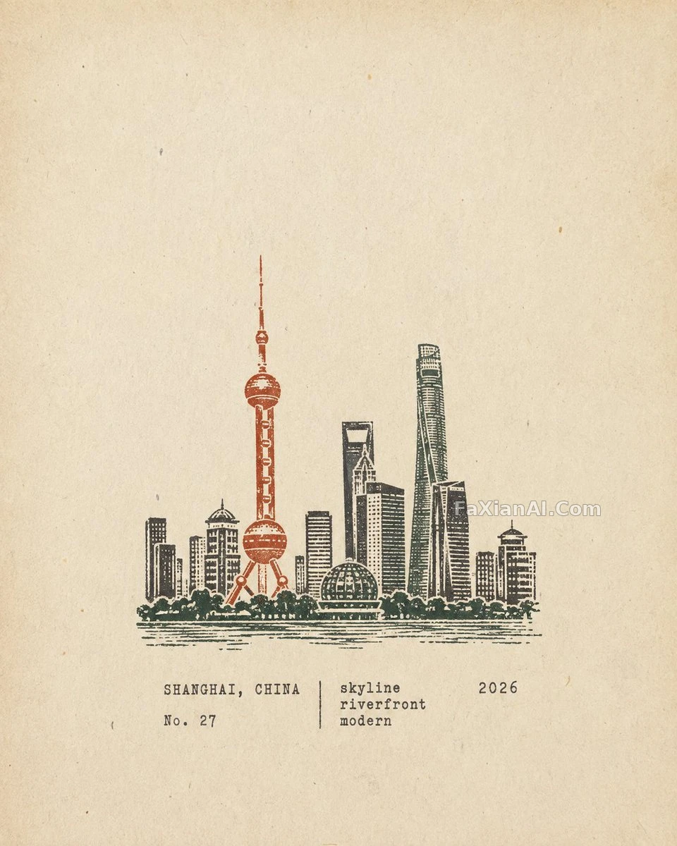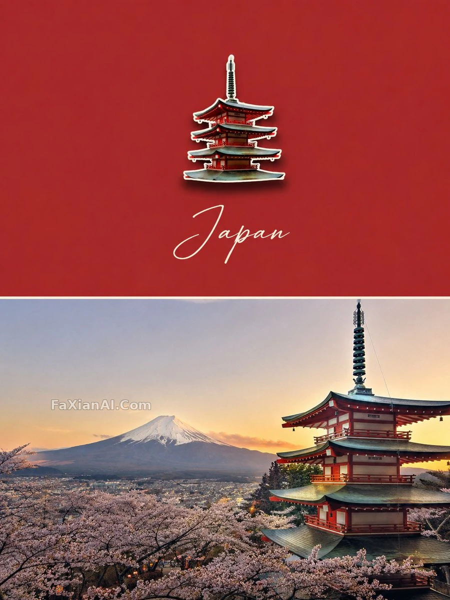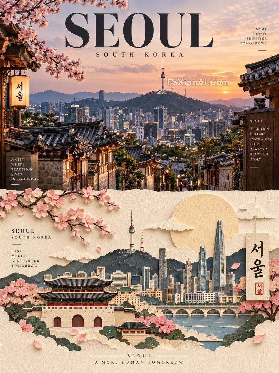
國家海報不堆地標,堆的是留白
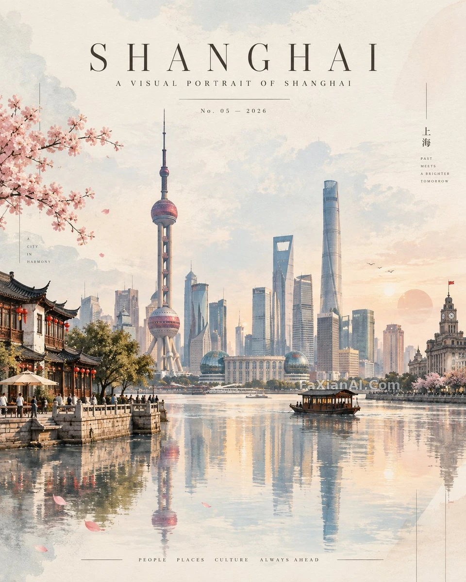
編號No.05這種細節比大字標題更像雜誌真會印的東西
✍️ 反光故意不對稱、留點模糊,這一步是跟“完美映象”式旅行海報拉開距離的關鍵。真正讓它像雜誌而不是導遊手冊的,其實是那行細瘦、寬間距、居中的刊頭字——排版比畫面本身更值錢。
📋 提示詞 自然語言1867 字元
A premium 4:5 vertical contemporary travel artwork for [COUNTRY], built as a refined, atmospheric editorial art print. Rather than stacking separate landmarks, reimagine the country as one cohesive, dreamlike landscape.
Let [COUNTRY]'s most recognizable natural scenery sit as a soft, distant backdrop, rendered with elegant atmospheric perspective, gentle mist, and a subtle horizon line. Fold in one or two iconic architectural landmarks as simplified sculptural forms — recognizable silhouettes, clean geometric detail — and let cultural elements weave through naturally: native vegetation, traditional rooftops, streets, local textures, decorative touches, a few tiny human figures, so the whole scene feels organically connected.
Keep the palette sophisticated and slightly desaturated: warm cream, soft sand, faded blush, powder blue, muted sage, warm gray, delicate charcoal. Set the landscape above a calm, mirror-like glass surface, its reflection soft and artistic — gently blurred rather than perfectly symmetrical.
Blend watercolor and gouache brushwork with tactile paper texture, subtle grain, clean digital lines, diffused lighting, delicate shadows, and atmospheric depth. Add minimal translucent geometric shapes and fine linear details along the edges for a modern gallery-poster feel; keep the composition spacious, tranquil, balanced, rich in negative space.
At the top, run minimal luxury editorial typography:
[COUNTRY]
A VISUAL PORTRAIT OF [COUNTRY]
No. 05 — 2026
Set it thin, widely spaced, and perfectly centered, the way an exclusive international design magazine would.
Avoid: clutter, harsh colors, excessive detail, photorealistic collage effects, oversized typography, generic travel-poster styling. The result should read like a collectible contemporary art print — elegant, cinematic, peaceful, instantly evocative of [COUNTRY].
📋 中文譯寫版 自然語言629 字元
一幅4:5豎版高階當代旅行藝術作品,主題為[COUNTRY],呈現為精緻而富有氛圍感的編輯級藝術印刷品。不堆砌零散地標,而是把整個國家重新構想成一整片如夢似幻的統一景觀。
讓[COUNTRY]最具辨識度的自然風光作為柔和、遙遠的背景,用優雅的大氣透視、輕盈薄霧與含蓄的地平線來表現。融入一兩處標誌性建築地標,以簡化的雕塑造型呈現——輪廓可辨、幾何細節乾淨;再讓文化元素自然穿插其間:本土植被、傳統屋頂、街道、本地紋理、裝飾細節、幾個微小的人物剪影,使整個畫面感覺有機相連。
色調保持精緻且略微去飽和:暖米白、柔沙色、淡腮紅粉、霧霾藍、柔和鼠尾草綠、暖灰、細膩炭灰。將這片景觀置於一片寧靜如鏡的玻璃質感水面之上,倒影柔和而富有藝術感——略微模糊而非完全對稱。
融合水彩與水粉筆觸、帶觸感的紙張質感、細微顆粒、乾淨的數字線條、漫射光、細膩陰影與大氣縱深感。在邊緣點綴極簡的半透明幾何形狀與纖細的線性細節,營造現代畫廊海報的質感;構圖保持疏朗、寧靜、均衡,留白豐富。
頂部排布極簡的高定編輯排版:
[COUNTRY]
A VISUAL PORTRAIT OF [COUNTRY]
No. 05 — 2026
字型纖細、間距寬鬆、完全居中,如同頂級國際設計雜誌的排版。
避免:雜亂、色彩生硬、過度細節、照片級拼貼效果、超大號字型、通用旅行海報的既視感。最終效果應像一幅可收藏的當代藝術印刷品——優雅、電影感、寧靜,一眼就能讓人聯想到[COUNTRY]。