
Home › Design Assets › A Country Poster That Stacks Negative Space, Not Landmarks
A Country Poster That Stacks Negative Space, Not Landmarks
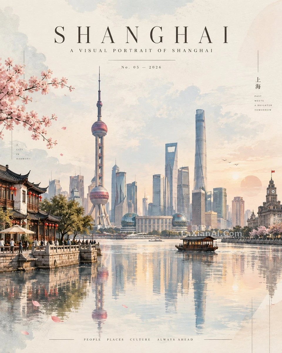
A detail like the number 'No. 05' feels more like something a real magazine would print than any oversized headline would.
✍️ Keeping the reflection deliberately asymmetric and slightly blurred is what separates this from the usual perfect-mirror travel poster. What actually makes it read as a magazine rather than a tour brochure is that thin, widely spaced, centered masthead type — the typography is worth more than the imagery itself.
📋 Prompt Natural Language1867 characters
A premium 4:5 vertical contemporary travel artwork for [COUNTRY], built as a refined, atmospheric editorial art print. Rather than stacking separate landmarks, reimagine the country as one cohesive, dreamlike landscape.
Let [COUNTRY]'s most recognizable natural scenery sit as a soft, distant backdrop, rendered with elegant atmospheric perspective, gentle mist, and a subtle horizon line. Fold in one or two iconic architectural landmarks as simplified sculptural forms — recognizable silhouettes, clean geometric detail — and let cultural elements weave through naturally: native vegetation, traditional rooftops, streets, local textures, decorative touches, a few tiny human figures, so the whole scene feels organically connected.
Keep the palette sophisticated and slightly desaturated: warm cream, soft sand, faded blush, powder blue, muted sage, warm gray, delicate charcoal. Set the landscape above a calm, mirror-like glass surface, its reflection soft and artistic — gently blurred rather than perfectly symmetrical.
Blend watercolor and gouache brushwork with tactile paper texture, subtle grain, clean digital lines, diffused lighting, delicate shadows, and atmospheric depth. Add minimal translucent geometric shapes and fine linear details along the edges for a modern gallery-poster feel; keep the composition spacious, tranquil, balanced, rich in negative space.
At the top, run minimal luxury editorial typography:
[COUNTRY]
A VISUAL PORTRAIT OF [COUNTRY]
No. 05 — 2026
Set it thin, widely spaced, and perfectly centered, the way an exclusive international design magazine would.
Avoid: clutter, harsh colors, excessive detail, photorealistic collage effects, oversized typography, generic travel-poster styling. The result should read like a collectible contemporary art print — elegant, cinematic, peaceful, instantly evocative of [COUNTRY].
Related Cases
 One Rubber Stamp, One City's Silhouette
 This Travel Poster Rhymes Instead of Rambling
 A Rainbow HI, Just Right for Today's Journal Cover
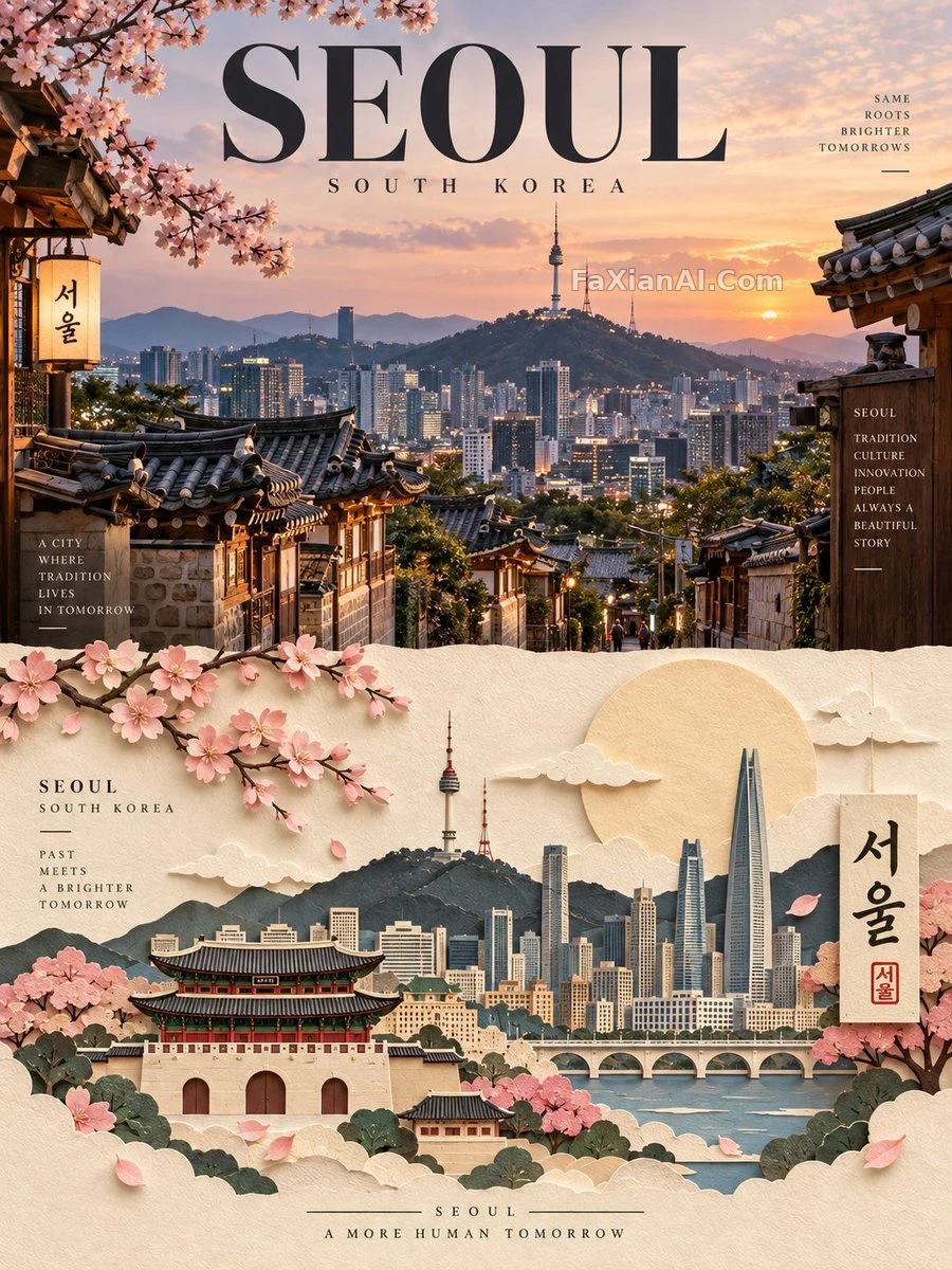 A City Poster Split Between Real Photo and Paper Sculpture
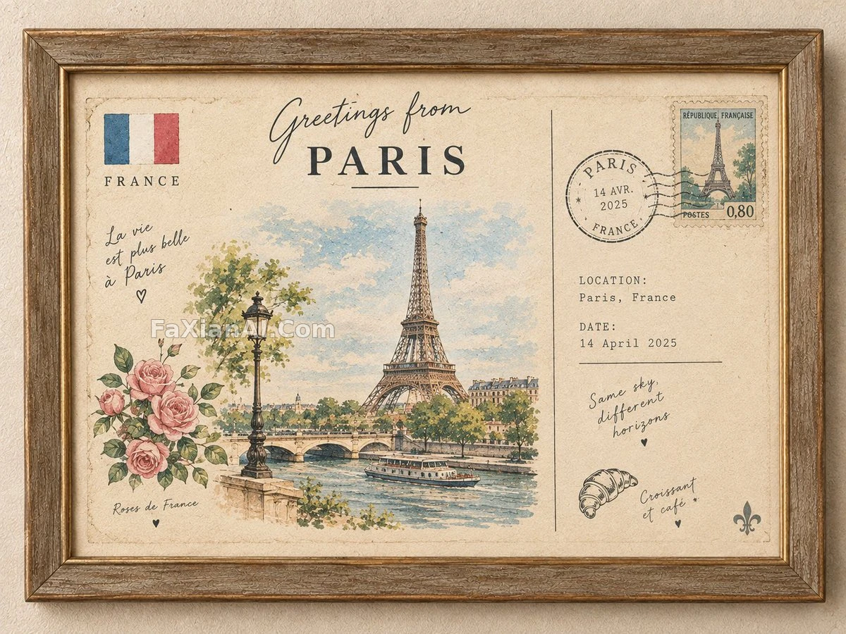 A Travel Postcard in a Vintage Frame, Mostly Empty Space by Design
 Four Corners Check In, the Middle Stays Empty on Purpose