
Infographic Prompts: Zone the Layout First, Then the Image Holds Up
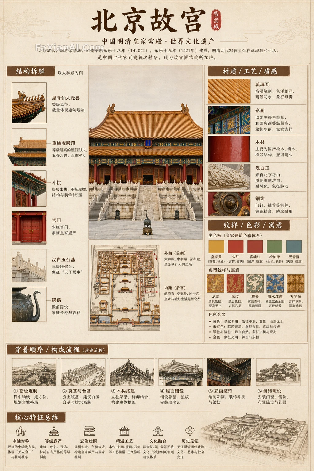
Infographics are the category most prone to looking fine at a glance and falling apart on closer inspection: small text blurring into a smear, modules crowding each other, callout lines pointing at empty space. Chinese-text rendering has improved a lot this year, but the model still won't lay the page out for you. Among the recent Chinese infographic examples the site has collected, the ones that actually work share one trait: write the layout first, write the image second.
Write the Layout as Coordinates: The Forbidden City Guide's Five Zones
This Beijing Forbidden City museum-guide infographic reads almost like a layout spec. The top holds the main title, subtitle and lead-in text; the left side is the structural-breakdown zone, using Chinese leader lines to label key components; the upper right is the materials-and-craft zone, showing texture swatches; the middle right is the pattern-and-color-symbolism zone; the bottom holds a process diagram and a summary of core traits. All five zones get a specific position, and each states exactly what goes inside it.
Writing it this way means the model doesn't have to guess. Say only "information-rich, refined layout" and it will scatter a pile of cards by its own habits. Pin down "left," "upper right," "bottom" and every block gets a fixed position.
The exclusion list in the back half of this prompt is just as deliberate: "avoid a poster feel, a studio-photo feel, an e-commerce feel, an anime feel, a cosplay feel." Drifting into one of those looks is the most common failure mode for infographics, and naming them in advance is cheaper than rerunning the prompt after the fact. "All text must be in Simplified Chinese, no garbled characters, typos, English or pinyin" is close to a mandatory line for any Chinese-language infographic.
Practice: write layout as position-plus-content pairs, one sentence per zone.
Splitting Hero Visual From Information Zones: How the Humble Administrator's Garden Poster Lays It Out
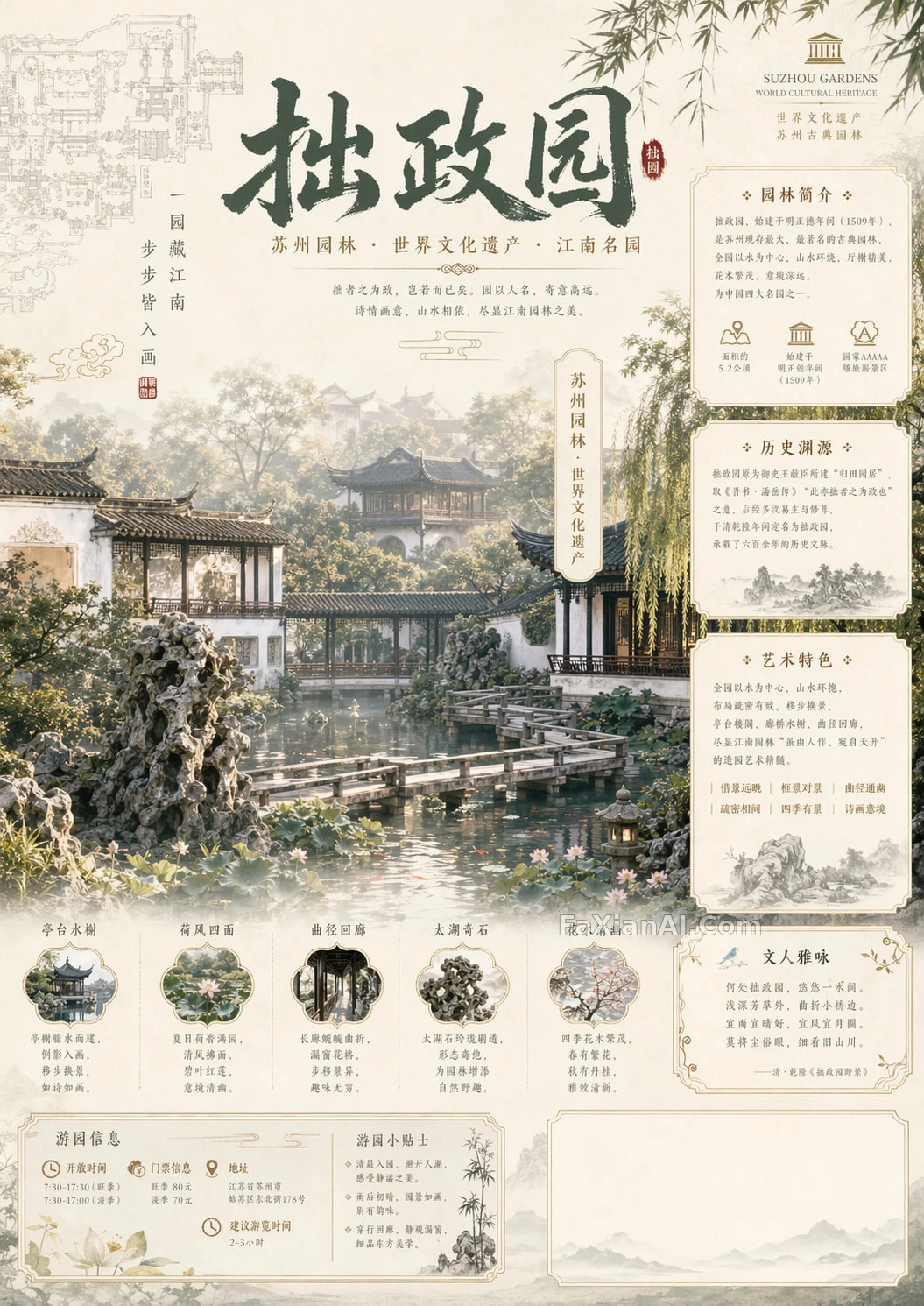
The Humble Administrator's Garden poster adds one thing the Forbidden City piece didn't have: a large hero visual, which turns the hard part into making the hero image and the information zones coexist. Its solution: the center is reserved for the garden's waterscape as the hero visual, and all information is pushed to the edges — a floor-plan line drawing, a seal and a vertical poem on the left, three info panels labeled "Garden Overview," "Historical Origins" and "Artistic Features" on the right, and four to six small text-and-image modules along the bottom.
Notice the phrasing "four to six" (四到六个). Write "several" and the model might hand you twelve crammed into one row; give it a range instead and the count stays stable. The palette is spelled out just as specifically — jade green, moon white, ivory gold, pale ink gray, lotus-leaf green, light pink — six colors, each one mapping directly onto something physically present in the garden.
Encyclopedia Cards: Give the Sections a Candidate Pool
The border collie encyclopedia infographic uses a reusable template — swap the subject for any animal, plant or object and it still runs. Instead of fixing the sections, it hands the model a candidate pool: basic profile, appearance traits, temperament, care tips, pros-and-cons comparison, a quick-rating card — and lets the model pick from the pool based on the subject. Rounded modules, soft shadows, refined small icons: these visual cues are what makes it read as a "knowledge card" rather than an ad.
For series content, this candidate-pool approach beats fixed sections — each card keeps a similar structure without repeating itself exactly.
Cross-Sections: One Image, One Thing Taken Apart
The ancient pagoda cross-section infographic organizes information a different way: no zones — instead it cuts one pagoda open from top to bottom, and every floor's rooms, corridors and structural members get their own callout line. Its editor's note flags something worth noting: what actually carries the information density is the text panel at the bottom — dimensions, weight, materials, craftsmanship, none of it can be missing. The contrast between colored-pencil shading and realistic shadow is also what keeps the image worth a second look.
Fewer Words Sometimes Reads Better
Not every infographic needs to be packed full. The pop-up food atlas allows exactly one line of legible text in the entire image — the dish's name tag — and hands everything else to the visuals: a pop-up 3D dish on the right page, a retro hand-drawn recipe on the left. The chalkboard-style infographic requires that even the icons and figures be drawn in colored chalk; the moment a realistic element sneaks in, the whole image's texture breaks.
Together these two show infographics have two working paths: zone the page and fill it, or leave a single line of text and hand the rest to the image. Decide which path before you start writing — don't try to have both.
A Checklist for Writing Infographic Prompts
- Layout: state "position + contents" for every zone, and give module counts as a range.
- Text: specify the language and the lettering's character, and quote the exact title text to be rendered.
- Style: state what it should look like (a museum display panel, an encyclopedia page, chalkboard notes), then name what it shouldn't.
- Aspect ratio: a vertical display panel, a horizontal chalkboard — state the ratio up front.
For more on text rendering, see getting the model to write text correctly; for organizing a prompt into structured fields, see structured prompt writing; similar work is collected under the design category.