Home › Design Assets › The Forbidden City, Broken Down to Every Stitch
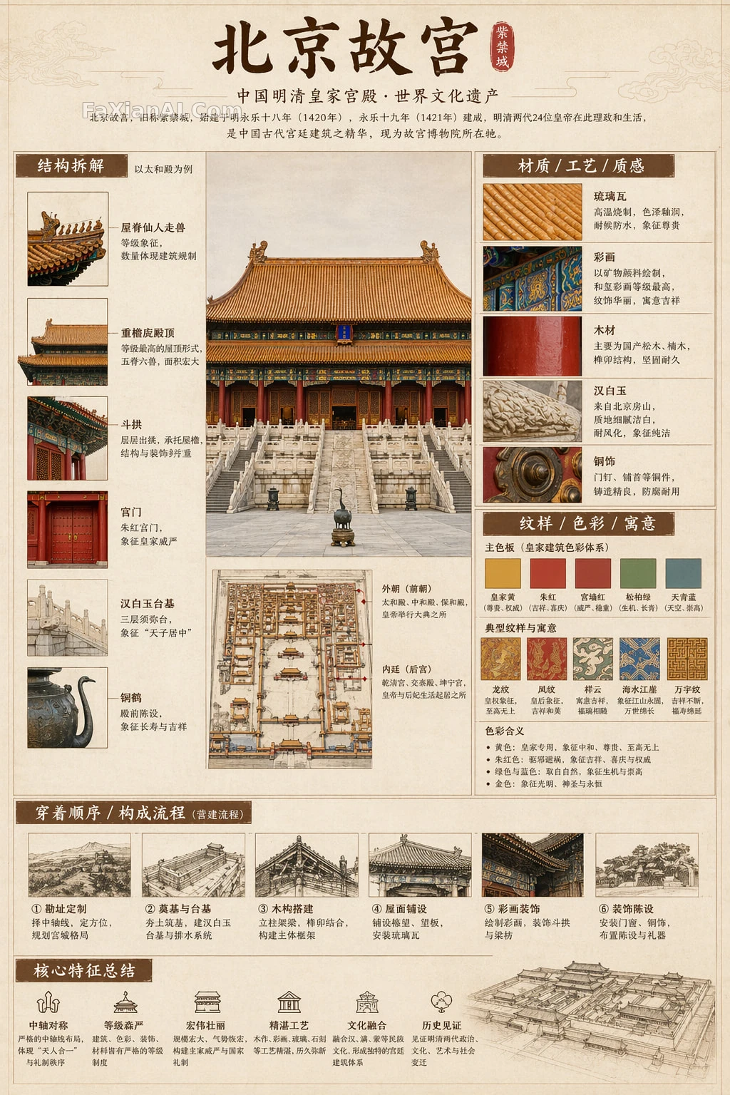
The Forbidden City, Broken Down to Every Stitch
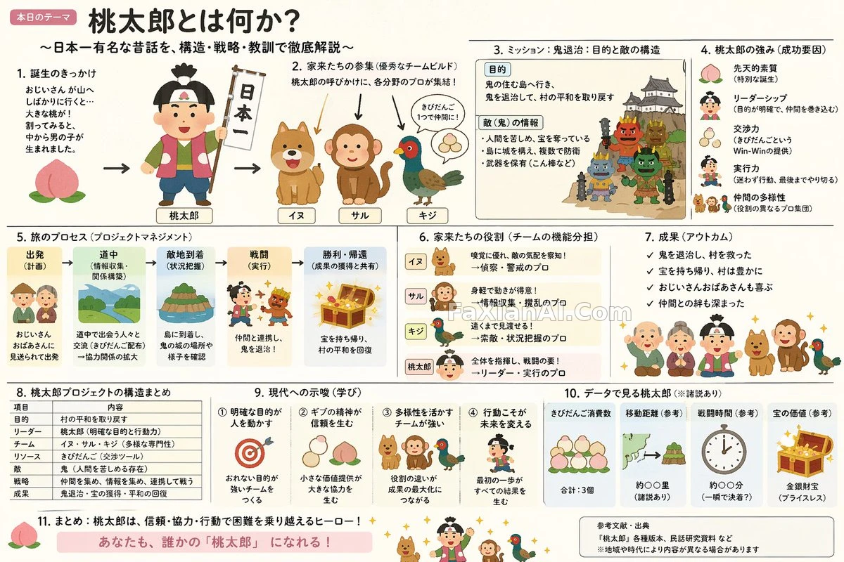
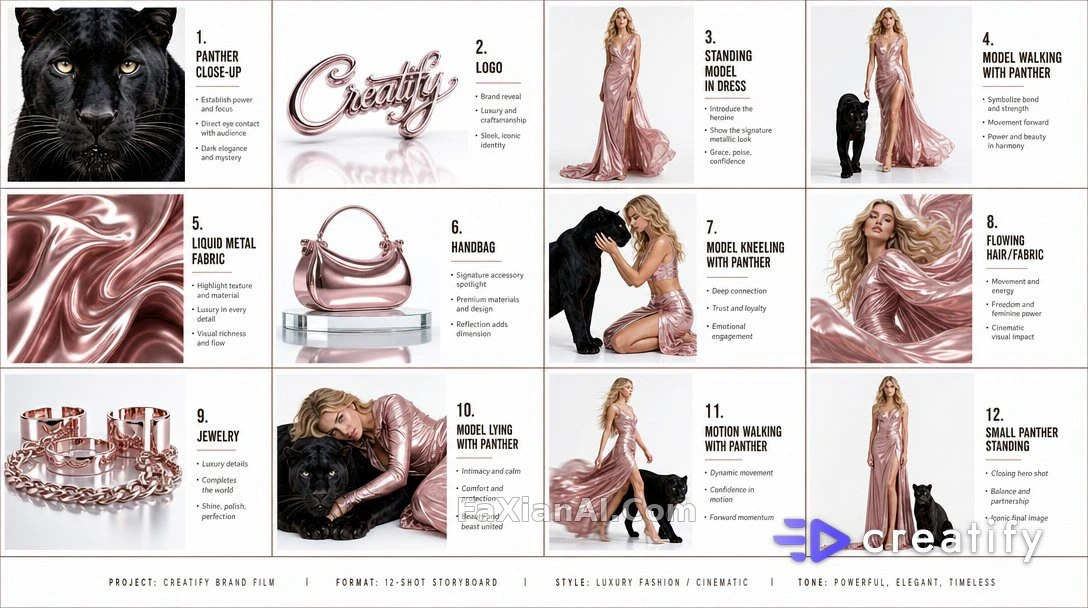
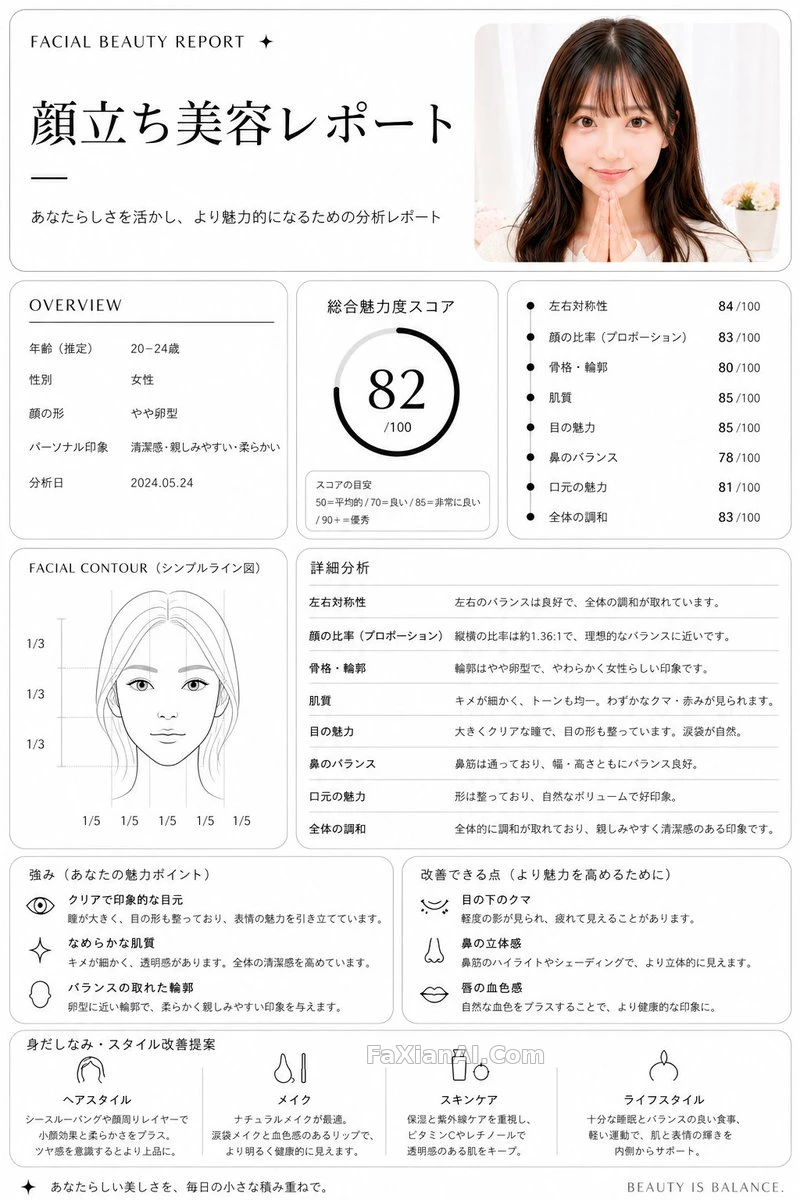
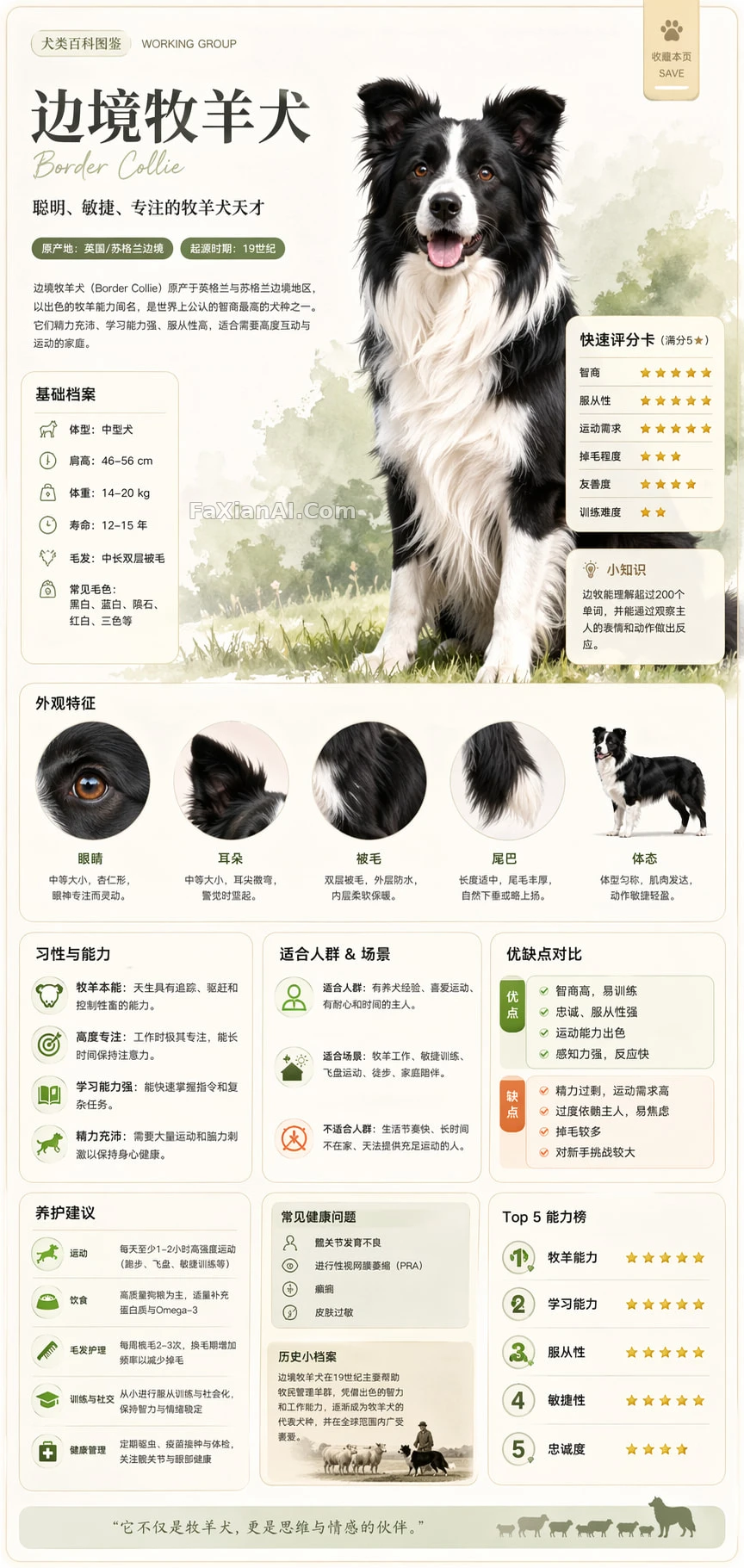
What actually lands isn't the full-body figure, it's that close-up corner where every stitch and material is carefully labeled.
✍️ What actually makes this kind of reference infographic work is locking the layout first — structural breakdown on the left, material and craftsmanship in the upper right, pattern and color in the middle right, a process summary along the bottom. Once the grid is set, whether the subject is a person or an object, it slots right in without needing to spell out every detail one by one.
📋 Prompt Natural Language2454 characters
Create an infographic for the topic {The Forbidden City, Beijing}, styled after a national-museum exhibition panel, a historical-costume reference guide, or a heritage-and-culture special poster — not an ordinary poster, not a guofeng photo shoot, and not an e-commerce product page or anime illustration. Use a paper-like background in tones like off-white, silk-paper white, or pale tea, aiming for a refined, restrained, professional, collectible feel.
Leave the subject matter, costume system, object structure, period style, key components, materials and craftsmanship, color scheme, and layout details entirely up to the model's own judgment based on the topic — no additional information needs to be supplied — but the result must simultaneously present all of the following layers: a realistic primary visual, a structural breakdown, Chinese-language annotations, material explanations, an interpretation of pattern symbolism, an explanation of color meaning, and a summary of core features.
Divide the layout into four zones: the structural breakdown goes on the left, with Chinese leader-lines pointing out key components alongside close-up details; explanations of material, craftsmanship, and texture go in the upper right, showing real texture swatches; interpretation of pattern, color, and symbolism goes in the middle right, accompanied by a main color palette and pattern samples; the wearing order or construction process, together with a summary of core features, goes along the very bottom; the top holds the Chinese main title, subtitle, and a one-line introduction.
How the subject itself is presented depends on the topic: if a human figure suits it best, use a realistic full-body standing figure as the center; if an object or a single structure suits it better, switch to an exploded-view breakdown of that central subject instead — but the overall piece must still keep the complete form of a Chinese-language infographic. All text must be in simplified Chinese, clear, well-formatted, and legible, with no garbled characters, typos, English, or pinyin. The core goal is to clearly convey real structure, material differences, and cultural context while keeping the proper tone of a reference guide — avoid anything that reads as a poster, a photo-studio shoot, an e-commerce page, an anime illustration, or cosplay, and avoid messy labeling, structural errors, blurred text, fake-looking materials, or excessive ornamentation.