
Let the Material Speak for Itself: Prompt Trade-offs for Side Light, Reflection, and Micro-Texture
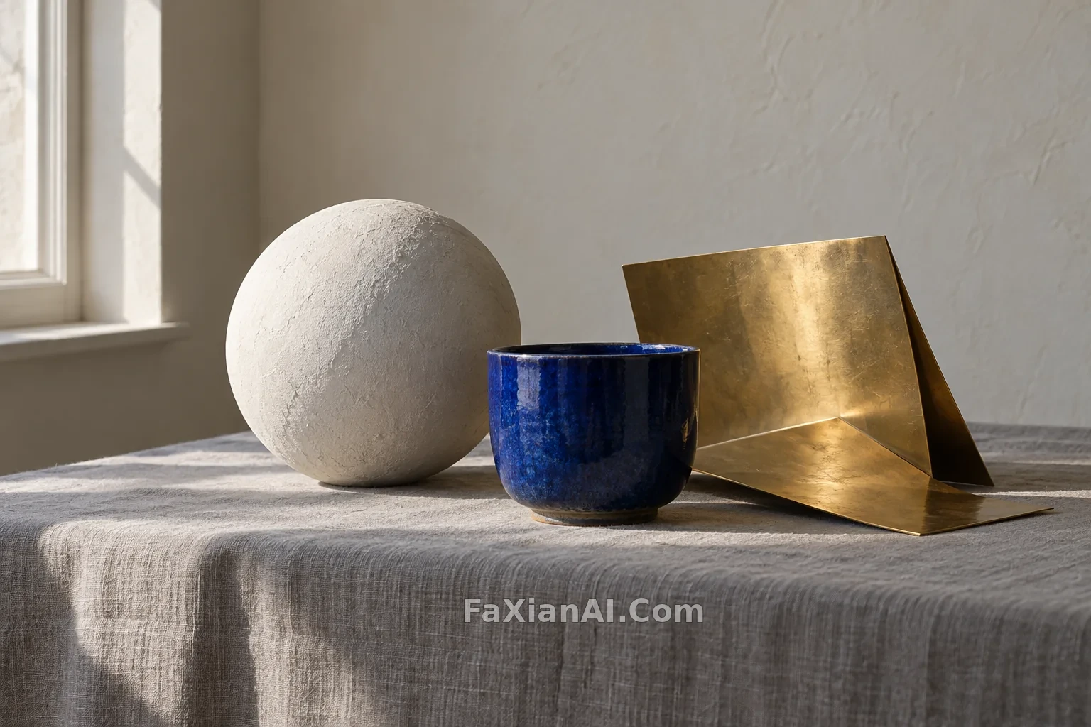
When you write "refined still life" in the same way, ceramic may look like plastic, metal may look like a yellow piece of paper, and linen may be left with nothing but a blurry underlying pattern. The problem is often not that there are too few adjectives, but that the light has not left evidence for the material. First ask clearly: where can surface coarseness be seen, which edge needs reflection, and how far back should the background recede? This makes it easier to form a comparable image than continuing to add "ultra-clear" and "premium."
First give the light a direction, then give the detail a scale
The raking-light example of a cobalt blue tea caddy places glaze crazing, a brass lid, and linen in the same scene. The details they need are not the same: crazing is fine lines, the brass lid is a narrow bright edge, and the fabric is looser fibers. If every surface is required to shine equally, the materials lose their distinction.
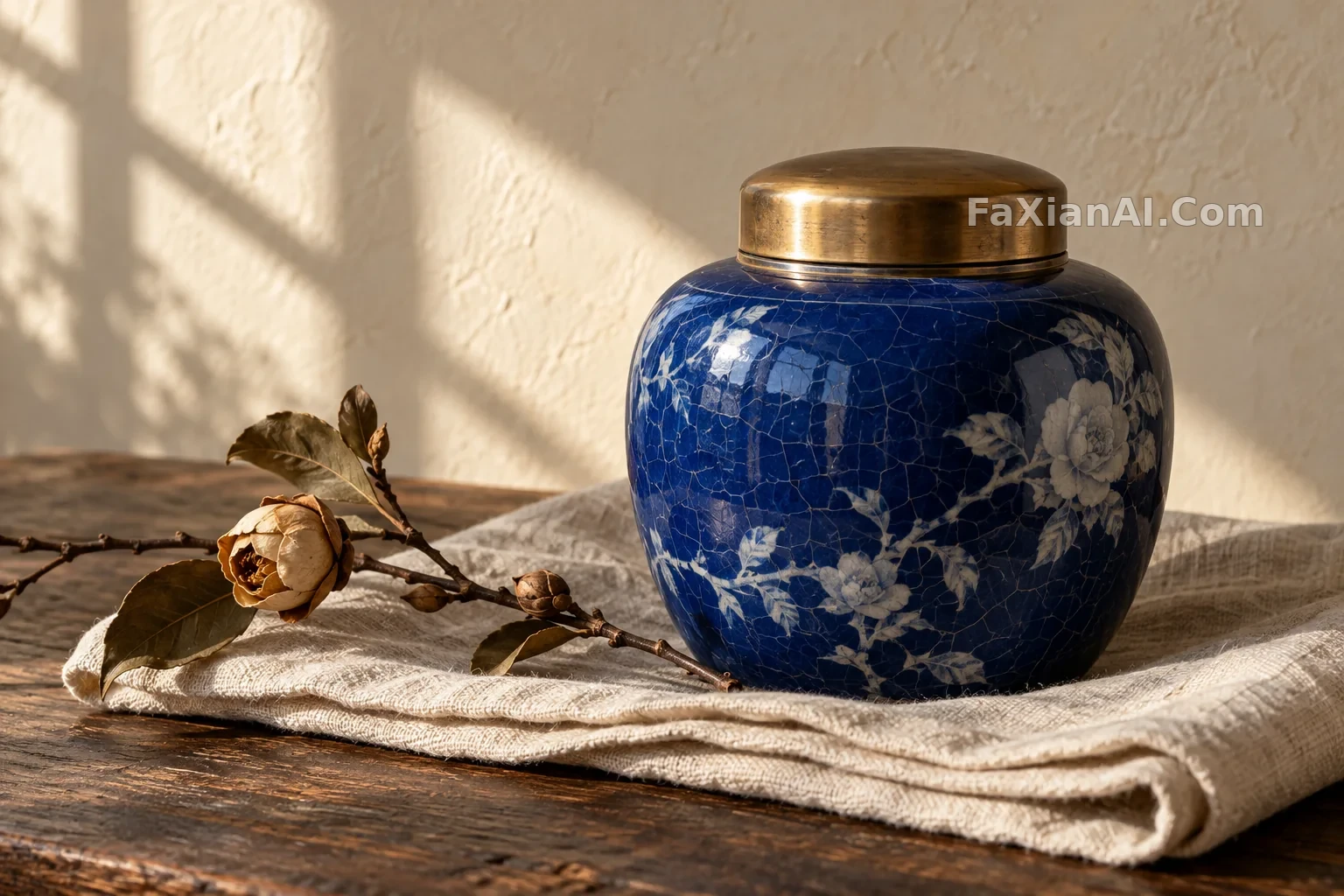
You can first write a core sentence like this: "Low-angle window light grazes the cobalt blue glaze, fine crazing remains clear, the old brass lid shows a narrow highlight only at its edge, and the linen folds leave soft shadows." Here you first specify observable results, then decide on the decorative objects. The dried flowers only provide a sense of scale and should not squeeze the tea caddy into the background.
The plaster sphere, cup, and brass sheet in the main image also follow this approach. Plaster needs a broad, soft transition between light and dark, the cup retains a concentrated glaze reflection, and the brass sheet changes the direction of its bright surface through its folded angle. They share one light source, but they do not share one kind of surface.
A white object does not mean it has no layering
The shell vase and limestone are both close to white, and writing only about color can hardly explain their difference. More useful are "powdery ceramic surface," "relatively coarse stone pores," and "a curled thin lip edge." In this way, even with very low saturation, viewers can still read softness versus hardness and coarse versus fine.
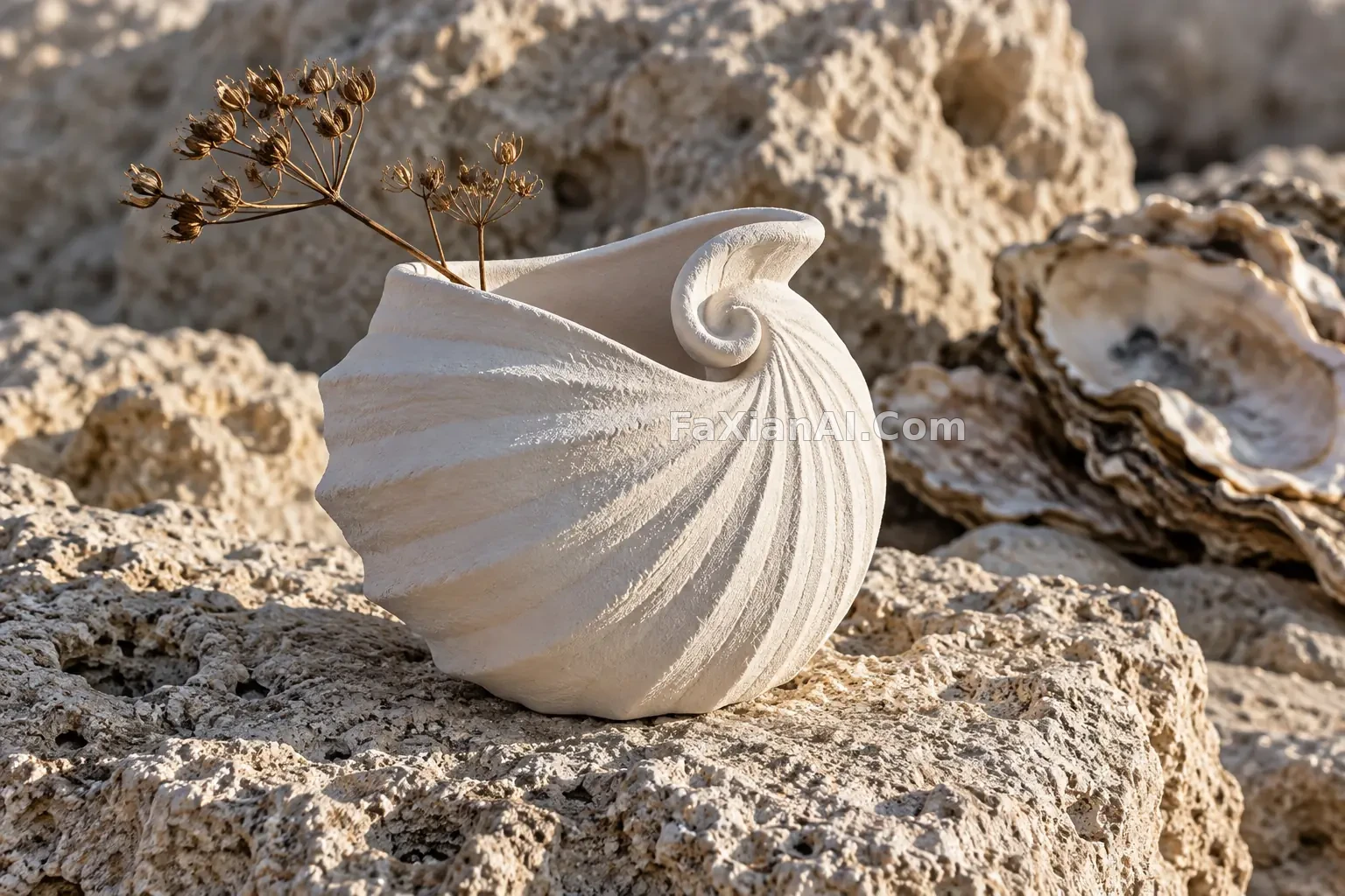
The prompt can narrow the focus to the vase's curled rim and ribbed lines, and the background stones do not need to be clear everywhere. If every inch of the background is required to have equally dense detail, the vase will lose visual priority. Conversely, flattening the background completely will lose the material comparison. The trade-off here is to keep the stone pores discernible and let the depth of field recede gently, rather than hiding structure behind extreme blur.
Transparent materials require checking both silhouette and transmission
The glass pear and orange square pedestal use warm and cool colors to distinguish the objects, but it is not color that proves it is glass. What truly carries the information is the thin edge, refraction, caustics on the pedestal, and a readable connection to the pear stem. If the outer silhouette of the transparent subject has already disappeared, adding more reflections will usually only make the image messier.
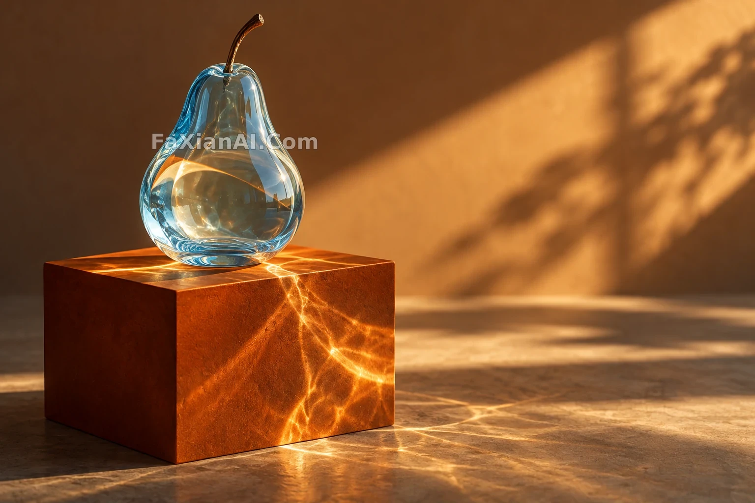
When writing about transparent objects, you can split what follows "ice-blue glass pear" into different tasks: the pear body may show transmitted color, the edges retain a clear contour, curved light patterns appear on the tabletop, and the background stays simple. Caustics are a visual simulation, and you cannot claim precise optical experiment results based on them; they serve material expression, not measurement conclusions.
The same check also applies to the olive-green glass bowl with bubbles. The handmade rim can be uneven, but it must be continuous; the bubbles can vary, but they cannot become dots stuck onto the surface. Comparing two kinds of transparent vessels can reveal the specific role of the prompt more effectively than repeating the same phrase "crystal clear."
Look at failures first, then decide what to add
When checking the finished image, look at structure first: whether the handle connects, whether the thin wall is continuous, and whether the contact surface is believable. When the structure does not hold, adding material words does not help. Then look at light: whether highlights wash out the edges, whether shadows swallow the texture, and whether the metal is left with only a patch of yellow color. Only then look at the small details after compression, to avoid assuming that a sharp original guarantees a sharp display file.
The variables suitable for further experimentation are light position, surface roughness, and background distance; changing only one at a time makes comparison easier. There is no need to turn every still life into the same set of warm window light: hard light is good for checking edges, diffused light is good for observing broad, gentle tonal gradations, and backlight more easily exposes the thickness of transparent materials. Different scenes should have different evidence.
More related examples can be compared in E-commerce and Product; if you want to dig deeper into the division of labor between lighting and surfaces, you can also read Product Lighting and Material Expression. When choosing prompts, keep the words that can be pointed out in the image and delete praise words with no concrete anchor; the differences between materials will then become more distinct.