
Halloween 3D Lettering Prompts: Candy Glass, Slime or Bandages for HAPPY HALLOWEEN? Pick the Material Before the Light
Every October the same request comes back: "Happy Halloween 3D text." A shop needs a holiday header, an official account needs a cover image, someone wants a greeting card for their group chat. The most common failure is lettering that looks like a plastic sticker: the colors are orange and black, the pumpkins and bats are all there, but you can't tell what the letters themselves are made of.
The site collected a good number of Halloween lettering cases this season, and the standout ones share one habit: the very first sentence names the letter material, and everything after it is evidence for that material. Here they are, grouped by material.
1. Decide the Material First: Say What the Letters Are Made Of in the First Sentence
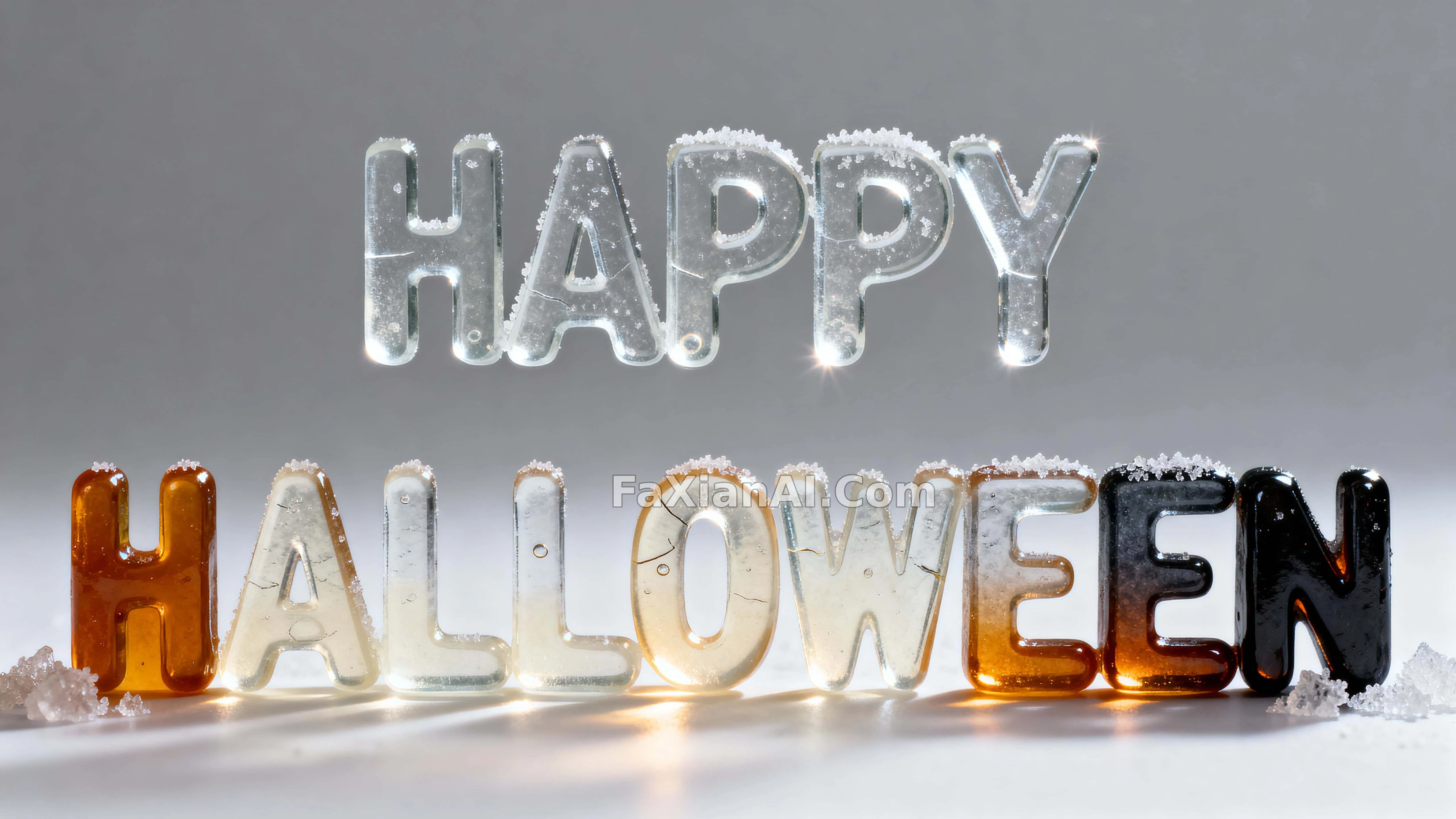
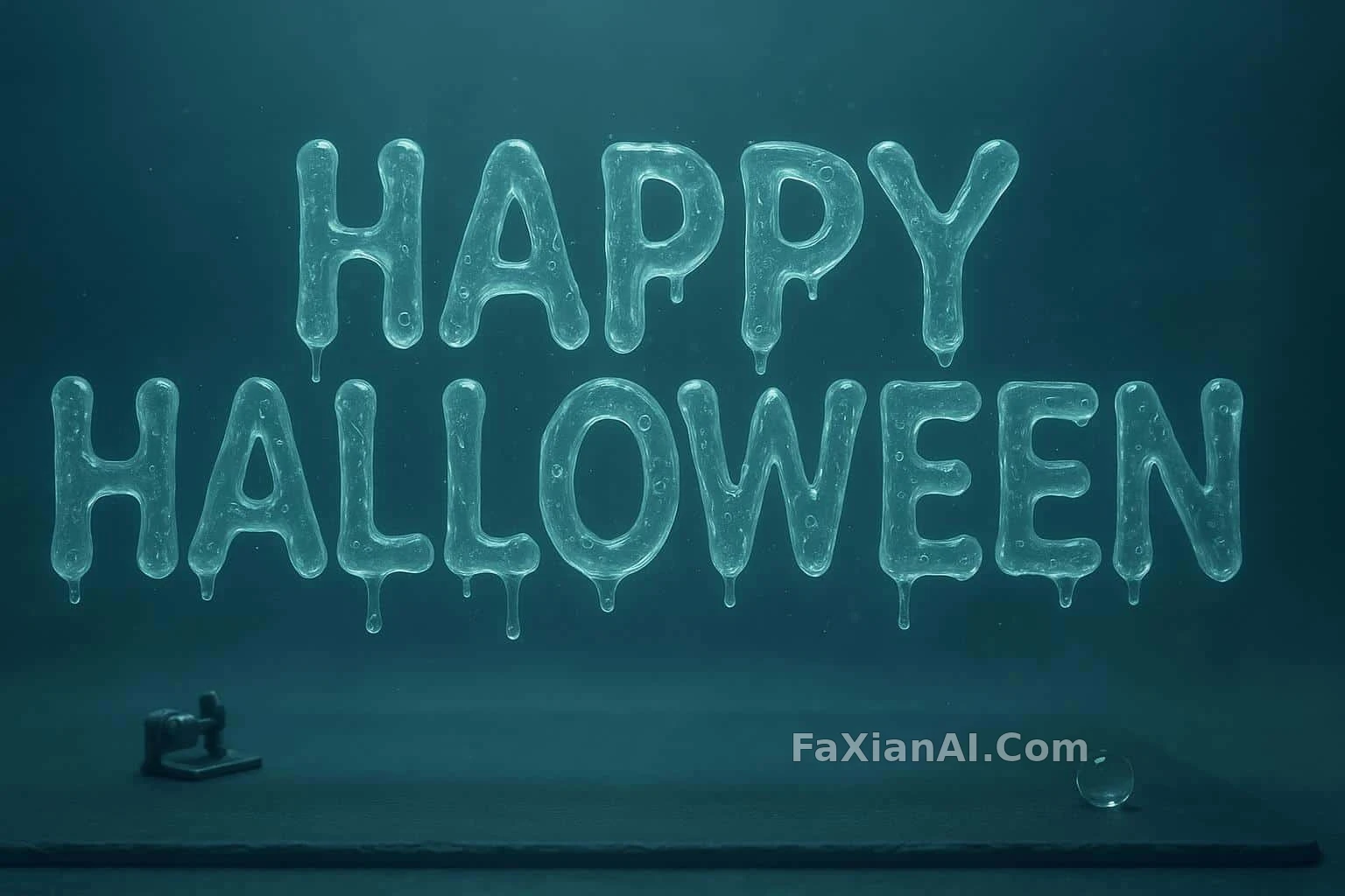
The candy glass lettering opens with each letter cast from clear candy glass; the slime lettering says built entirely from semi-transparent ectoplasmic slime; the zinc lettering is built entirely from riveted zinc panels; and the candle lettering uses stacked candle segments melt together.
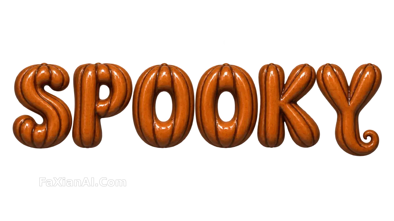
Two newer entries push the idea a step further. The glazed ceramic SPOOKY begins with sculpted as pumpkin-shell lettering in glazed terracotta ceramic: every letter is itself a pumpkin shell, vertical pumpkin ribs wrap the strokes, and dark brown glaze pools in the grooves. The bunny magician case uses extruded glossy acrylic letters, with orange, cream and grape lollipop swirls embedded inside the acrylic.
Notice the verbs: cast, built, stacked, melt. Each one also tells the model how the letter was made, so it fills in details that follow the process: cast pieces get bubbles, welded pieces get seams, melted pieces get wax drips. Write only "3D Halloween text in candy style" and the model gets nothing but a style tag, which usually comes back as a layer of candy-colored gradient.
2. Give the Material "Flaw Evidence," and the More Specific the More Believable
Once the material is set, the next step is writing its traces. The candy glass case lists four: glossy sheen, a light dusting of sugar crystals, hairline cracks, occasional trapped bubble. The slime case puts bubbles clustering along the creases of each stroke, gathered where the strokes fold instead of drifting randomly across the whole image.
The job of these details is to give the letters a history. Perfectly smooth letters look like a renderer's default material; with hairline cracks, sugar frosting and a bubble caught inside, they look like someone really did boil a pot of sugar and pour it into a mold. The same idea comes up in the handmade material cues article: a trace has to be explainable by a cause, not just random dirt.
The candle lettering goes further and makes "where the fire is" the focus: thin wicks glowing at select junctions, so embers show only at some of the letter joins. The letter heights are slightly uneven, as if hand-stacked, deliberately not lined up, which is exactly what makes them look hand-built.
3. The Light Direction Follows the Material
Transparent materials rely on side light. The candy glass case says it outright: Side light is doing the work here. The caustics, highlights and amber refraction all come from the side light, and flat frontal lighting can't produce them.
Translucent materials rely on rim light over a dark base. The slime lettering sits on a matte lab-slate that pulls the contrast down, with a thin outline glow around the letter edges. If the surface were a mirror instead, its reflections would compete with the glowing letters for the same layer of brightness.
Soft materials split the job between warm and cool. The bandage lettering prompt is only four sentences long, yet the lighting is clearly divided: a gentle amber key handles the friendliness, a cool edge light handles the outline. Halloween doesn't have to be pitch black, and lit this way the image can go straight onto a kids' event poster.
4. Add a Small Character and Give It Something to Do
Several of the lettering cases tuck in a small character, but the character isn't just standing there; it is doing something to the letters. In the bandage case a little mummy is rewrapping the tail of the "Y"; on the zinc lettering a felt Frankenstein's monster leans in to tighten a tiny bolt; beside the cloud BOO! three small cloud ghosts crowd in.
The bunny magician case is even more direct: A bunny magician stands by the "O" and pulls a ribbon out of it, so the counter of the letter becomes a magic prop.
Giving the character an action works far better than a bare "with a cute ghost mascot." It ties the character to the letters, and the model places it beside or on the lettering instead of shrinking it into a corner of the frame.
5. Write Legibility as Its Own Sentence
The fancier the material, the easier it is for the letters to turn to mush. The cloud BOO! case spells out clearly open counters and pristine edges, because cotton-like clouds can easily fill in the middle of the O. The ceramic SPOOKY guards against the same problem: it spells the six letters out one by one (S, P, O, O, K, Y), then adds carved faces, eyes and mouths are absent. Without that, the model readily carves jack-o'-lantern faces into the pumpkin shells, turns the O's into lanterns, and the word becomes unreadable. If you need a transparent background for a sticker, you also have to write no shadow, no white backing and no checkerboard; miss one and you may get a fake-transparent image with a gray grid baked in.
Frame and margins should be settled up front too: the candy glass case uses a tight 16:9 crop with generous margin above and below, which is exactly where an event date and a shop name would go. For how a title and the main subject of the image relate, continue with poster prompts where the word is the subject; if letters keep coming out misspelled, the text-in-image prompt article has a more detailed troubleshooting approach.
6. A Halloween 3D Lettering Template You Can Adapt Directly
The words "[HAPPY HALLOWEEN / BOO! / TRICK OR TREAT]" are centered in [one line / a gentle arch], all caps, evenly spaced, each letter [cast from / built from / stacked from] [MATERIAL]. The surface shows [TRACE 1], [TRACE 2] and [TRACE 3]. [SMALL CHARACTER] is [ACTION] on the letter "[X]". [Side light / soft amber key with cool rim light] creates [highlight or refraction effect]. The letters sit on a [matte dark slate / neutral studio ground], shallow depth of field, [16:9 / 4:5 / 1:1] frame with clean negative space [above / below] for text. Keep every letter readable with open counters and crisp edges.
How to fill it in: for the material slot, pick one of candy glass, translucent slime, linen bandage, riveted zinc or stacked candles. For the trace slot, write what that material leaves behind on its own, such as hairline cracks and bubbles for candy glass, wax drips and charred wicks for candles, rivets and weld seams for zinc. For the character slot, say which letter it is working on and what it is doing. Set the lighting by matching it to section 3.
More ready-made cases are in the graphic design category, and for how to handle empty space in holiday backgrounds, see holiday copy space backgrounds.