
Typography Poster Prompts: How One Word Locks Into the Subject and the Space Around It
A single-word poster looks simple: one good photo, one big word. Try writing the prompt yourself, though, and nine times out of ten what comes back looks like a watermark stamped on a photo. The text just floats on the top layer, unrelated to anything in the frame — swap in a different background image and it would still work just as well, which is exactly the problem.
In a good typography poster, the text is part of the image's structure. It either aligns with a line already in the picture, overlaps the subject in front of or behind it, or exists as an object within the space itself. This batch of posters on the site, made with GPT Image 2 and GPT Image 2.5, happens to cover all of these relationships.
1. The Text Aligns With a Line Already in the Frame
The moment a ski track lines up with that row of trees and the line inside a wave barrel, drawn jointly by the board and the wave are a matched pair. Their prompts are surprisingly short, but share the exact same structure:
- Category and aspect ratio come first: A premium winter-sports editorial, 9:16;
- Then the single creative idea: the diagonal line a skier carves out echoes a row of pine trees alongside it; a surfboard's arc hugs the curve of the wave behind it;
- The lens: a long telephoto shot from a distance;
- And only then the text: Typography reads: "STRIDE." / "CURL."
Notice that neither prompt says where the text goes, how big it is, or what font to use. The visual weight of the whole image is handed to "that line," and the word is just naming it. STRIDE means a stride, CURL means the curl of a wave — the word and the image are saying the same thing, so even sitting in empty space, the text doesn't feel tacked on.
The key to this approach is finding the line in the image first, then picking a word that can name it. Do it backwards — settle on the word first and go looking for an image to match — and you usually end up with a word stuck onto an illustration.
2. The Text Gets Partly Cropped, and the Person Emerges Through the Gaps
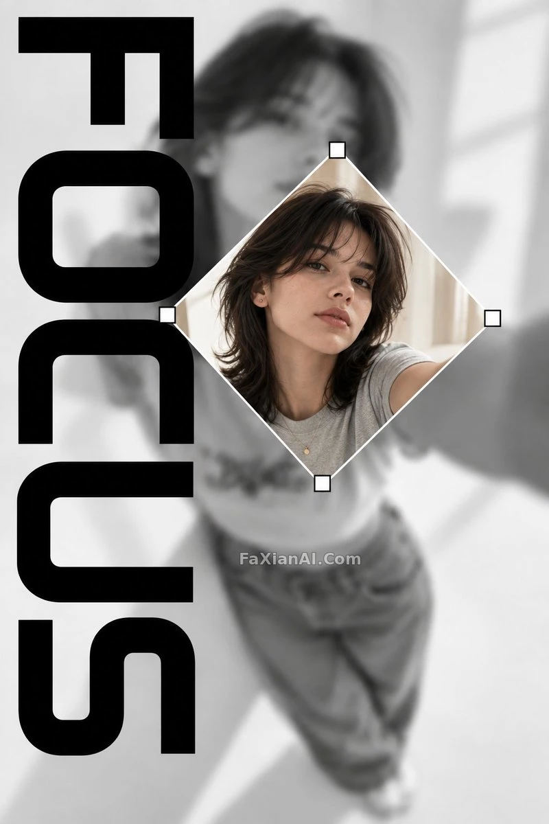
In an out-of-focus selfie, a diamond-shaped crop suddenly snaps into focus works on a different relationship: both the text and the image itself are "being cropped." The background is a grayscale, out-of-focus selfie; a slightly rotated diamond-shaped crop sits in the middle, framing a sharp color photo of the same person; FOCUS runs vertically along the left edge, with the letters partly cut off by the crop frame.
Two parts of this prompt are especially precise:
1. The crop frame is described as a cropping tool from design software — thin white border, small white square corner handles. The model's grasp of "interface elements" is reliable, and that's far more controllable than writing "a diamond-shaped picture frame."
2. It states explicitly that FOCUS is the only text anywhere in the design, then lists a string of things to exclude: captions, logos, barcodes, symbols. Fashion-magazine styling makes the model prone to auto-adding barcodes and fine print, so that has to be blocked in advance.
An earlier case on the site, giant lettering as a picture frame, with the figure stepping out through the gaps in the letters, turns the same idea into a series: the lettering takes on four different roles — portal, folded structure, border, motion trail. It's written as a functional checklist, handy when you want to generate a whole set of layout references in one go.
3. The Text Is an Object Within the Space Itself
Letters that grow out of three-dimensional space instead of being stuck onto the surface is a variable-driven template: fields like TITLE, MEDIUM, SPATIAL MECHANISM, and SUBJECT get listed up front, and the body then requires the letters to be built from hanging strings, points floating in space, beams of light, or layered wire mesh — fragments from any other angle, resolving into a complete word only from the one designated camera position.
Its core sentence is exists through elements scattered across real three-dimensional space rather than sitting flat on a surface. That one line directly overrides the model's default behavior of sticking text onto a flat surface. Combine it with a requirement for three depth layers — foreground, midground, background — plus pinning the letters to 35–55% of the frame, and the model has a much harder time cutting corners with a flat word.
In the same category, light glowing through a crack, that line of dimensional lettering splits the word CONSISTENCY apart with a crack, warm light leaking out from inside. It uses a low three-quarter angle to give the letters a monumental feel, while still insisting on fully legible. The biggest risk with dimensional lettering is sacrificing readability for effect, and that one phrase is the insurance against it.
4. The Text Is the Only Thing Outside the Color Scheme
In chrome flower petals, her face becomes part of the reflection is a poster styled like an album cover: six mirror-finish steel petals, with a woman leaning in close enough that her face becomes one of the reflections; above it sits a huge outlined sans-serif CHROME BLOOM, and below, the small text SIDE A and OS.4.
The most worth-learning line is the color spec: chrome, her red lipstick as the only pigment in the frame, black ground. The lipstick is the only thing with color in the entire image, and because the large text is outlined rather than solid, it doesn't compete with that one spot of red for attention. Font style and color allocation need to be considered together — outlined text steps back and makes room for the image, while solid bold text would become the main attraction itself.
A Few Checks for Writing Typography Posters
1. Use exactly one word, written in quotes with the exact spelling, ideally all caps. Add a subtitle and you add another place for things to go wrong.
2. Spell out the relationship between the text and the image: aligned with a line, partly cropped, in front of or behind the subject, or an actual object in space. Leave it unwritten and the default is just floating on the top layer.
3. List the text you don't want: captions, logos, barcodes, dates. Magazine and album-cover styles need this especially.
4. Lock in the aspect ratio first. Vertical 9:16 and 2:3 suit stacked or top-bottom layouts, while landscape works better for text running horizontally across the frame.
For subjects like city travel posters, where text pairs with a landmark, see the city travel poster template prompt next — it covers how to lock down fixed fields like city name, coordinates, and numbering with variables. For the broader question of getting the model's text accuracy right, getting the model to spell text right goes into more detail.