
City Travel Poster Templates: What to Make a Variable, What to Lock Down
Travel posters are one of the best prompt types to turn into a "template": same structure, swap out the city name, and you can generate Tokyo, Istanbul, Paros one after another. But try it in practice and most templates fall apart by the second city — either the landmarks turn into a jumbled pile, or every city ends up looking identical.
The travel poster templates on the site that actually hold up all share one thing: they draw a hard line between what's allowed to change and what absolutely can't.
1. Reserve variables for what's unique to that city
The hand-drawn city doodle poster leaves exactly one blank: [CITY]. Everything else is locked — a pure white background, loose black ink lines, one iconic landmark in the center, small scattered elements around it (cafés, traditional food, transit, street signs), and a limited accent palette.
When you swap the city, the model goes and finds that city's own landmarks, food, and transportation on its own — but the drawing style, the white space, the line weight all stay fixed. The sample image gives you London: Big Ben, a red phone booth, a double-decker bus. Swap in another city and the content changes while the layout and brushwork stay locked — put several side by side and they read as one series.
The cinematic destination poster is even smarter about it: it also has just one variable, [LOCATION], but it explicitly requires that the terrain, architecture, climate, and clothing all belong to that actual place, and bans mixing in styles from other regions. That line might look unnecessary, but it exists specifically to head off a common failure — the model dressing an East Asian city in European street lamps, or giving a desert city pine trees.
The transferable move: the fewer variables the better; everything outside the variable needs to be specific enough to hold a series together.
2. Stating the aspect ratio twice isn't redundant
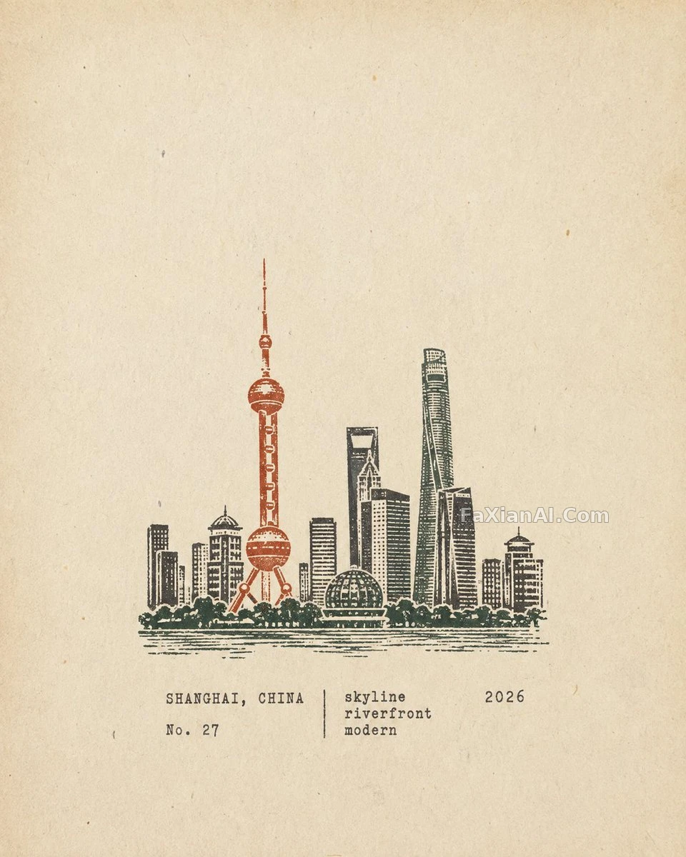
The iconic landmark travel poster template opens with "strict 4:5 vertical" and closes by repeating "strict 4:5 vertical, no other ratios accepted." The rubber-stamp poster puts 4:5 as the first line of its format section too.
Travel posters get printed, framed, and turned into series — one wrong aspect ratio and the whole set is ruined. Template prompts also get reused over and over, and the model reads a different surrounding context each time, so stating a critical constraint once at the start and again at the end noticeably cuts the odds of it getting dropped. The site's aspect ratio piece covers this in more depth.
3. Give elements a position and a footprint, not just a list
The rubber-stamp case is the most detailed of this batch: the stamp sits in the lower-middle area, taking up 30% to 38% of the frame's height, with generous white space around it; the text sits below or beside the stamp in a typewriter font, limited to place name, a number, three keywords, and a year.
List elements without positions and the model will crowd them to fill the whole page. Give a footprint percentage instead and you get that restrained "field notebook" look. It also breaks composition into five types by subject matter — architecture gets outline-and-dome treatment, mountain settlements follow the terrain, coastal scenes get reduced to a few lines of water, and city skylines get a silhouette plus one landmark building — a single template that also solves "how do I compose different kinds of cities."
The Madinah case locks the crowd size at 3 to 5 people, "never a large group." Fewer people keeps the scene calm; writing the number out means the model won't decide on a crowd on its own.
4. A country poster can skip landmarks entirely
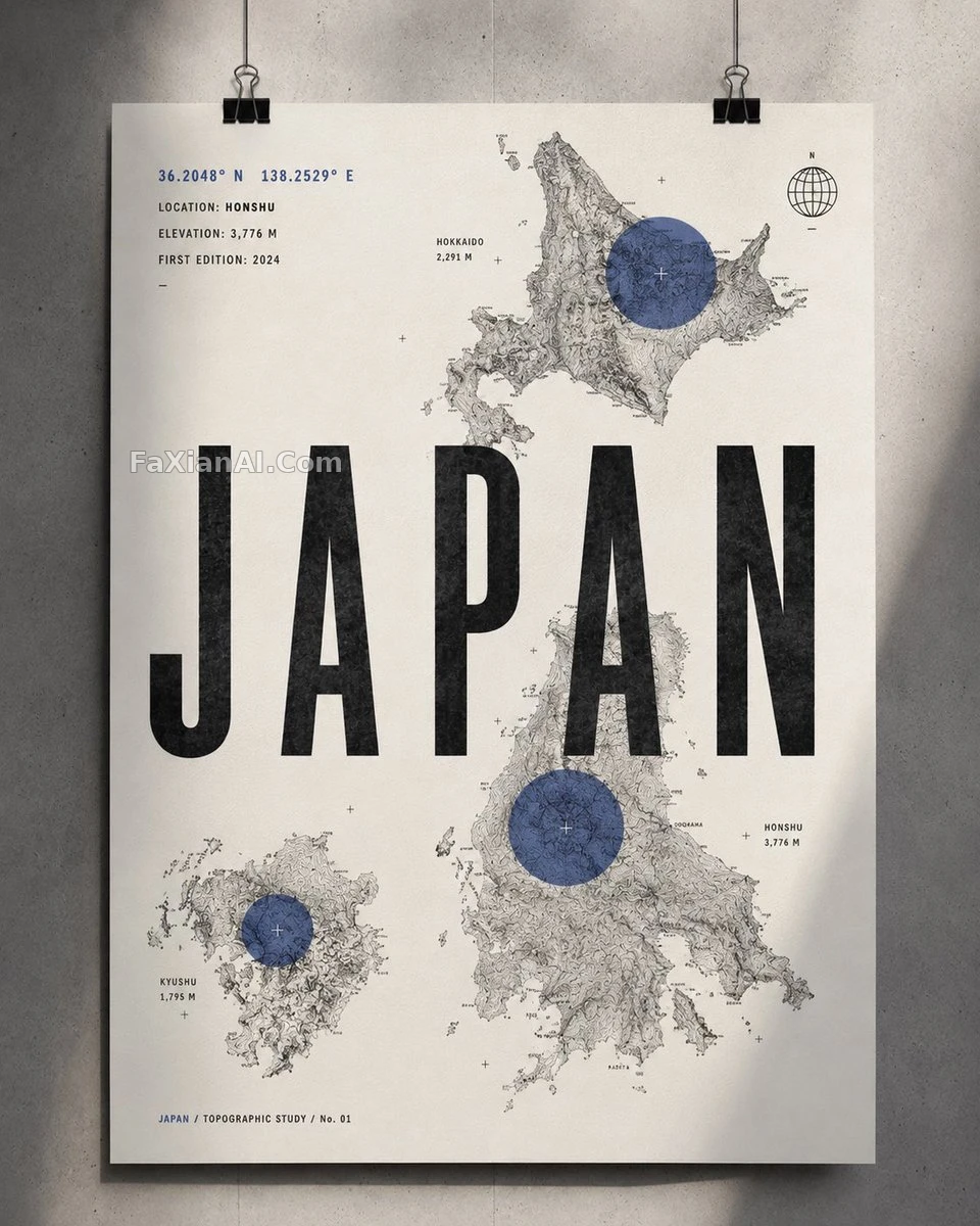
The topographic country map poster takes a completely different path: no landmarks, no flag, no tourist imagery — just contour lines, coordinates, and elevation numbers to represent a country. The palette is almost entirely black, white, and gray, with the one accent color reserved for a handful of translucent circular location markers.
The insight here: a travel poster's sense of identity doesn't have to come from a symbol like the Eiffel Tower. A country's own outline and mountain ranges are distinctive enough on their own, and paired with a large Swiss-style sans-serif headline, the result can end up feeling more sophisticated than a landmark collage.
5. The don't list sets the floor
Nearly every working template ends with a paragraph of "avoid": no photorealism, no watercolor, no gradients, no landmark collages, no excess text, no incorrect Arabic script... The rubber-stamp case even goes as far as excluding "round seals, Chinese-style red ink stamps, postage perforations, wax seals" — because the word "stamp" is exactly the term the model is most likely to misread as one of those.
The transferable move: think about what your core keyword is most likely to be misread as, and write those misreadings directly into the don't list.
Before you swap in the next city
1. Is the only variable the place name (plus, at most, one color palette)?
2. Is the aspect ratio stated once at the start and once at the end?
3. Do the subject and text have a stated position and footprint?
4. Are people count and element count written as concrete numbers?
5. Does the don't list cover the most common misreadings of your core keyword?
For an earlier approach, compare against the site's universal city travel poster template and the ribbon-threaded city tourism scroll poster piece; if your poster needs to carry more text, getting the model to write text correctly covers font and layout instructions. Two more worth comparing for palette: the Paros Cyclades blue-and-white poster and the pink-toned Shanghai Bund map.