
Where in the Prompt You Put the Aspect Ratio Decides Whether the Model Actually Follows It
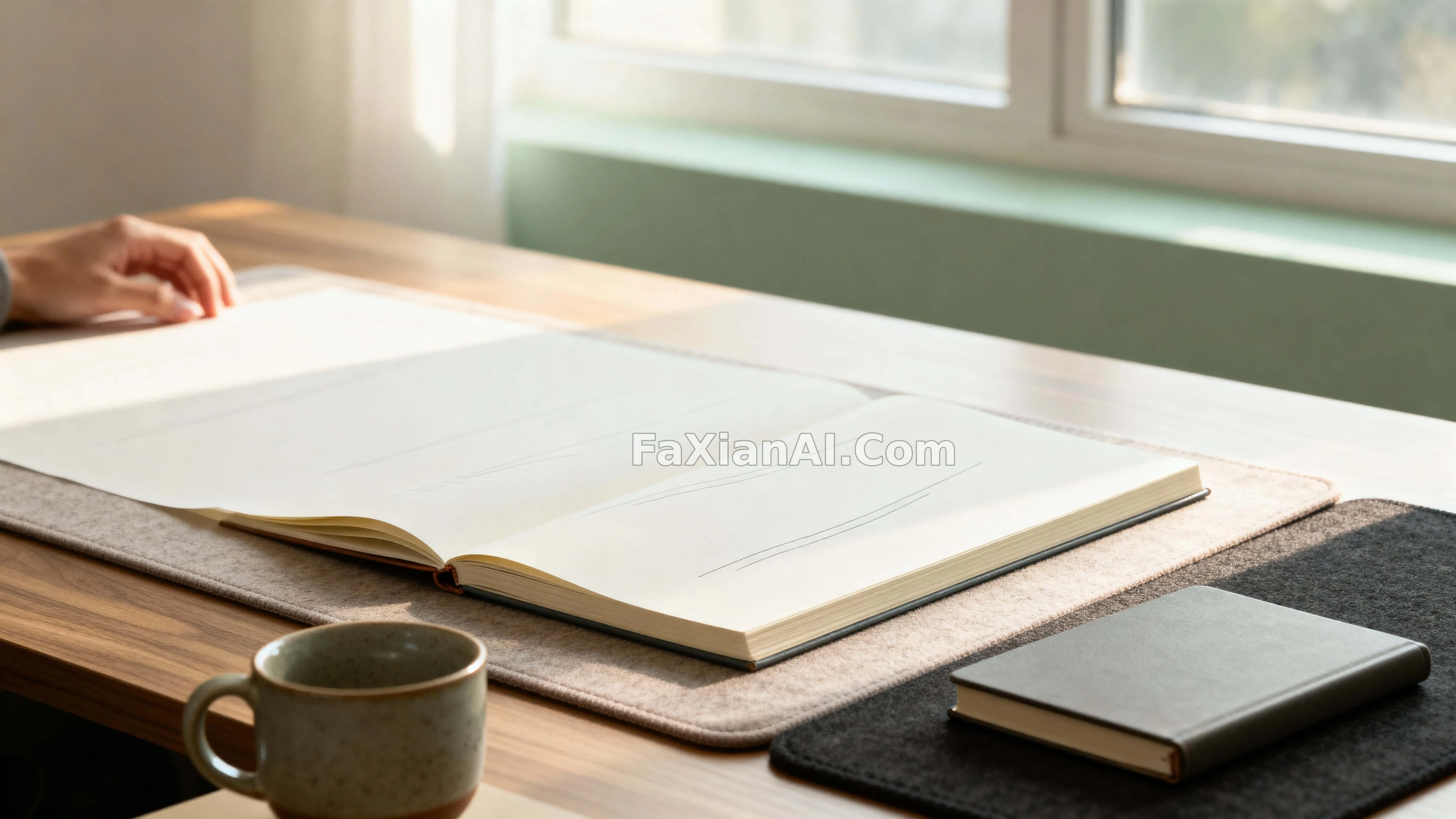
Of the site's 1,300-plus cases, more than half have prompts that explicitly state an aspect ratio. But even with the ratio spelled out, some images come out honestly 16:9 while others drift back toward something close to square. The difference usually isn't the model — it's where that phrase sits in the prompt, and whether a composition instruction follows right after it.
Put the Ratio Near the Front, Not Tacked On at the End
Position first. Stuff a phrase like `16:9 widescreen wallpaper format` at the end of a prompt, and the model has usually already locked in the composition at its default ratio — the ratio only gets applied as a stretch at the very end, and the subject ends up squeezed out of shape.
The empty bench after rain puts the aspect ratio in the second sentence, immediately followed by "horizon pushed low, most of the frame given over to a heavy overcast sky" — the ratio and the compositional weight are stated together. The same approach shows up even more clearly in the morning desk shot: the widescreen format is set first, and only then does it say the desk occupies just the lower half, leaving the upper half for hazy light.
Now flip it around for vertical formats. The moose portrait in misty reeds is written as 9:16, immediately followed by antlers reaching into the top third of the frame — skip that line, and all the extra height from 9:16 just gets wasted on empty reeds.
A transferable pattern: the ratio must be immediately followed by a line saying where the subject sits within that ratio and where the empty space goes. Stating the ratio without the compositional weight is the equivalent of handing over a canvas with no composition.
Vertical and Horizontal Aren't the Same Image Cropped Two Ways
The real trap is that a lot of people treat a vertical version as just a crop of the horizontal one. In a prompt, these need to be thought through separately.
The plant's shadow on a wall is a 2:3 vertical format — the frame is almost entirely empty wall, with the shadow cutting diagonally down it. Turn this composition horizontal and it stops working immediately, because the length of the shadow needs vertical space to carry it.
The sideline strike caught in motion, on the other hand, only works as a horizontal format: the motion blur needs horizontal distance to travel, and turning it vertical cuts the momentum off.
The rule of thumb is simple: think about the direction the action in the frame is happening in. Growing upward, falling, looking up — vertical. Moving sideways, stretching out, sitting side by side — horizontal. If the direction fights the format, it doesn't matter how precisely the ratio is written.
Wallpapers Have One More Layer: Leaving Room for Text
Wallpapers carry an extra constraint beyond horizontal versus vertical — they usually need to have a title, clock, or icons laid over them.
The large blank space at the top of the purple-indigo wave isn't an unfinished image — it's reserved for a title and caption; this kind of image is designed as a "half-finished" piece from the start. The forest-green-and-gold argyle pattern takes a different approach: gaps deliberately left between the diamonds keep the density down so the pattern doesn't feel cramped, and text stays legible no matter where it lands.
So for wallpaper prompts, it's worth adding a functional description right after the ratio — something like "keep the top third low-contrast to support overlaid text." That line does far more work than just saying "leave some blank space."
One More Thing
Don't rewrite the ratio values themselves. There's a hard rule when the site reworks prompts: technical elements like lens, lighting position, material, and ratio can't be dropped, and the numbers don't get touched either. The reason is simple — swap `50mm f/1.2` for "wide aperture" and the model reads it as an entirely different thing.
For more finished images sorted by aspect ratio, browse the wallpaper category, which has both horizontal and vertical cases; to fold this approach into a full prompt structure, the prompt-writing formula covers it more systematically; if you want to test the effect of changing just one variable, the same-scene, different-light comparison is a ready-made method; and once the ratio is locked in, for how to allocate the remaining blank space, what negative space does across three types of images picks up from here.