
Negative Space Isn't an Unfinished Image: What Blank Space Actually Does Across Three Types of Shots
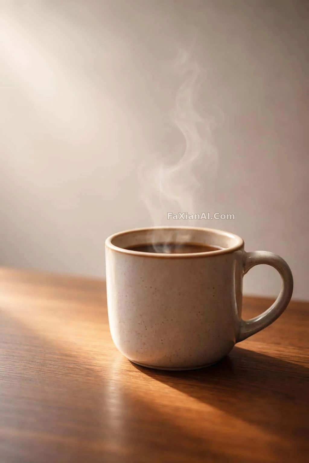
"Add more negative space" is one of the easiest lines to drop into a prompt — and one of the easiest to have it do nothing. The model doesn't know where you want the space, how much, or what it's for. Spell out those three things and the blank space becomes structure instead of just an unfilled frame.
Type One: In Product Shots, Blank Space Is Setting the Price Point
In e-commerce images, negative space ties directly to perceived quality. In the coffee cup in morning light, the empty space left on the left is worth more than the cup itself — the rising steam fills the upper half, and the cup shrinks into a corner almost like a prop, with the glaze highlight as a bonus detail rather than the deciding factor.
The cat-eye sunglasses product shot offers a scale that's easier to copy directly: the temple's shadow stretches out and stops at the one-third mark of the frame. That establishes volume without stealing the scene from the lens's gradient color. Specifying "shadow length as a fraction of the frame" is far more useful than just saying "clean background."
The pearl tiara on a white backdrop demonstrates something else — the even studio lighting isn't there to save effort, it's there so it doesn't steal focus from the rose-toned baroque pearl at the center. Negative space and lighting are one move, not two separate ones.
Pattern: instead of writing "clean negative space," write "subject occupies the lower-right third of the frame, left side kept as a clean background." Give a proportion, give a position.
Type Two: In Wallpapers, Blank Space Is Reserving a Slot
Negative space in wallpapers has a clear function — it's there for a clock, title, or icons to sit on top of.
The blank space at the top of the purple-indigo wave is reserved for caption text — this kind of image is designed as "half-finished" from the outset, with unbroken flowing lines as the real focus and purple as just the color choice. The forest-green-and-gold argyle pattern takes a different route: gaps deliberately left between the diamonds keep the density down, so any text placed on top stays legible.
Together, these two cases show that the standard for wallpaper negative space is functional, not aesthetic — the question isn't whether it looks good, it's whether text stays readable once it's laid on top.
Type Three: In Still Life and Scenes, Blank Space Is Carrying Mood
With still life and landscape shots, blank space starts doing a different job.
The plant's shadow on a wall is almost entirely empty wall, with the shadow cutting diagonally across it — here the blank space is laying the path for the shadow. The empty bench after rain pushes the horizon down low, giving over most of the frame to a heavy overcast sky, with the bench sitting small and off to one side — here the blank space is the vessel carrying the sense that no one's around.
The glowing cracked 3D lettering offers a case in reverse: what actually determines legibility is the negative space — a third of blank margin left top and bottom keeps the heavy lettering from blurring into one mass. Blank space isn't there for breathing room; it's there so the subject's edges read clearly.
How Much Is Actually Enough
A rough but useful test: shrink the image down small and look again. If the subject is still recognizable and the blank space still reads as blank space, the proportion is right; if all that's left is a flat, layerless block of color, the negative space is overdone or the subject is too scattered. This test is especially useful for light-toned scenes — a screen full of white can look crisp on a display, but the real risk when printed is that it turns muddy gray.
For more finished images with this kind of compositional trade-off, the e-commerce products and wallpaper categories are the densest places to look; for how to fine-tune lighting and material separately in product shots, product lighting and material editing goes into more detail; and to work out the relationship between negative space and aspect ratio, where to put the aspect ratio in a prompt picks up from here.