Home › E-commerce › This Cup Looks Like a Limited Edition
This Cup Looks Like a Limited Edition
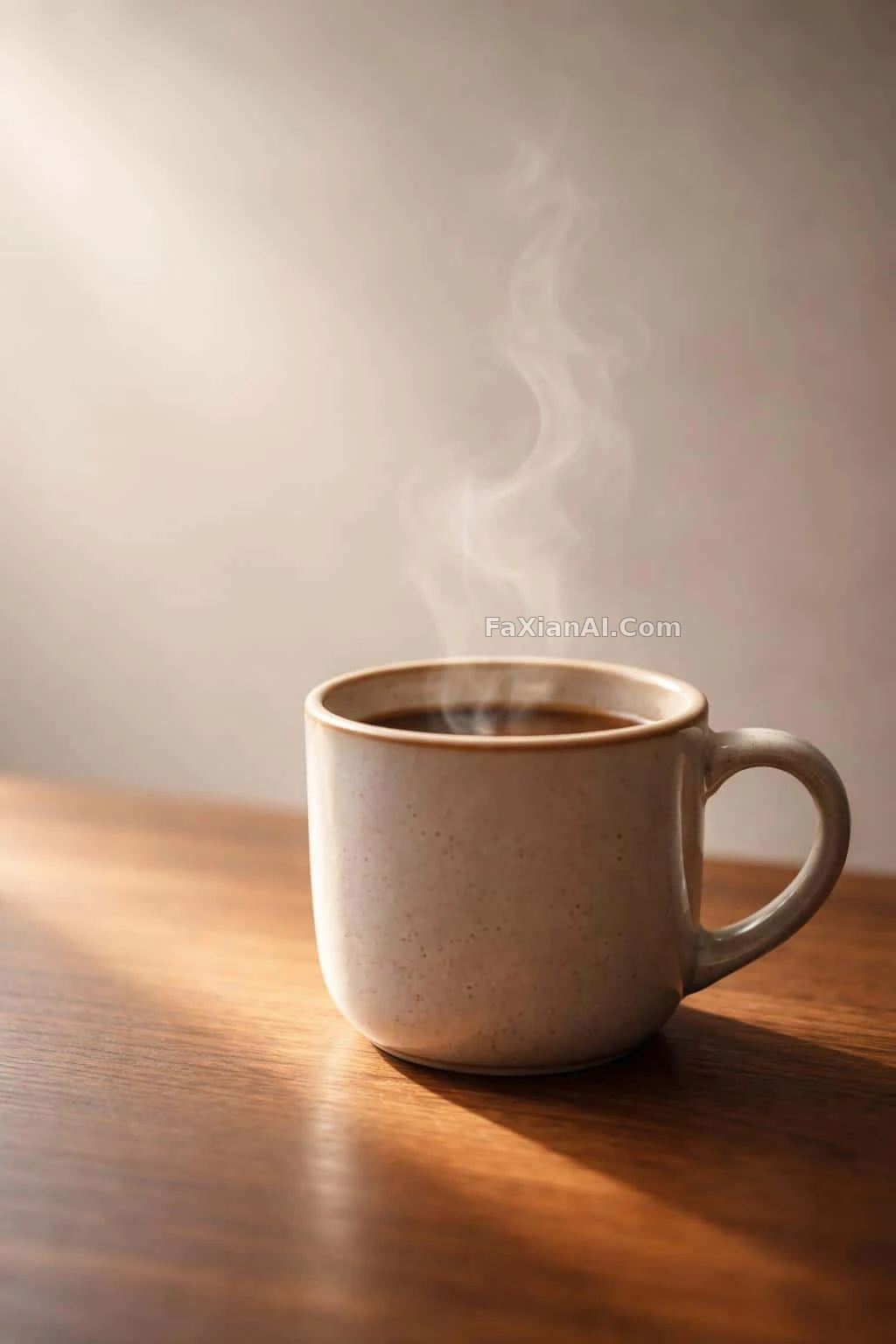
The rim highlight is rendered fine enough to match the plating on a limited-edition figure.
✍️ That empty space on the left is worth more than the cup itself — ninety percent of a product shot's polish rides on that negative space. The steam owns the upper half, and the cup shrinks into a corner like a prop. The glaze highlight is a bonus, not the deciding factor.
📋 Prompt Natural Language996 characters
A single ceramic coffee cup, the primary subject, sits low and slightly right of center in a vertical 2:3 frame, its base anchored in the lower third while steam rises through the upper two-thirds. The cup itself fills only about a quarter of the frame's width, leaving generous negative space across the left third for a balanced poster-style layout. Morning light from the upper-left throws a warm amber rim and soft side-shadow across the cup and a narrow wooden tabletop, catching gentle specular highlights on the glazed ceramic against a matte wood-grain texture. Steam curls upward in delicate translucent tendrils, edges softly defined against a graduated neutral background filling the upper 60 percent of the frame. Keep focus shallow: razor-sharp rim and lip detail up close, texture softening progressively toward the background to build depth. Render it as polished product photography, naturalistic tonal transitions, subtle film grain, restrained contrast, for a cozy, serene mood.