
City Tourism Posters: How One Ribbon Fits an Entire City Into One Frame
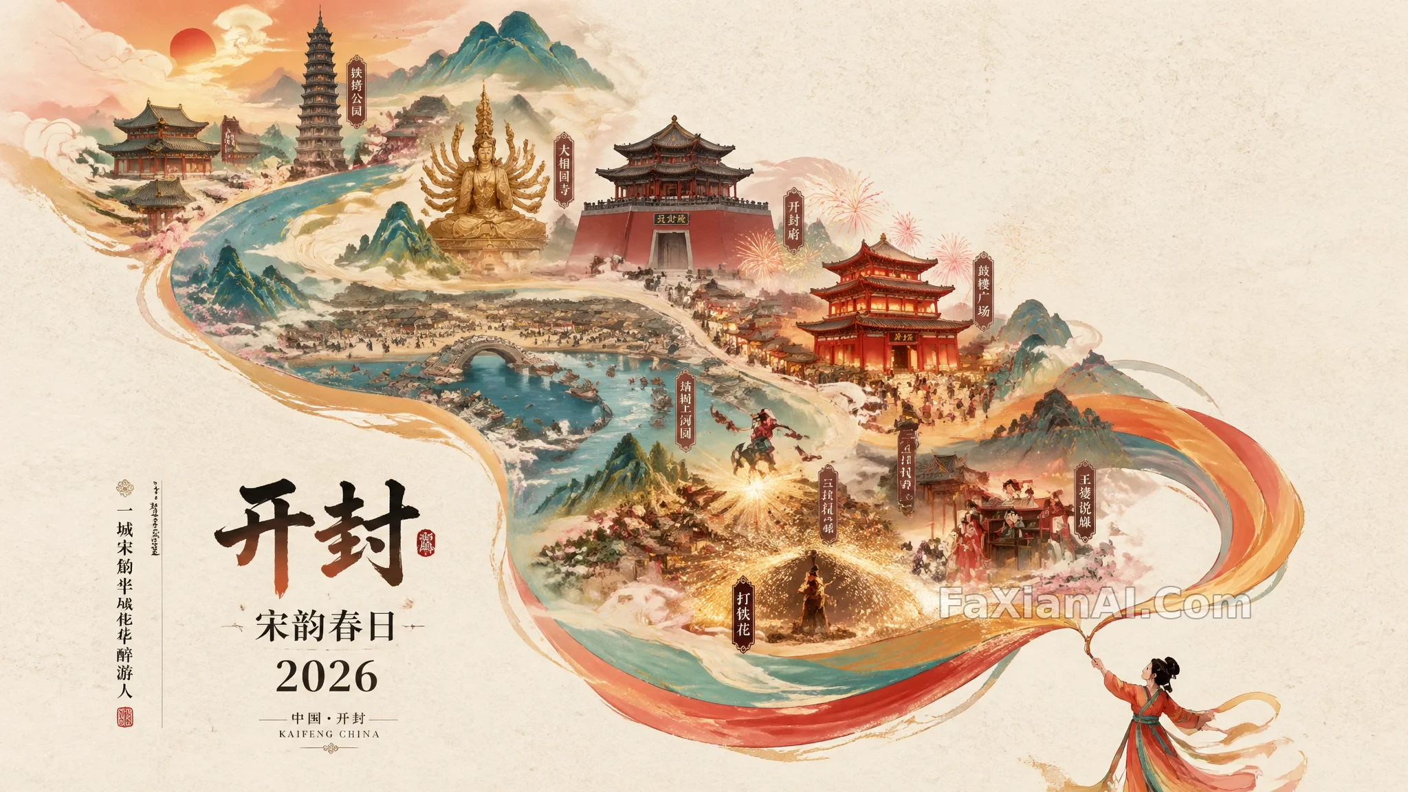
This spring a city-poster template made the rounds in the prompt community, recycled across dozens of cities: a small figure in traditional dress in the bottom right flicks out a ribbon, the ribbon drifts toward the upper left and turns into mountains and rivers, a full hand-drawn city map sits layered inside that river, and the bottom left carries a line of "SPRING 2026" next to a vertical tagline. The template itself is easy to copy. What's hard is making it hold up once you swap in a different city. The site has two of these posters, plus a few city images built on completely different ideas — put side by side, it gets a lot clearer which words in the prompt are actually doing the work.
The Ribbon Template's Skeleton: Figure, Ribbon, Mountains — a Three-Part Relay
The Kaifeng poster is the standard version of this template. Break it down and there are only three parts: the figure is the starting point, responsible for the motion only; the ribbon is the transition, pulling the eye from bottom right to upper left; the mountains and rivers are the container, holding all the city's landmarks. In the prompt, the phrase for an "S-shaped flow" handles the eye path, and "generous negative space" handles the breathing room. Write only the first and the frame gets stuffed with landmarks. Write only the second and the ribbon turns into one lonely red line.
The Kaifeng version lists six landmark clusters: Qingming Riverside Landscape Garden, Wansui Mountain, the Iron Pagoda, Kaifeng Prefecture, Daxiangguo Temple, Drum Tower Night Market. Six is the right number — each one gets enough recognizable space. Add more, and the model starts blurring the buildings into a generic mass of "ancient architecture" that nobody can actually identify.
One more detail makes the point. The original Kaifeng version that circulated in the community only tucked "9:16 dimensions" (尺寸9:16) at the very end of the prompt, yet the actual image that came out was a 2048×1152 landscape frame. The Fuzhou version of the same template instead wrote "9:16 dimensions, suited to immersive vertical viewing" (尺寸9:16,适合竖屏沉浸式观看), and that one rendered vertical. Two samples don't prove a pattern, but aspect ratio really shouldn't be the last clause buried in a long paragraph — which is why, when the site logged the Kaifeng prompt, "vertical 9:16" (Vertical 9:16) was already moved to the first sentence. For where in the prompt an aspect ratio actually sticks, this piece has a dedicated comparison.
Practice: write landmarks as blocks — give each cluster one recognizable subject, and cap it at six to eight clusters.
Shifting the Mood: The Fuzhou Poster Turns a Festival Into a Memory
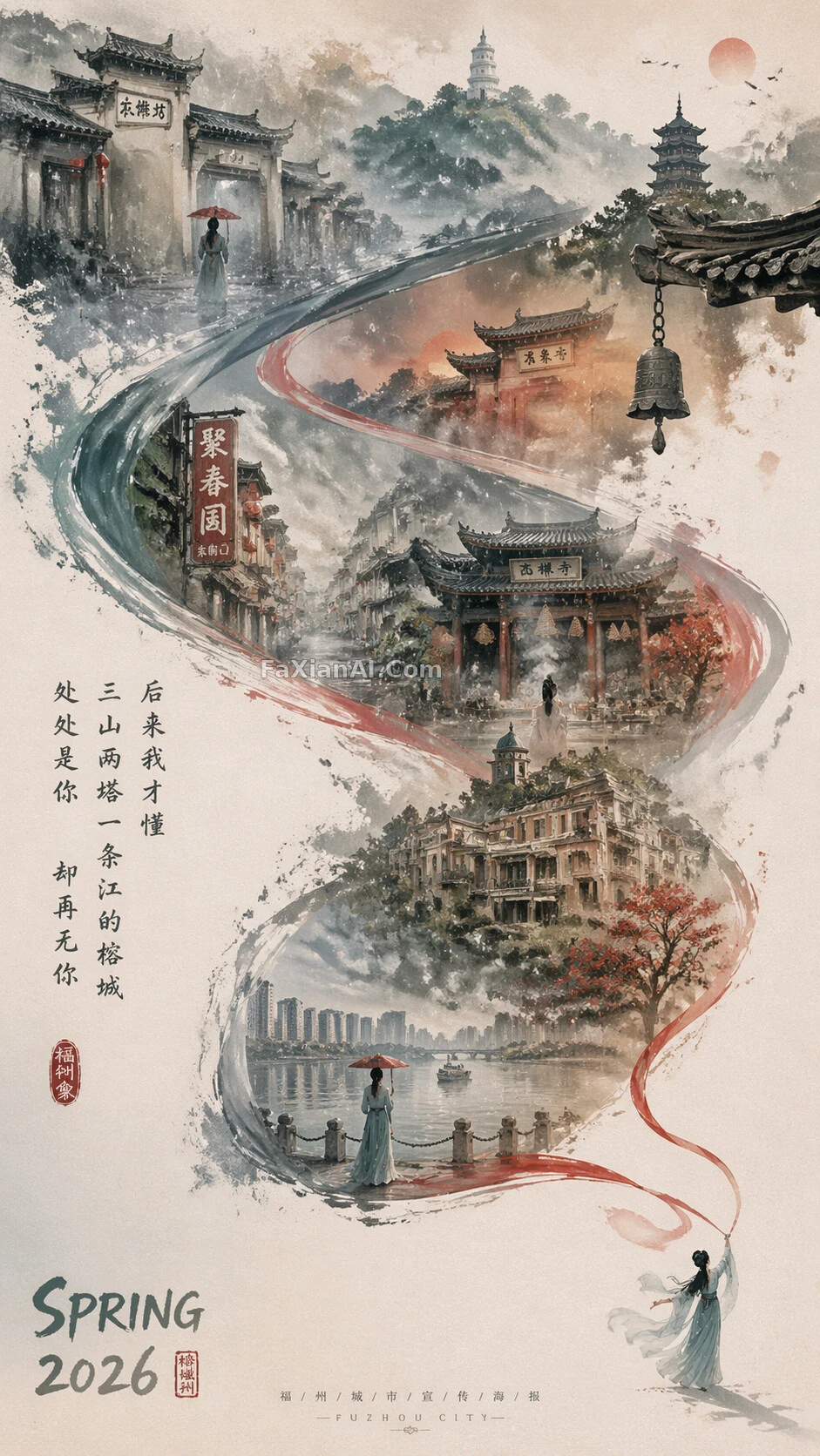
Same skeleton, but what the Fuzhou version changes most isn't the city — it's the mood. The original template wanted festive Spring Festival warmth without losing elegance. The Fuzhou prompt swaps that for a faded old-photograph finish, landing the mood somewhere between memory and the present, and the figure shifts from a small one waving red silk to a pale cyan, moon-white female silhouette. Once those pieces changed, the whole palette shifted with them: the base color retreats from China red to an ink-wash gray-blue, and red survives only as an accent on the ribbon.
The way it writes landmarks is worth copying too. Sanfangqixiang, Gushan, Xichan Temple, Yantai Mountain, the Min River — each one is written as a scene with a person in it, like the back view of someone standing alone under an umbrella by the Min River. A sentence like that gives the model a compositional anchor, and it works far better than a bare list of place names. The 📍 marker at the start of each line in the prompt is a divider meant for human eyes — the model won't render it — but it does make a long prompt much easier to edit.
Practice: to get a different city temperament out of the same template, change the mood words and base color first, then swap the place names.
Another Way to Fit a City In: Compress the Landmarks Into One Line With a Telephoto Lens
The ribbon template is the illustration approach. This global-landmarks stack takes the photography approach instead: the Shanghai skyline sits at the bottom, and stacked above it, in order, are the Potala Palace, the Taj Mahal, the pyramids, the Statue of Liberty — all lined up on the same sightline. What holds the image together is "spatial compression pushed to the limit" and "shot on an 800–1200mm lens": an extreme telephoto flattens scenery separated by tens of kilometers into one plane, so buildings from different continents can stack together without looking fake. The closing string "No collage seams, no floating fantasy elements, no illustration style" matters just as much — it blocks off the three ways the model most likes to drift, in advance.
Establish the Silhouette First, Then the Map Can Take the Lead
If the destination already has a highly recognizable silhouette, you can use that silhouette as the canvas itself. The map-silhouette collage has an editor's note that puts it precisely: let the reader recognize the silhouette first — the scenes filled inside it are secondary information added afterward. Reverse that order and you have to redo the whole thing.
The Paris travel-map collage instead makes the map itself the subject: place names, directions and distances all need to stay clearly legible, with Polaroid photos layered right over the seam between the banner and the map. The hard part in this kind of image is exactly that seam — the prompt specifically calls for only a narrow strip of misty transition between the banner and the map, with no hard dividing line allowed.
The Restrained Approach: Hide the Landmark Inside Ink-Line Drawing
The last one runs in the opposite direction, adding almost nothing. The Oriental Pearl Tower in ink-wash magnolia is nothing but blue-and-white porcelain lines against a wide white ground, with the tower's outline hidden in the negative space between the magnolia petals. Its note names the difficulty directly: lines too solid and it becomes an ordinary illustration; lines too faint and nobody can tell which tower it is. This approach suits magazine covers and brand collateral — low on information, betting all its recognizability on a single silhouette.
Three Things to Settle Before Writing a City Poster Prompt
- How to fit the city in: ribbon-and-mountains, telephoto compression, map silhouette, or ink-line concealment — pick one, don't mix them.
- Where the negative space goes: state clearly which area stays empty before placing landmarks in what's left. For how to arrange negative space, see the piece on negative space.
- Text to render: one main title plus one vertical tagline is enough — quote the exact text, and the fewer characters, the more likely the model gets it right. For getting Chinese characters rendered accurately, see the piece on text rendering.
More poster and layout work sits under the design category.