Home › Design Assets › One Rubber Stamp, One City's Silhouette
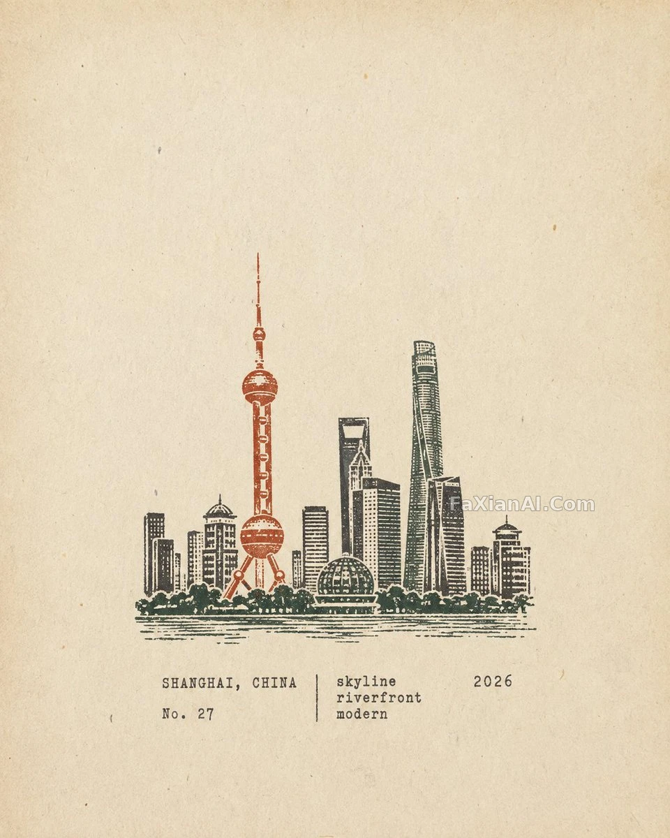
One Rubber Stamp, One City's Silhouette
Aged paper fills the frame, a small multicolor carved stamp sits lower-middle — restraint pared down to pure recognizability.
✍️ Recognizability comes from subtraction, not addition — strip out the crowds, the cars, the repeated windows, and keep only the strokes that let you identify the place at a glance. The stamp sits at roughly 30% of the frame; any bigger and it steals the show, any smaller and it stops reading.
📋 Prompt Natural Language1147 characters
Output each scene as its own separate poster -- never merge scenes into a collage.
Format: strict 4:5 portrait. Cover the full frame in warm off-white aged paper -- subtle fibers, natural grain, light wear, matte tactile texture -- and keep generous blank whitespace.
Stamp artwork: a compact, multi-color carved rubber stamp depicting the location's most recognizable features -- distinctive architecture, mountains, terrain, vegetation, roads, shorelines, skyline, or key foreground shapes. Simplify aggressively, keeping only the visual information needed to instantly recognize the place and scene; strip out crowds, vehicles, repetitive windows, dense buildings, fragmented vegetation, decorative details and irrelevant background elements.
Position the stamp lower-middle, occupying about 30-38% of the frame height, with ample whitespace around it -- compact and understated, not a full landscape illustration, painting, logo or oversized graphic.
Adapt the composition naturally: for architecture, use distinctive silhouettes, roofs, domes, arches, towers and main structures; for mountain settlements, simplified terraced buildings...