
How to Write Photo Abstract Editorial: Negative Space Is Harder Than Piling on Detail
One image, the person takes up a third of the frame, the rest is empty. That's not a bad shot. That's the basic composition of photo abstract editorial. Most people's first instinct writing this kind of prompt is to add things — add lighting effects, add texture, add props. The result gets messier the more you add, and the less it looks like a magazine cover. Real editorial feel comes from having the nerve not to add.
Photo abstract editorial isn't abstract painting
Let's clear one thing up first. The "abstract" in "abstract editorial photography prompt" doesn't mean the image turns into abstract splashes of color. It means the compositional logic is abstract — stripping away narrative, stripping away scene-setting, leaving only light, shape, and color. The subject can be photorealistic. The background doesn't have to be. That's the meaning this term is actually going for.
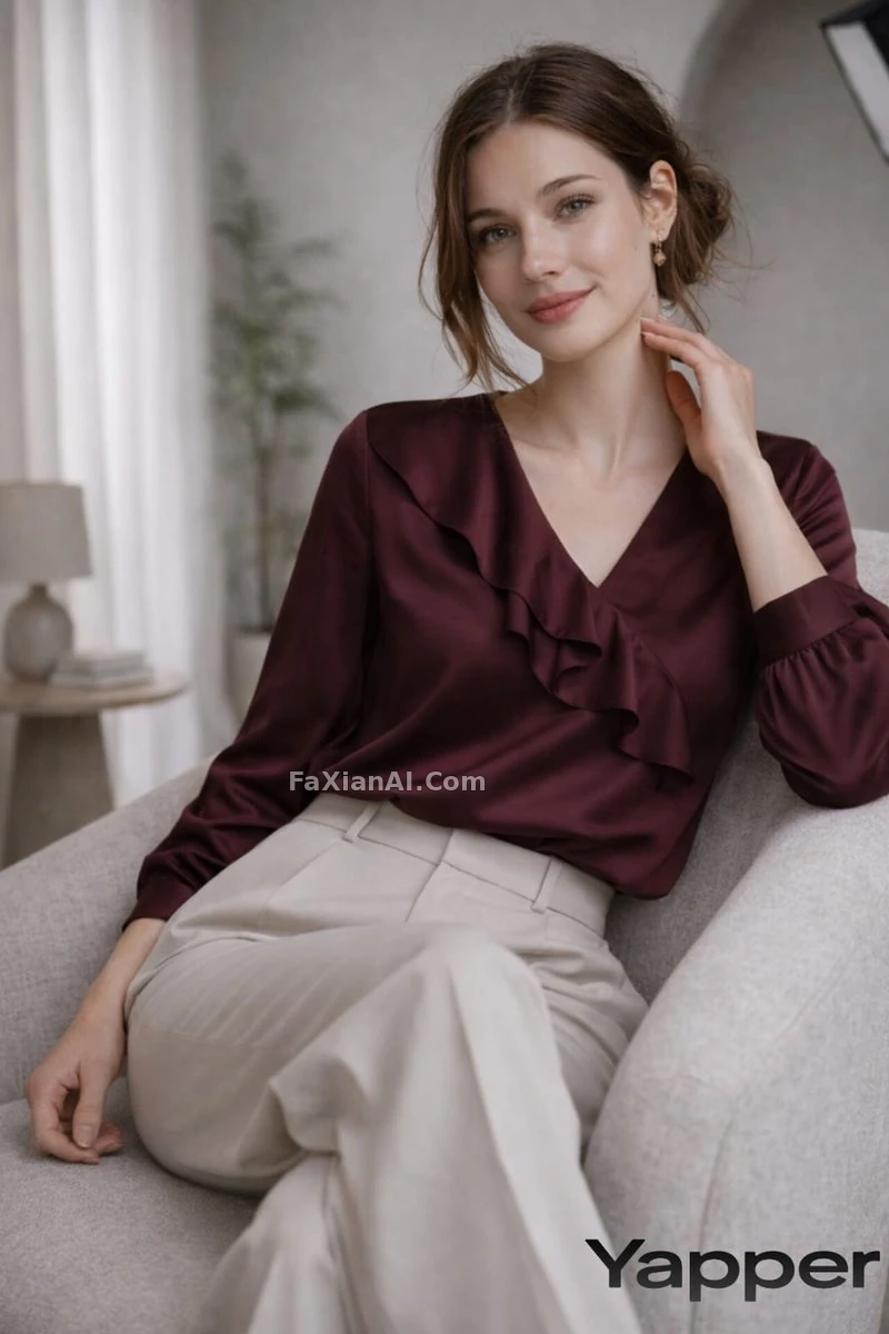
An archway plus a person, that's enough. No need to explain what room this is. See the full prompt.
- Studio archway composition, subject centered between two soft arches, symmetrical framing, one accent color prop only, muted neutral background, no clutter.
- Full-length studio portrait, single soft-box light from camera left, negative space filling two-thirds of the frame, neutral beige backdrop, no props, editorial magazine composition, muted color palette.
Editorial style ai photo keeps just one light source
Add more lights and the image goes soft. Hard light, a single point, one direction. Shadows as deep as they need to be. No fill light. This is the biggest difference between editorial style ai photo and an ordinary lifestyle portrait — ordinary portraits fear shadow, editorial style relies on shadow for its presence.
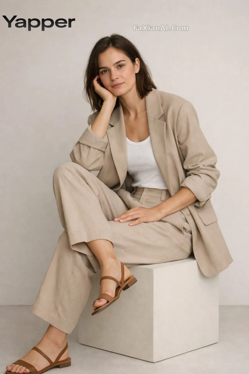
The way a chair is sat in matters more than ten props would. See the full prompt.
- Minimalist seated pose, one arm resting on knee, hard side light creating a single defined shadow, grey seamless backdrop, no smile, direct gaze, editorial tone.
- High-contrast black and white editorial portrait, single hard light source, deep shadow occupying one-third of the face, no fill light, no retouching softness.
- Abstract editorial composition, subject positioned in the lower third of frame, upper two-thirds pure negative space in a single flat color, no gradient, sharp horizon line.
- Minimal full-body stance against a pale wall, shadow cast at a 45-degree angle, no props, no background texture, single focal point on posture.
Grids and split screens are another kind of editorial negative space
Negative space isn't only empty room. Grid layout is also a form of restraint — every cell repeats the same lighting setup, changing just one variable. Change more than that and it falls apart.
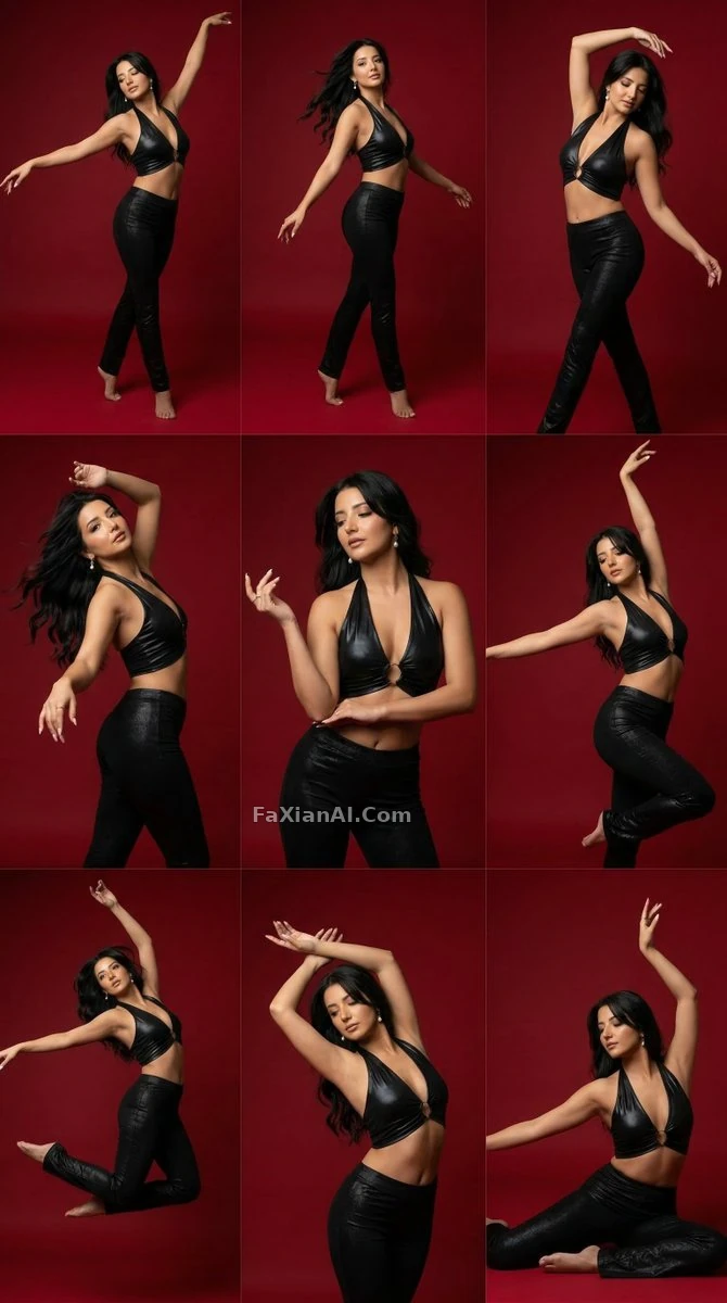
Nine panels, one lighting rig, one background color. Only the pose changes. See the full prompt.
- Nine-panel grid portrait series, identical studio lighting across all panels, subject in slightly different poses per frame, crimson background, consistent framing, no panel gaps.
- Editorial fashion grid, four frames per row, same subject same lighting rig, only wardrobe color changes per frame, no text overlay, high resolution.
- Split-screen editorial layout, left half solid color block with bold typography space reserved, right half full-length portrait, consistent lighting temperature across both halves.
A period feel is also a tool for negative space. Limiting the palette works better than layering on a vintage filter.
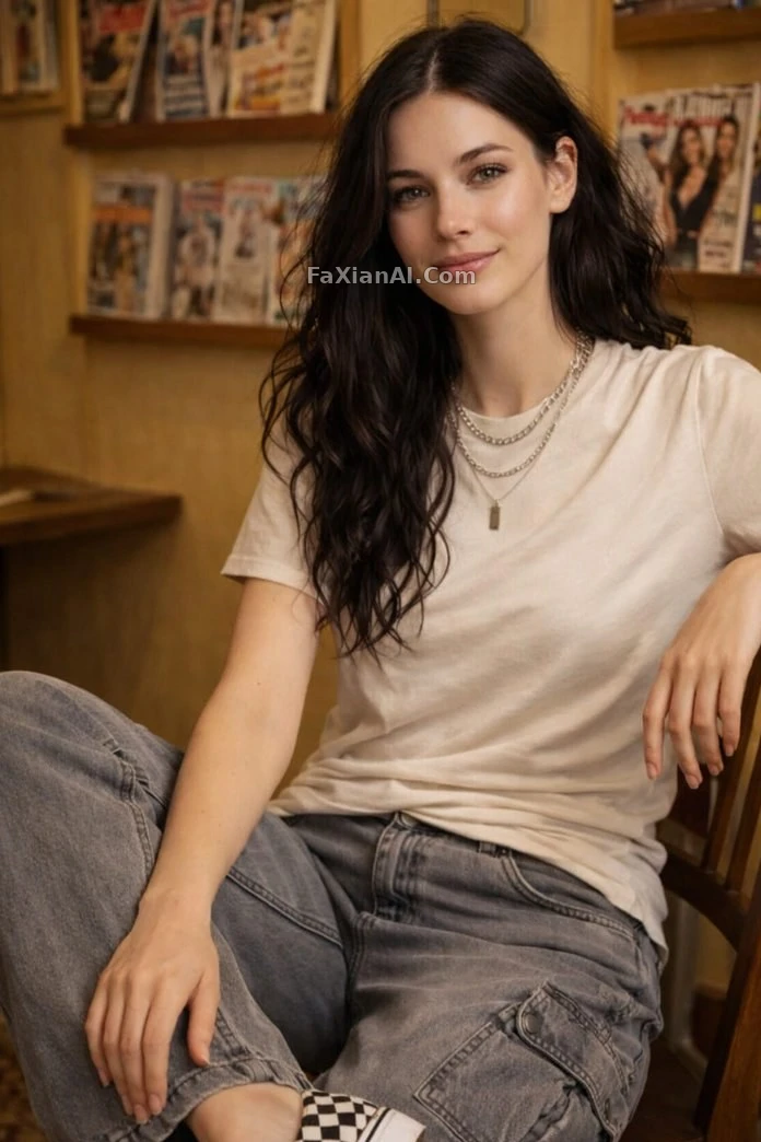
Three colors, one necklace, that's enough. See the full prompt.
- Vintage magazine room set, Y2K color palette limited to three tones, subject layered with one statement necklace, soft window light only, no additional accessories.
Can you still add things in editorial style ai photo?
Yes. But only one thing at a time.
One prop. One reserved line of typography space. One block of color.
Add a second thing and you break the point of the negative space. The idea in a studio shoot that "subtraction comes before addition" is the same principle — figure out what to take away first, and only then does it become a question of what to add.
- Editorial still life composition, single ceramic object placed off-center, generous negative space around it, one soft shadow, no additional props, muted background color.
- Portrait with reserved typography space in the upper third, subject occupying only the lower half, no actual text rendered, just clean negative space for future text placement.
Negative space isn't leaving things empty. It's leaving space that "can be filled in." Magazine layouts need room for a headline, and that empty space needs proportion — it's not just leaving any random patch blank.
Not every scene calls for this negative-space logic
Negative space looks good, but that doesn't mean it belongs everywhere.
Social media header images, posters with reserved text space, blog cover images — these scenes suit it. Little information is needed, visual impact comes first.
E-commerce detail images don't suit it. Buyers need to see the material clearly, see the size labels clearly, see the close-up details clearly — leaning on negative space here just hides information the buyer actually needs. For the approach product shots take instead, see the e-commerce product prompt writing guide — it's aiming for a completely different goal from editorial style.
Figure out first who the image is for and what it's meant to communicate, then decide whether to use negative space — that's a sequencing question, not an aesthetic one.
Three self-check criteria
No need for a grand summary. Just these three:
- Is there anything in the frame that could be removed? If it can be removed, remove it.
- Is there only one light source? If there's more than one, cut it down.
- If the color count is above three, cut it down to three or fewer first.
For more on the underlying structure of prompts, see the prompt structure formula. Negative space in prompts follows a similar principle to the restrained use of negative prompts — sometimes writing one line less works better than writing one line more. For layout- and composition-related material, check the design and portrait categories. The homepage also has the full category list.