
photo abstract editorial怎么写:留白比堆细节更难
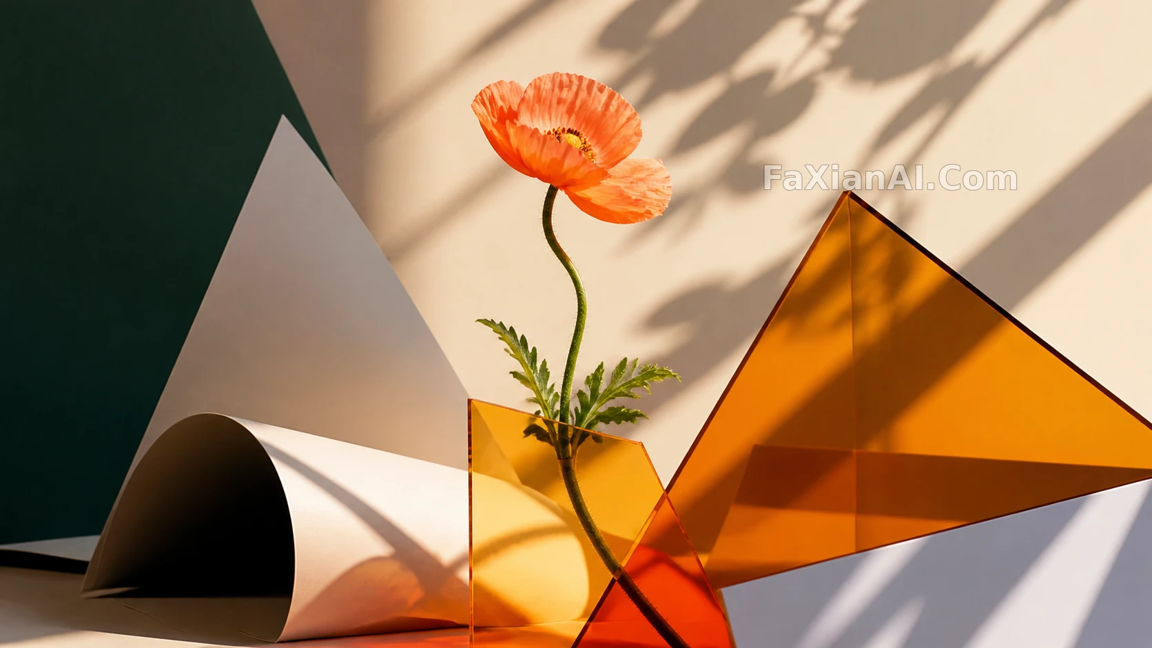
一张图,人占三分之一,剩下都是空。这不是没拍好。这是photo abstract editorial的基本构图。多数人写这类提示词,第一反应是加东西。加光效,加纹理,加道具。结果越加越乱,越乱越不像杂志封面。真正的editorial感,是敢于不加。
photo abstract editorial 不是抽象画
先说清楚一件事。abstract editorial photography prompt里的"abstract",不是指画面抽象成色块乱涂。是指构图逻辑抽象——去掉叙事,去掉场景交代,只留光、形、色三样东西。人物可以是写实的。背景不用是写实的。这才是这个词该有的意思。
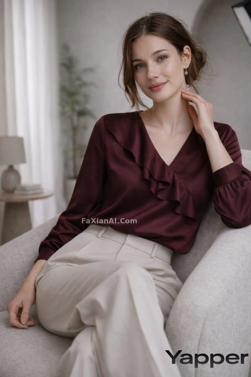
拱门加人,就够了。不需要再交代这是什么房间,查看完整提示词。
- Studio archway composition, subject centered between two soft arches, symmetrical framing, one accent color prop only, muted neutral background, no clutter.
- Full-length studio portrait, single soft-box light from camera left, negative space filling two-thirds of the frame, neutral beige backdrop, no props, editorial magazine composition, muted color palette.
editorial style ai photo 只留一个光源
光加多了,画面就软了。硬光、单点、一个方向。阴影该多深就多深。不补光。这是editorial style ai photo跟普通生活写真最大的区别——普通写真怕阴影,编辑风格靠阴影撑气场。
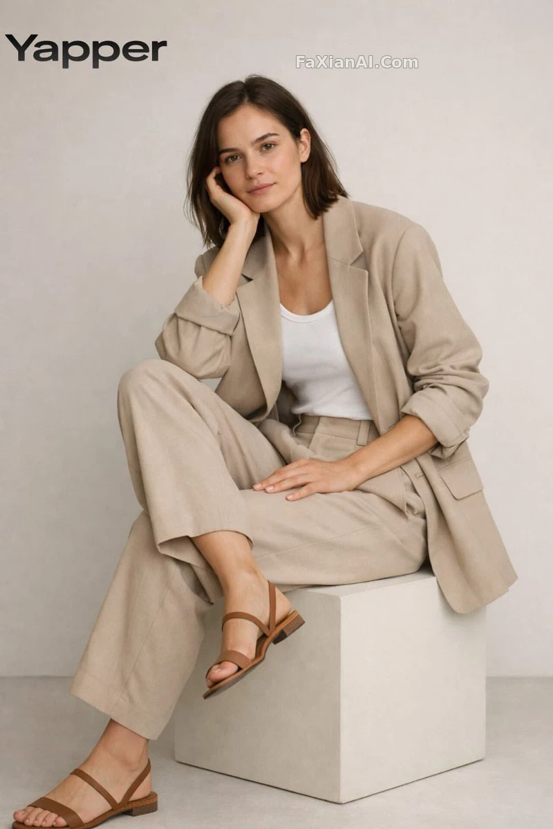
一把椅子的姿态,比十件道具管用,查看完整提示词。
- Minimalist seated pose, one arm resting on knee, hard side light creating a single defined shadow, grey seamless backdrop, no smile, direct gaze, editorial tone.
- High-contrast black and white editorial portrait, single hard light source, deep shadow occupying one-third of the face, no fill light, no retouching softness.
- Abstract editorial composition, subject positioned in the lower third of frame, upper two-thirds pure negative space in a single flat color, no gradient, sharp horizon line.
- Minimal full-body stance against a pale wall, shadow cast at a 45-degree angle, no props, no background texture, single focal point on posture.
网格和分屏,是editorial的另一种留白
留白不只是空间上的空。网格排版也是一种克制——每格重复同一套灯光,只变一个变量。变多了,就散了。
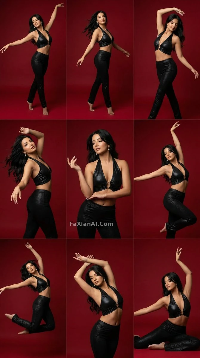
九格,一套灯,一个背景色。变的只有姿势,查看完整提示词。
- Nine-panel grid portrait series, identical studio lighting across all panels, subject in slightly different poses per frame, crimson background, consistent framing, no panel gaps.
- Editorial fashion grid, four frames per row, same subject same lighting rig, only wardrobe color changes per frame, no text overlay, high resolution.
- Split-screen editorial layout, left half solid color block with bold typography space reserved, right half full-length portrait, consistent lighting temperature across both halves.
时代感也是一种留白工具。限定色调,比加复古滤镜更准。
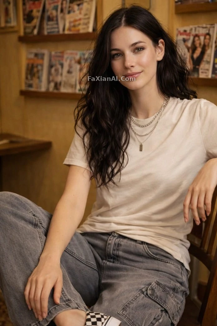
三种颜色,一条项链,够了,查看完整提示词。
- Vintage magazine room set, Y2K color palette limited to three tones, subject layered with one statement necklace, soft window light only, no additional accessories.
editorial style ai photo 还能不能加东西
能。但只能加一样。
一个道具。一句排版空间。一个色块。
多加一样,就破坏了留白的意义。摄影棚里"减法先于加法",是同一个道理——先想清楚拿掉什么,才轮到加什么。
- Editorial still life composition, single ceramic object placed off-center, generous negative space around it, one soft shadow, no additional props, muted background color.
- Portrait with reserved typography space in the upper third, subject occupying only the lower half, no actual text rendered, just clean negative space for future text placement.
留白不是留空。是留出"能被填进去"的空。杂志排版要放标题,这块空得有分寸,不是随便留一片。
不是所有场景都该用这套留白逻辑
留白好看,不代表哪里都能用。
社交媒体的头图,海报的预留文字位,公众号封面,这些场景适合。信息要素少,视觉冲击优先。
电商详情图不适合。买家要看清材质、看清尺寸标注、看清细节图,一味留白等于藏起了该给的信息。产品图那套思路,可以参考电商产品图的提示词写法,跟编辑风格是两套完全不同的目标。
先想清楚这张图给谁看、要传达什么信息,再决定留不留白,这是顺序问题,不是审美问题。
三条自查标准
不需要总结陈词。只留三条。
- 画面里有没有一样东西是能删掉的。能删就删。
- 光源是不是只有一个。多了就减。
- 色调数量超过三种,先砍到三种以下。
想再补一下提示词的底层结构,看提示词结构公式。留白这件事,写多了反而露怯,跟负向提示词的克制用法是一个道理——少写一句,有时候比多写一句管用。想找排版和构图相关的素材,去设计素材和人像写真两个分类。首页也有全部分类。