Home › Design Assets › A City Poster Split Between Real Photo and Paper Sculpture
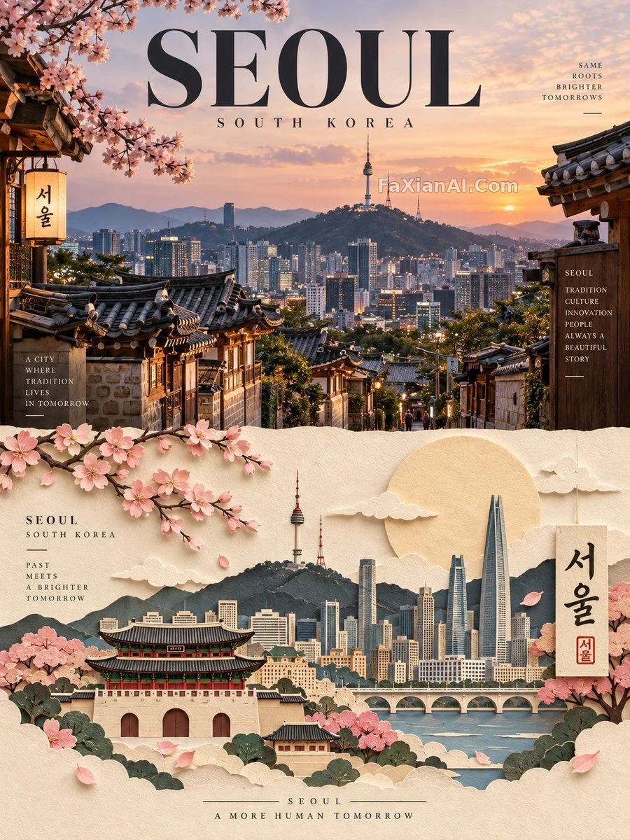
A City Poster Split Between Real Photo and Paper Sculpture
Realistic landmark on top, handcrafted paper art below — the whole poster generates from nothing but a place name.
✍️ With a top-bottom 50/50 split like this, a misaligned bleed or center line will show up immediately in print, and the halftone dots in the paper-art half are especially unforgiving. However convincing the paper texture looks on screen, the highlight and shadow values need to be re-calibrated for print — don't just carry over the screen's color values.
📋 Prompt Natural Language1770 characters
Design a premium editorial travel poster for [CITY / LOCATION], built entirely from the place name and a short description — no reference photos required.
Format: strict 3:4 vertical canvas, split into two horizontal halves of exactly 50% each.
UPPER HALF — photorealistic destination: render an ultra-realistic, refined take on [CITY / LOCATION], centered on its most iconic landmark, architecture, skyline, street life, landscape, or cultural signature. Ground it with authentic local detail, believable materials, natural light, convincing shadow, atmospheric depth, and a magazine-grade composition. Grade the color subtly, in the register of high-end travel publications and contemporary editorial photography.
LOWER HALF — handcrafted paper art: reinterpret the same [CITY / LOCATION] as an elegant layered paper-cut / paper-sculpture scene. Translate its landmark, skyline, architecture, landscape, and cultural motifs into carefully cut, folded, layered, overlapping paper forms. Stack a clear foreground, midground, and background, with tactile paper texture, dimensional shadow, clean cut edges, masking, and generous negative space — keep the landmark instantly recognizable while simplifying detail into confident graphic shapes.
Color & material: hold to a restrained palette drawn from [CITY / LOCATION]'s own visual identity — warm ivory paper stock paired with harmonious destination colors, darker structural tones, subtle highlights, minimal accents.
The finished piece should read as a luxury travel-magazine cover crossed with a contemporary paper-art exhibition — sophisticated, minimal, tactile, architectural, culturally authentic, visually striking. Everything is generated directly from [CITY / LOCATION] with no external reference imagery.