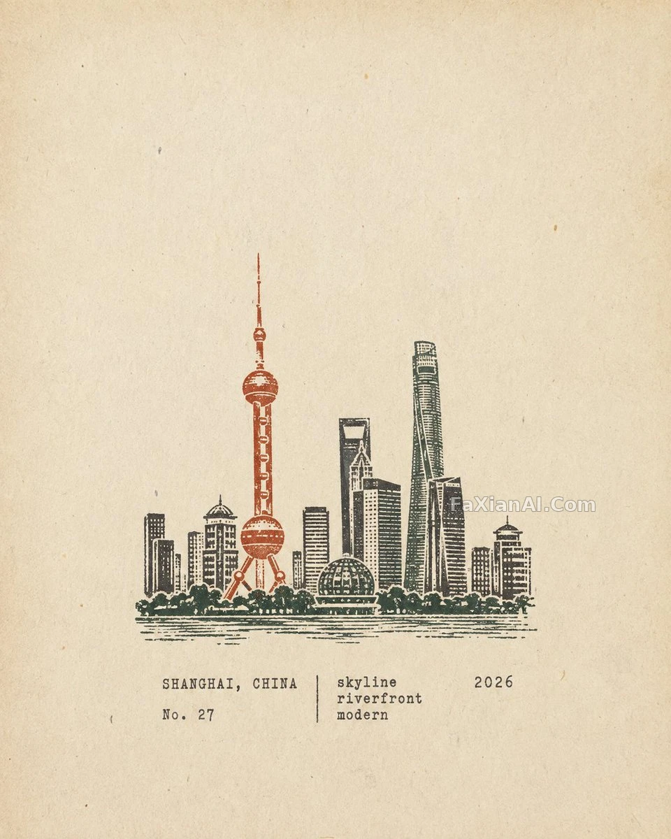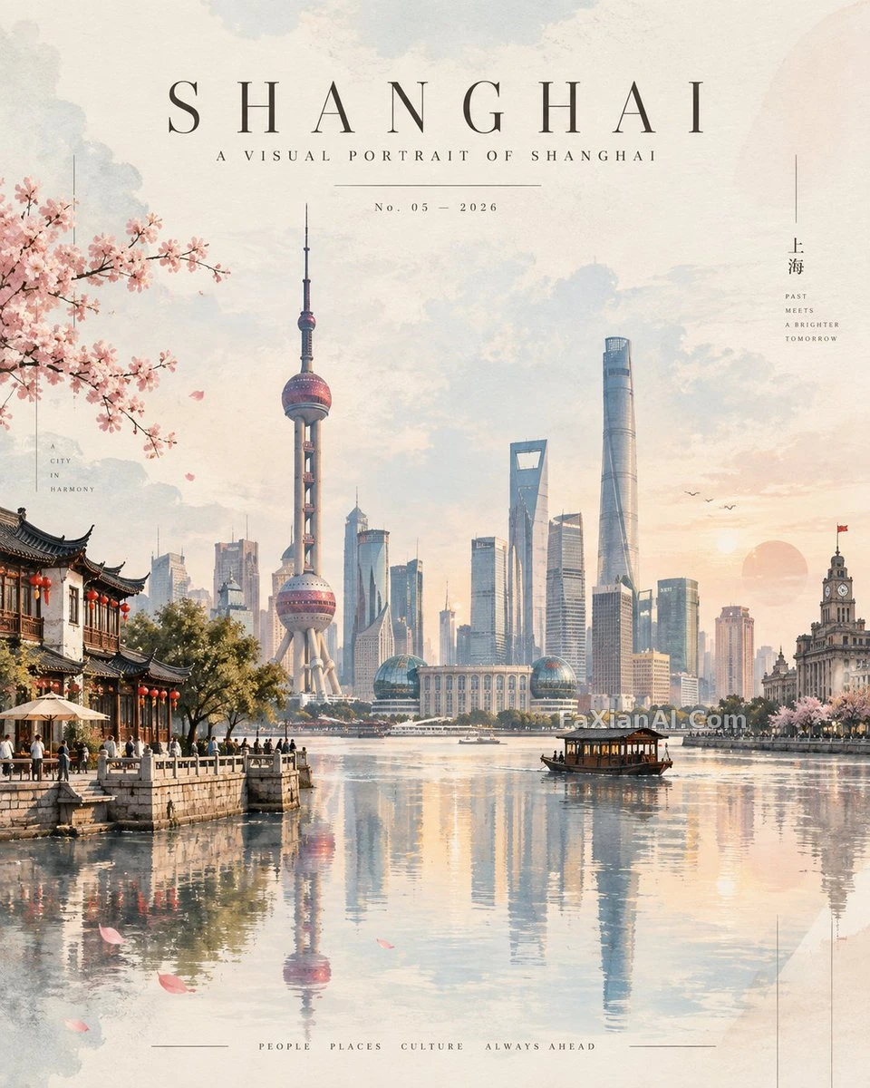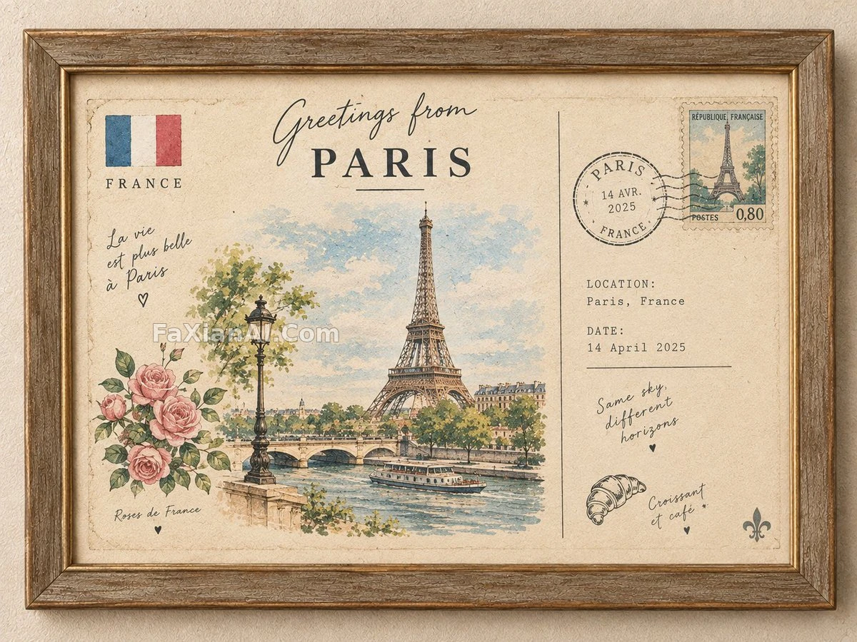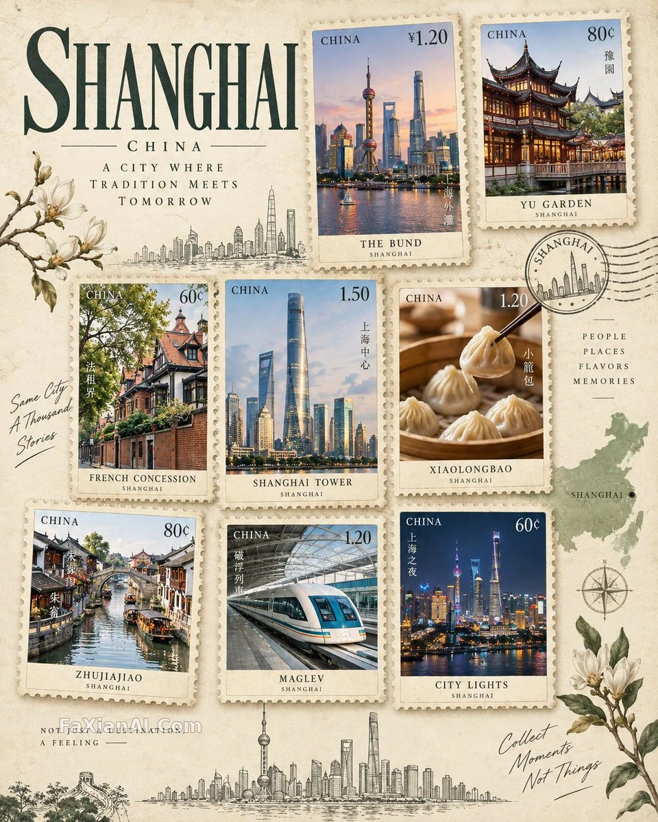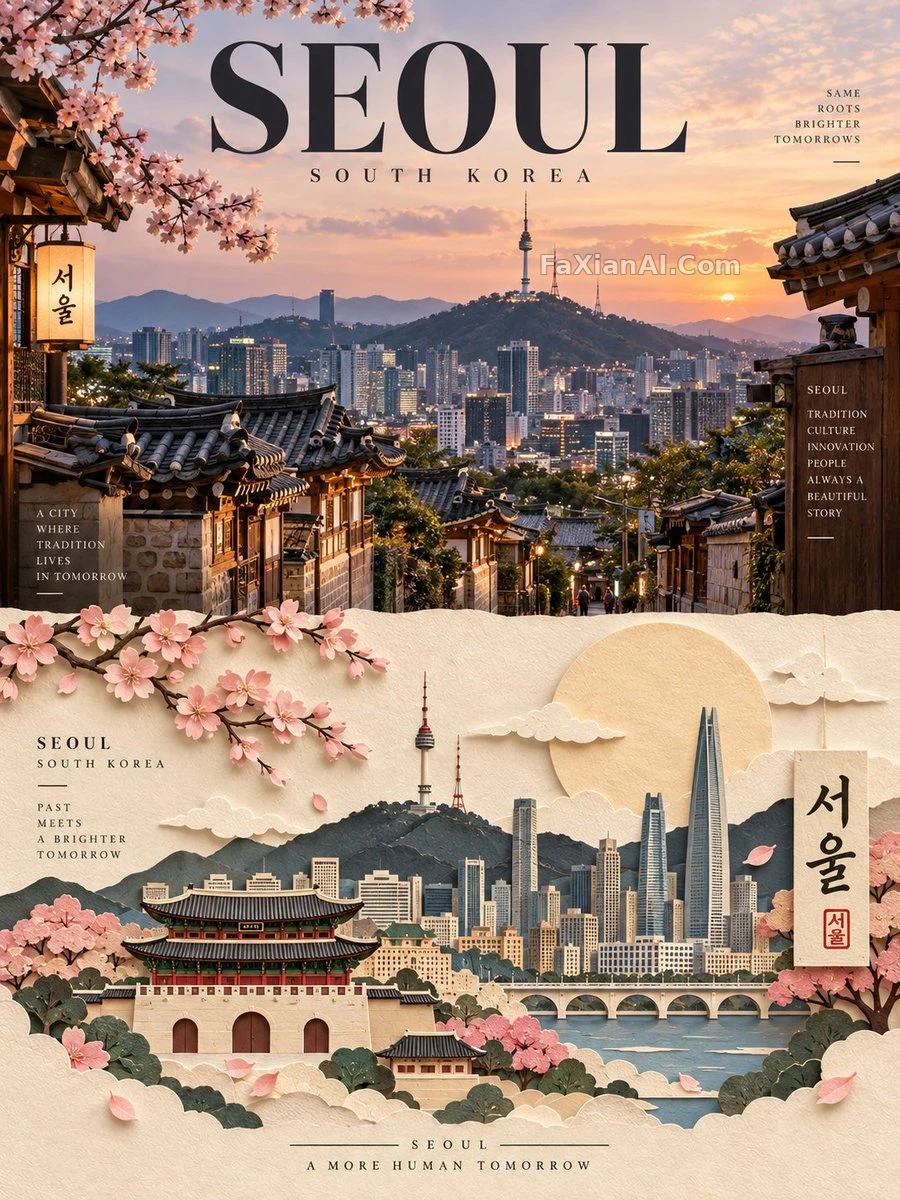
半張實景半張紙雕的城市海報
上半寫實地標,下半手工紙藝,只靠地名就能生成整版
✍️ 這種上下對半分割的版式,出血位和中線對不齊印出來就穿幫,網點在紙藝那半尤其挑剔。螢幕上紙感再逼真,落到印刷品上高光和陰影層次都得重新壓一遍,別照搬螢幕色值。
📋 提示詞 自然語言1770 字元
Design a premium editorial travel poster for [CITY / LOCATION], built entirely from the place name and a short description — no reference photos required.
Format: strict 3:4 vertical canvas, split into two horizontal halves of exactly 50% each.
UPPER HALF — photorealistic destination: render an ultra-realistic, refined take on [CITY / LOCATION], centered on its most iconic landmark, architecture, skyline, street life, landscape, or cultural signature. Ground it with authentic local detail, believable materials, natural light, convincing shadow, atmospheric depth, and a magazine-grade composition. Grade the color subtly, in the register of high-end travel publications and contemporary editorial photography.
LOWER HALF — handcrafted paper art: reinterpret the same [CITY / LOCATION] as an elegant layered paper-cut / paper-sculpture scene. Translate its landmark, skyline, architecture, landscape, and cultural motifs into carefully cut, folded, layered, overlapping paper forms. Stack a clear foreground, midground, and background, with tactile paper texture, dimensional shadow, clean cut edges, masking, and generous negative space — keep the landmark instantly recognizable while simplifying detail into confident graphic shapes.
Color & material: hold to a restrained palette drawn from [CITY / LOCATION]'s own visual identity — warm ivory paper stock paired with harmonious destination colors, darker structural tones, subtle highlights, minimal accents.
The finished piece should read as a luxury travel-magazine cover crossed with a contemporary paper-art exhibition — sophisticated, minimal, tactile, architectural, culturally authentic, visually striking. Everything is generated directly from [CITY / LOCATION] with no external reference imagery.
📋 中文譯寫版 自然語言
為[CITY / LOCATION](城市/地點)做一張高階編輯感旅行海報,只憑地名和一小段描述就生成全部畫面,不需要任何參考圖。版式:嚴格的3:4豎版畫布,水平對半分成兩塊,各佔50%。上半部分——寫實目的地:以超寫實且考究的手法呈現[CITY / LOCATION],聚焦其最具代表性的地標、建築、天際線、街頭氛圍、地貌或人文特徵,配上真實的在地細節、可信的材質、自然光線、有說服力的陰影、大氣縱深,以及雜誌級的構圖,色調按高階旅行刊物與當代編輯攝影的路數做細膩分級。下半部分——手工紙藝:把同一個[CITY / LOCATION]重新演繹成一幅優雅的分層剪紙/紙雕場景,把它的地標、天際線、建築、地貌與人文元素轉譯成精心裁剪、摺疊、層疊、彼此交錯的紙形。搭出清晰的前景、中景、背景層次,保留紙張的觸感質地、立體投影、乾淨切邊、遮罩處理與充裕留白——地標要一眼認出,細節則簡化成利落的圖形語言。色彩與材質:調色剋制,取自[CITY / LOCATION]本身的視覺氣質——暖象牙白紙材搭配與目的地相呼應的協調色、更深的結構色、細膩高光與極簡點綴。成片要看起來像高階旅行雜誌封面撞上當代紙藝展——考究、極簡、有觸感、有建築感、在地真實、視覺衝擊力強。一切都直接從[CITY / LOCATION]生成,不依賴任何外部參考素材。