四宮格廣告拼圖,黃金週流量該這麼搶
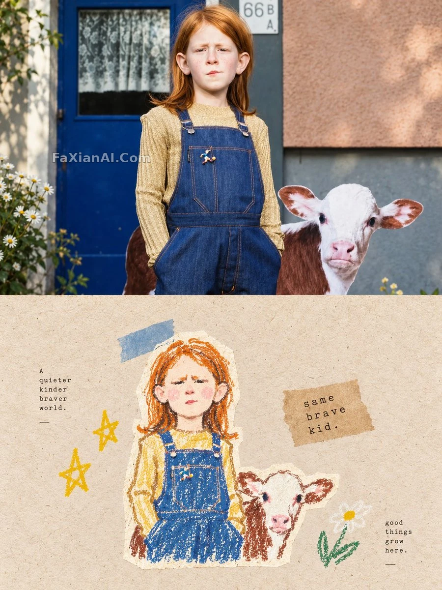
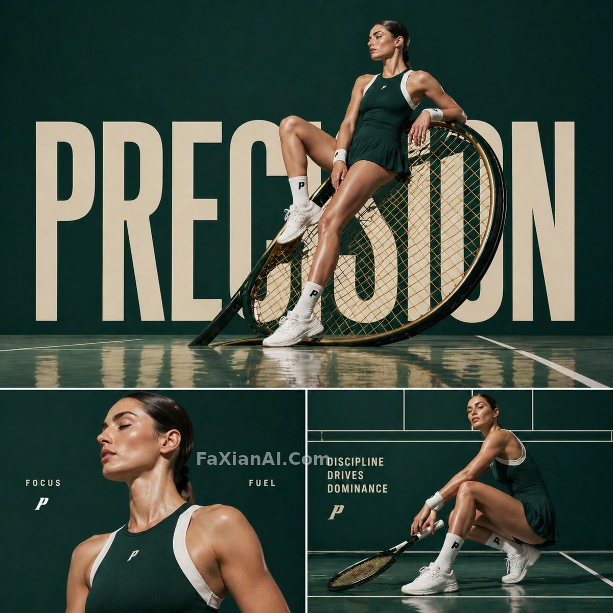
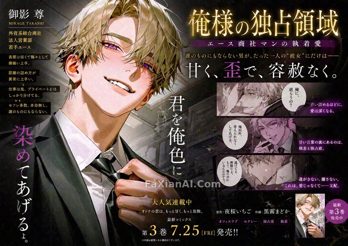
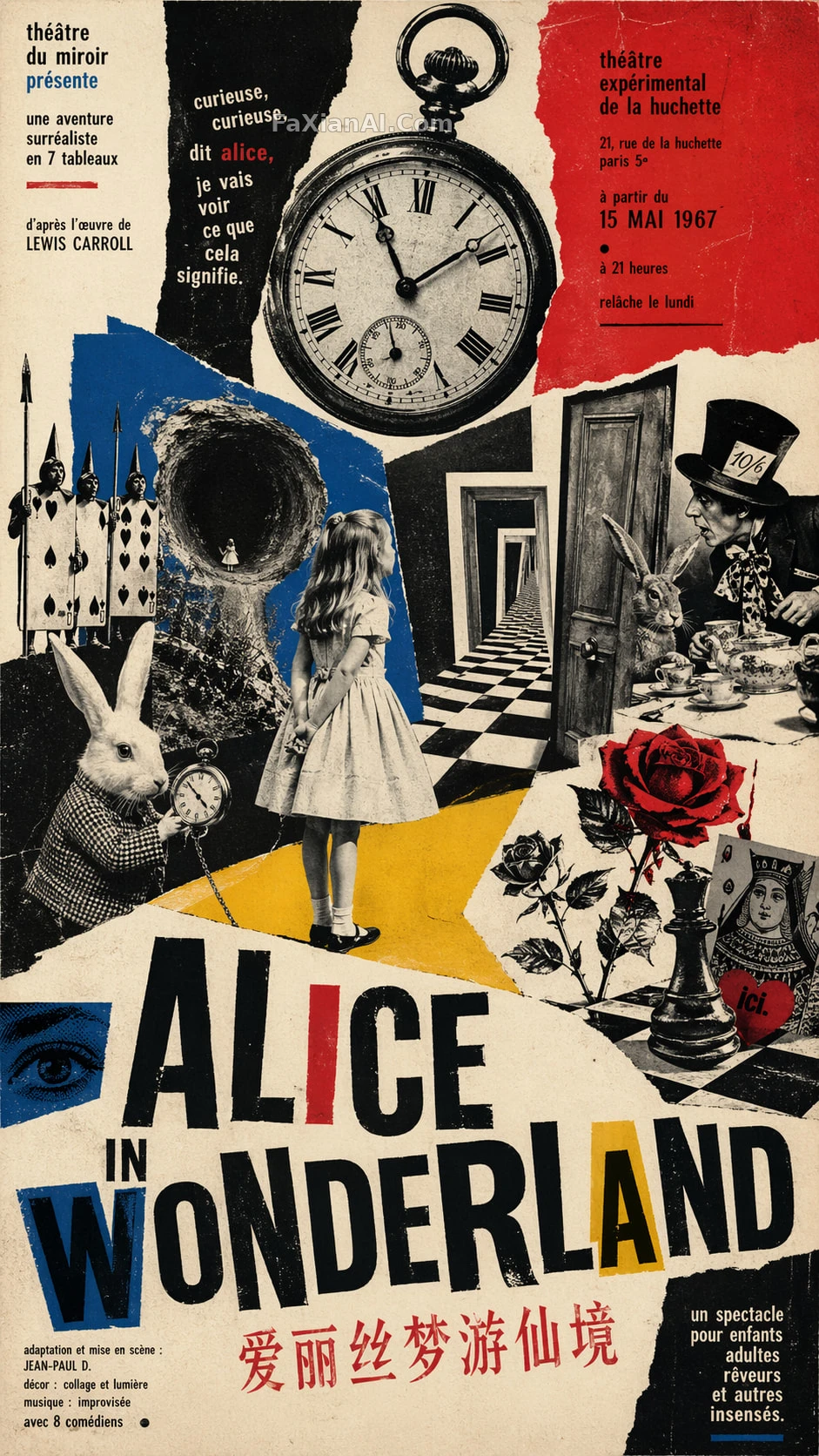
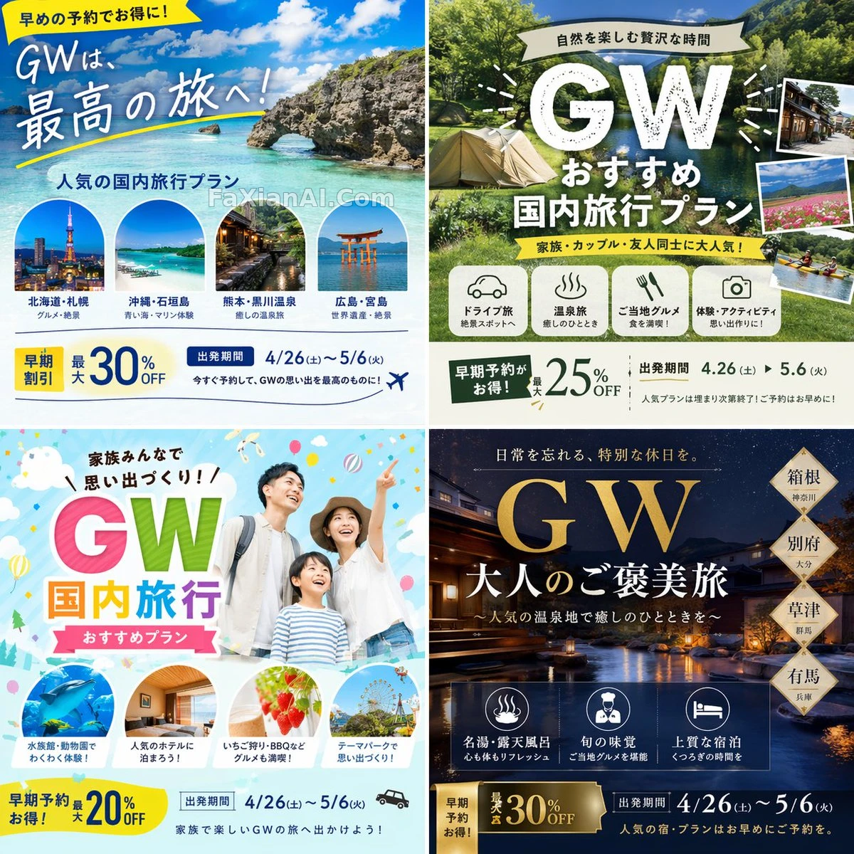
4款完全不同風格的黃金週旅行廣告一次拼進2x2網格里,專門拿來做點選率對比測試。
✍️ 關鍵是「完全不同的圖案」這四個字——四格不是配色微調,是四套獨立創意邏輯,A/B測試要的就是差異夠大才出結果。點選率這事兒,風格撞了等於白測。
📋 提示詞 自然語言
Ad creative batch for [campaign name: travel plan for Golden Week], laid out as a 2x2 grid so four completely different design directions sit side by side. Ground every variant in web research on the highest-performing domestic Japan travel campaigns from the past decade, then push each pattern toward maximum scroll-stopping appeal -- vary the color story, the headline placement, and the hero visual across the four cells. Lock aspect ratio = [aspect ratio: 1:1] so the set is ready to run as an A/B test.
📋 中文譯寫版 自然語言
黃金週旅行廣告創意,做成2x2四宮格,四種設計路線並排放在一起對比。基於過去十年日本國內旅遊高轉化案例的調研,把每一格都往"忍不住點進去"方向推——顏色基調、標題位置、主視覺各不相同。比例鎖定1:1,方便直接拿去做A/B測試。