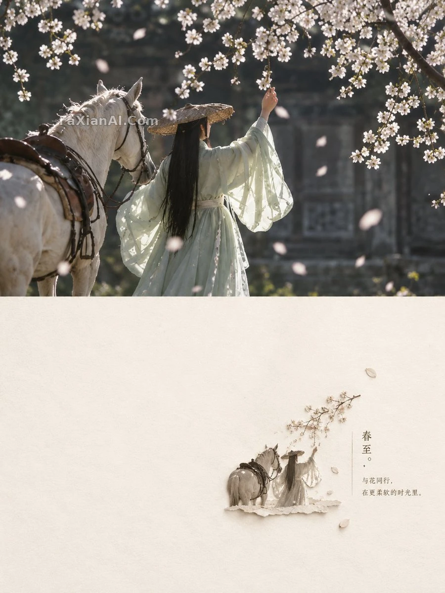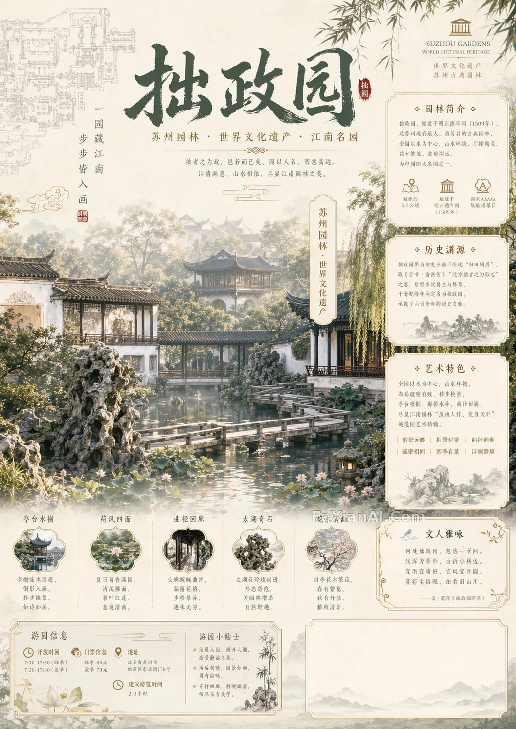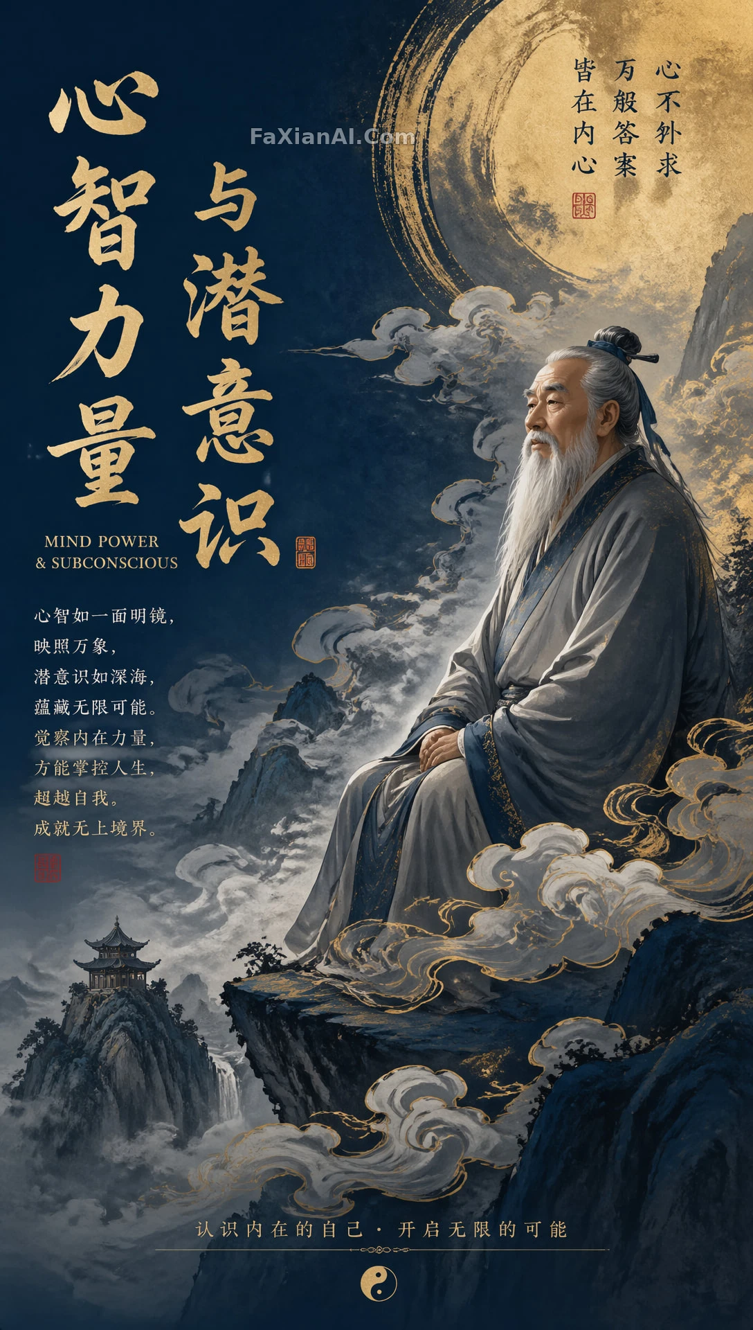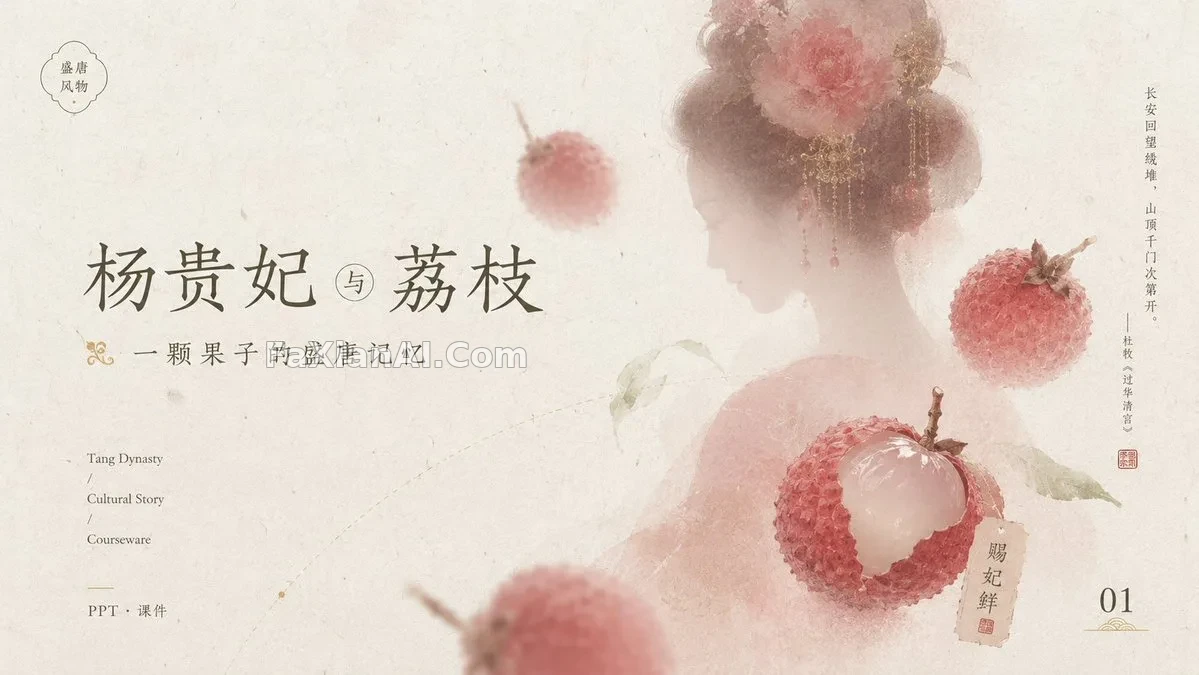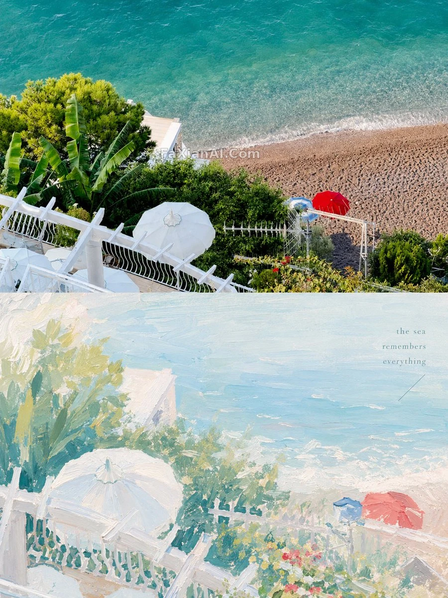
上半寫實,下半重新作畫
原圖與治癒系水粉重構對半分層,留白與低飽和收著來
✍️ 結構分兩段最見功力:上半原樣保留,下半才是真正的作文——把主題重新用厚塗顏料講一遍。霧藍和米白打底,粉桃只能點綴,多了就散了。
📋 提示词 自然语言617 字符
Turn each uploaded photo into its own 3:4 vertical design poster. Keep the top half as the original image with a light, high-end color grade; rebuild the bottom half as a painterly reinterpretation drawn from the subject's own story. Aim the palette at a soft, bright healing-pastel feel — thick gouache or acrylic texture — with muted, transparent tones like misty blue and ivory white, lifted by touches of [accent colors: blush pink or soft peach]. Let the composition lean on visual weight and negative space, and keep any text spare and meaningful, reading more like an independent art zine than commercial copy.
📋 中文译写版 自然语言
把每張上傳的照片都做成獨立的3:4豎版設計海報。上半部分保留原圖,做輕微高階調色;下半部分重建為一幅取材於主體自身故事的繪畫式再創作。色調偏向柔和明亮的治癒系粉彩風——厚塗水粉或丙烯質感,用霧藍和象牙白這類低飽和透明色打底,點綴[accent colors: blush pink or soft peach]。構圖依靠視覺重心和留白來撐住,文字保持精簡有意味,更像一本獨立藝術刊物而非商業文案。