Home › Design Assets › Photoreal on Top, Repainted Below
Photoreal on Top, Repainted Below
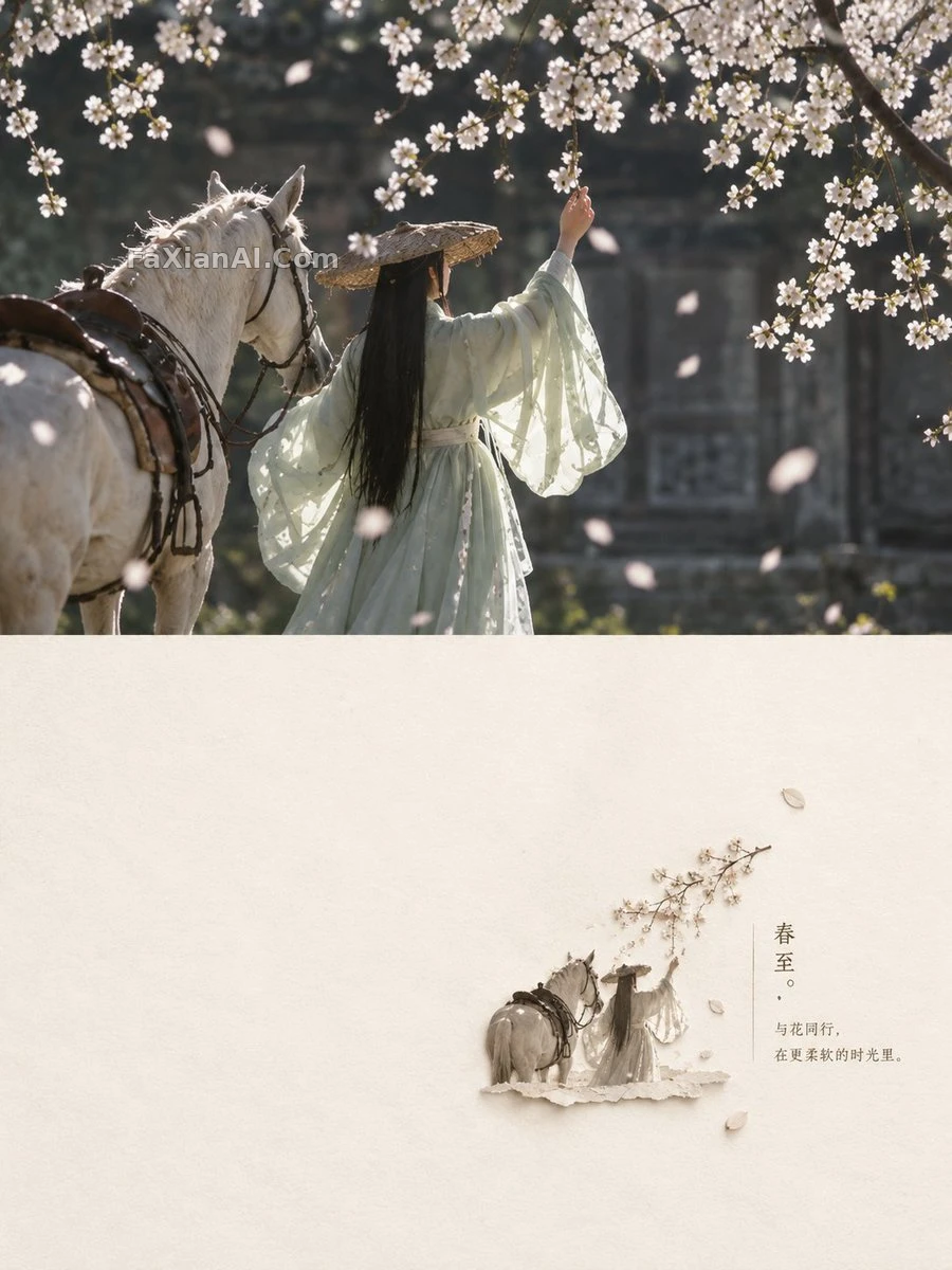
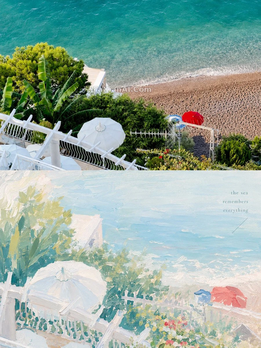
The original photo split evenly against a soothing gouache reinterpretation, held together by negative space and muted tones.
✍️ The real craft is in the two-part split: the top half stays untouched, and the bottom half is where the actual composing happens — retelling the subject through thick paint. Misty blue and ivory carry the base tone, with blush peach only ever used as an accent; overdo it and the whole thing falls apart.
📋 Prompt Natural Language617 characters
Turn each uploaded photo into its own 3:4 vertical design poster. Keep the top half as the original image with a light, high-end color grade; rebuild the bottom half as a painterly reinterpretation drawn from the subject's own story. Aim the palette at a soft, bright healing-pastel feel — thick gouache or acrylic texture — with muted, transparent tones like misty blue and ivory white, lifted by touches of [accent colors: blush pink or soft peach]. Let the composition lean on visual weight and negative space, and keep any text spare and meaningful, reading more like an independent art zine than commercial copy.