
ChatGPT Image Generation Commands From Beginner to Advanced: 18 ChatGPT Image Generator Commands
Before getting into it, some background: I'm not a professional at this — I started digging into how to write chatgpt image generator command more efficiently because manually editing chart illustrations for a rushed paper was taking too long. The chatgpt image commands in this post are all "tried and confirmed to work" experience, not deep theory — beginner-oriented.
Beginner tier: say the whole thing
The most common beginner mistake is writing an instruction that's too short — something like just "a landscape photo" — and then complaining the result isn't good. The problem is the sentence itself doesn't carry enough information, so the model has to guess blindly. The entries below demonstrate the "passing grade" for how much information to include.
1. "Generate a landscape photo of a sunlit dirt road leading through a pasture, golden afternoon light, wide aspect ratio." — Just the words "landscape photo" and the model can give you basically anything. Add time of day, lighting, and composition, and the stability of the output changes completely.
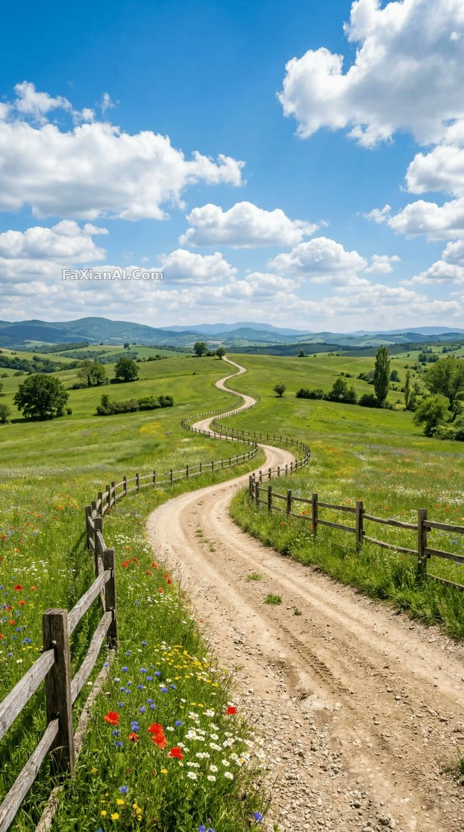
Dirt road + pasture + afternoon light — drop any one of the three elements and the result drifts. See the full prompt
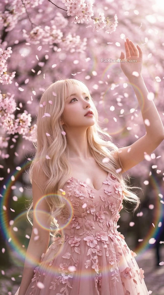
2. "Create an image of cherry blossom petals falling in gentle rain, soft dreamlike lighting, muted pastel colors." (I used this one as a phone wallpaper once, and a friend asked which app I shot it with — awkward.)
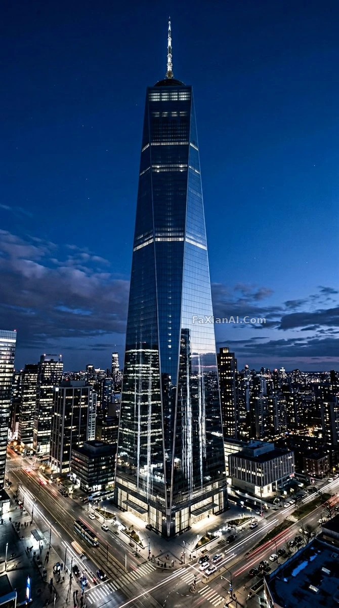
3. "Generate a futuristic city skyline at blue hour, neon reflections on wet streets, cinematic wide shot." The phrase "blue hour" is more precise than "evening" — the model knows exactly which ten-or-so minutes of light after sunset, before it's fully dark, you mean.
4. "Generate a simple flat vector illustration of a coffee cup, minimal color palette, no background." For beginners, it's worth practicing on a single object like this first — fewer style and composition variables, so it's easier to see what effect each change to the instruction has.
5. "Create a portrait photo with soft window light, subject looking slightly off-camera, neutral background."
6. "Generate an image in the style of a watercolor painting, subject: a quiet library reading corner."
Advanced tier: controlling detail and consistency
Once the beginner tier gets you generating images, the next step is solving the "looks different every time" problem — this is also where I personally hit the most snags. Images used in a paper looking inconsistent from one to the next got me a direct question from my professor about whether I'd swapped subjects.
7. "Generate a character turnaround sheet: front view, side view, and back view of the same character, consistent proportions and outfit across all three views." For advanced needs like a turnaround sheet, the word "consistent" has to be there — leave it out and the model is very likely to give you three somewhat different faces. See the character turnaround sheet example for reference.
8. "Generate the same subject in four different poses, keep facial features, hairstyle, and outfit identical across all four."
9. "Create an image with a specific color palette: navy blue, cream, and burnt orange only, no other colors." Restricting the palette is especially useful for making a series of posters — otherwise you have to re-match the color scheme for every single image.
10. "Generate a wide shot first, then generate a close-up of the same scene keeping composition logic consistent."
11. "Regenerate this image but only change the lighting from daytime to sunset, keep composition and subject identical." — This is far more precise than "generate a similar image" — the word "similar" leaves the model way too much room for interpretation.
12. "Generate an isometric-style illustration of a small workspace, muted colors, no text or labels in the image."
13. "Create a comparison set: same subject rendered in three styles — photorealistic, watercolor, and flat vector — side by side." This one for testing styles is particularly handy — see all three results at once instead of testing them individually one by one.
14. "Generate a portrait with negative space on the left third of the frame, reserved for text overlay." Remember to reserve negative space for poster design images, or there's nowhere to put the text later.
15. "Generate the image at a 3:4 aspect ratio suitable for printing, high resolution, no watermark elements."
16. "Recreate this reference photo as a fully original illustration, keep the pose and composition but change the medium to hand-drawn ink style."
17. "Generate four variations of the same prompt with different random seeds conceptually, vary only lighting mood between them."
18. "Generate an image, then apply a second pass to only refine the hands and fingers, keep everything else unchanged." For the perennial hands problem, running a separate refinement pass is more reliable than hoping a single generation gets it right.
What separates beginner from advanced
Looking back at these 18 entries, the difference between the beginner and advanced tiers isn't vocabulary — it's an awareness of controlling variables. Every advanced entry is emphasizing "change only this, keep everything else the same." This is the same idea covered in this site's universal prompt structure formula — worth reading alongside this one, since eight times out of ten, an ineffective instruction comes down to exactly this issue.
Since hands come up so much, it's worth separately reading fixing AI hand problems, which is dedicated to avoiding extra fingers and misalignment. If a generated character needs to keep the same look across multiple images, character consistency is also worth a read — it's an extension of the same topic covered in entries 7 and 8 here.
Just remembered while writing this that the chart assignment still isn't turned in (telling myself I'll get to it right after finishing this post). To try these instructions directly, the homepage has a generation entry point, and the character design and wallpaper illustration categories have more complete examples to browse.