
Home › Design Assets › Arch as a Window, a Landmark Silhouette Beyond
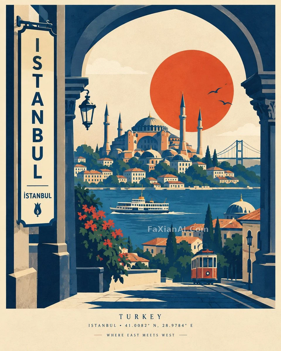
Arch as a Window, a Landmark Silhouette Beyond
Lock the palette to just 2 to 5 colors — nail that and it reads better than ten colors ever would.
✍️ Whether this looks good has nothing to do with picking the right landmark — it's that fixed count of 2 to 5 colors, plus the aged texture unique to screen printing. Fewer colors actually carry more flavor; pile on too many and it turns cloying.
📋 Prompt Natural Language1507 characters
Build a premium modern travel poster for [CITY, COUNTRY], drawing on bold vintage screen-print and mid-century graphic design but structured through an original architectural-portal composition. In the foreground, set a large, distinctive [LOCAL ARCHITECTURAL ELEMENT / GATE / ARCH] acting as a window into the destination; through its opening, reveal a stylized layered scene holding [ICONIC LANDMARK], [FAMOUS NATURAL FEATURE], simplified rooftops, local streets, trees, transportation and a few subtle cultural details. Behind the main landmark, place one large, bold geometric sun, moon or circle, its shape and placement striking rather than traditional. Weave 2-3 recognizable local symbols naturally into the scene rather than isolating them as separate objects. Hold the palette to a limited, sophisticated set drawn from the destination: [2-5 COLORS]. Keep the forms flat and geometric, silhouettes strong, edges clean, layers subtly overlapping, with a light screen-print texture and elegant negative space. Add a tall integrated sign or architectural panel carrying: [CITY] / [LOCAL SCRIPT]. At the bottom, include small refined editorial type: [COUNTRY] — [CITY] • [COORDINATES] — [SHORT DESTINATION PHRASE]. The result should feel minimal, artistic, cohesive, collectible — not photorealistic, not a collage, free of excess detail, built on sophisticated composition, strong visual hierarchy, balanced asymmetry, a warm paper background and subtle print imperfections, in a 4:5 vertical format.
Related Cases
 Heroic Gouache Equals Geometry Plus Aged Texture
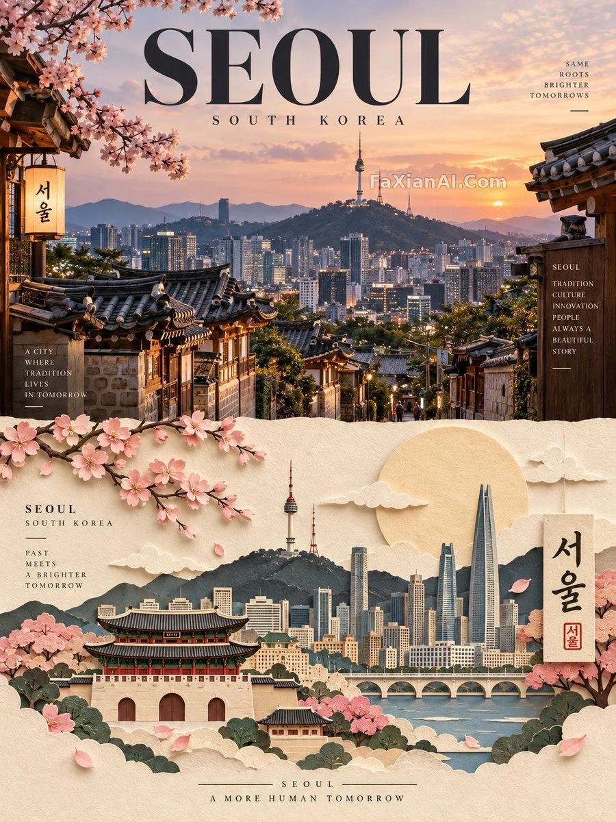 A City Poster Split Between Real Photo and Paper Sculpture
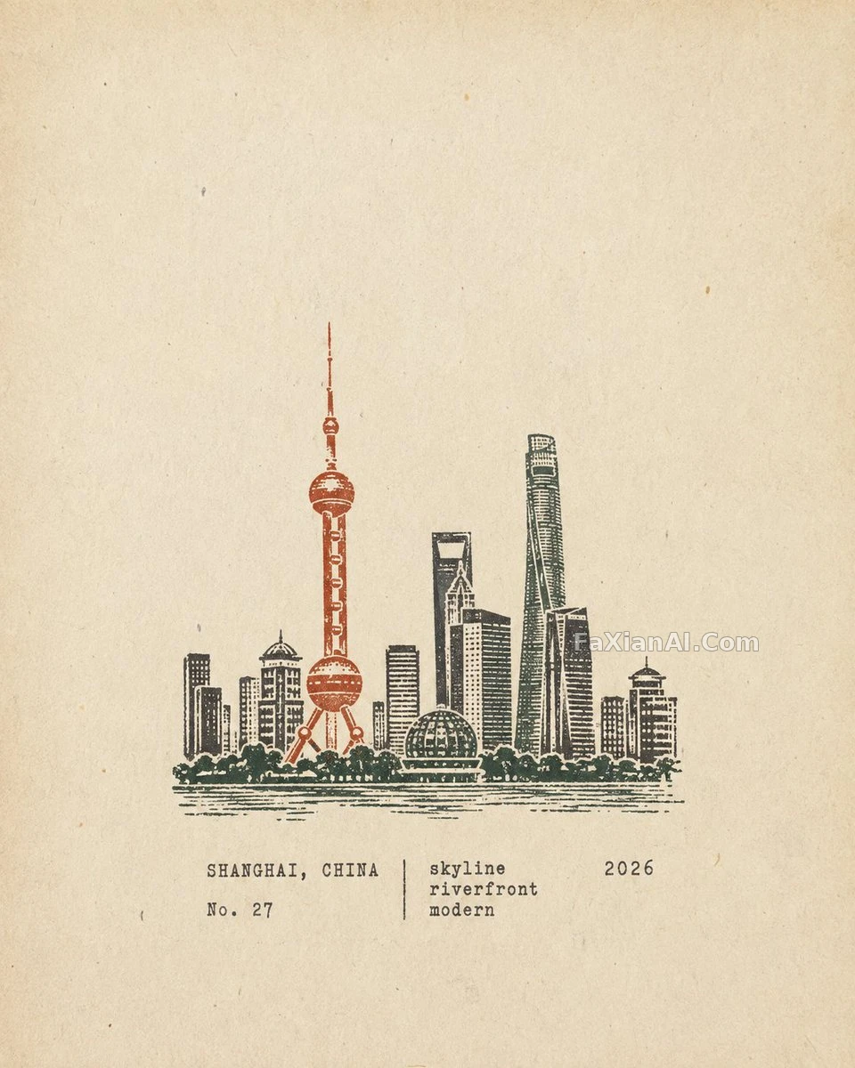 One Rubber Stamp, One City's Silhouette
 Memphis Geometry Against a Gray Night Sky
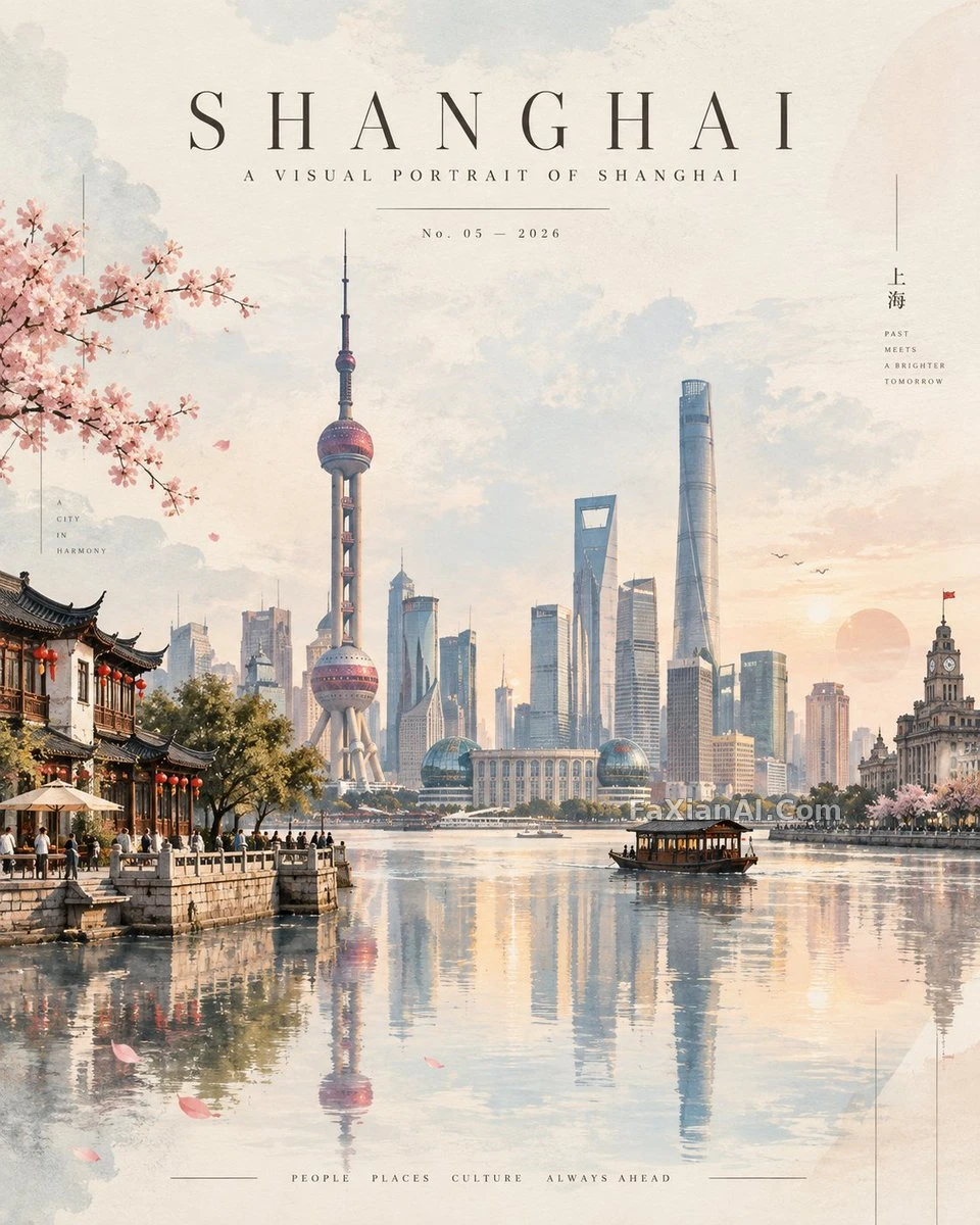 A Country Poster That Stacks Negative Space, Not Landmarks
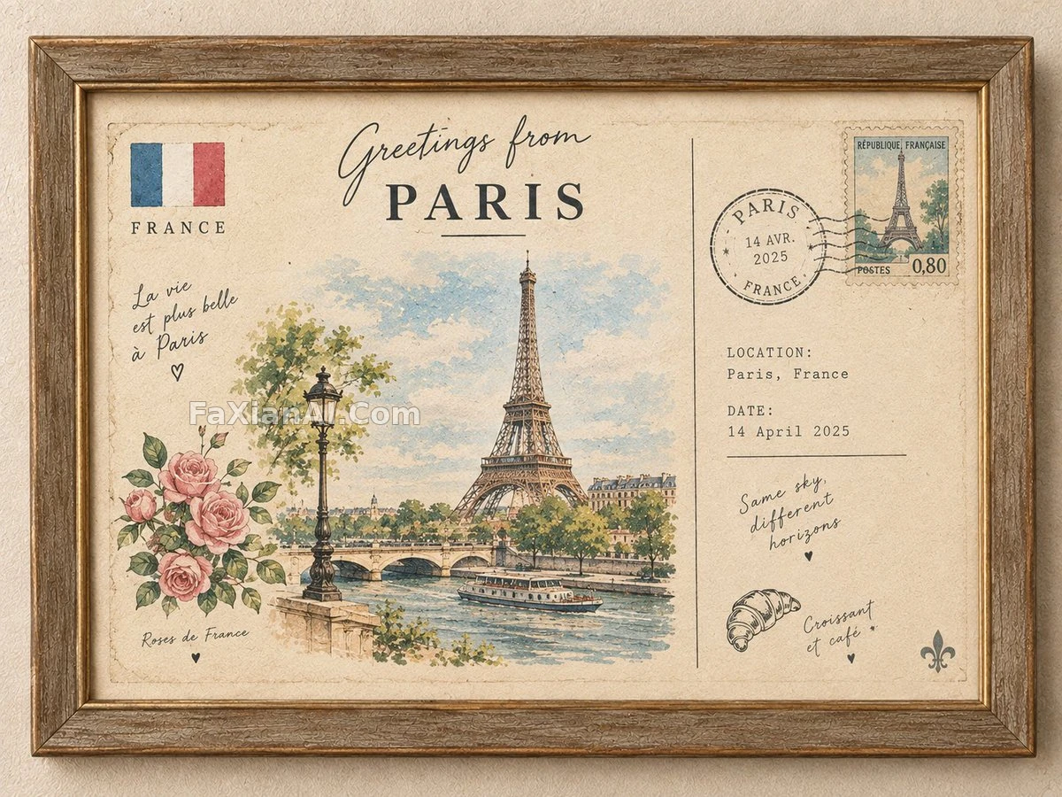 A Travel Postcard in a Vintage Frame, Mostly Empty Space by Design