
Food and Drink Ad Poster Prompts: Lay Out Product, Selling Points and Price as Three Text Layers So the Model Stops Cramming
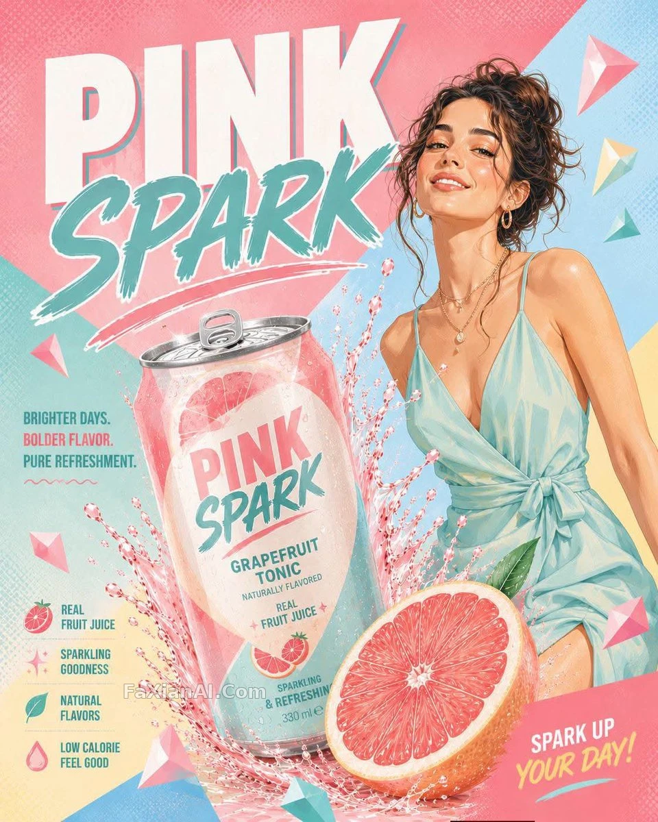
When people make drink or restaurant ads, most of the effort goes into the product first: the water droplets should be crisp, the steam should look real, the cut lemon should look fresh. The product comes out well, and then adding text wrecks it: the headline covers the bottle, the small selling points get crammed together, and the price number lands in the dead center of the frame.
The food and beverage ad cases the site has collected share one habit among the ones you can use as-is: split the image into a "product zone" and a "text zone" first, then assign the text line by line to positions according to its hierarchy.
1. The Product Zone: Write One Hero Only, and Light It Exclusively
The copper soda can case is only three sentences: an unlabelled copper can, a wet black stone, a lime slice and a few ice cubes; the light is a single narrow softbox, used to pull one bright edge along the curved can; the background is deep teal. All the information in the image is concentrated on "curved metal + condensation," with not one extra element.
It also has a detail worth copying: unlabelled. A can with no label leaves the brand spot open, so you can paste in your own design afterwards, and it sidesteps the problem of generated images inventing trademark text. If your prompt must include a brand name, use one that is obviously fictional, as in the ENFLAMMER beverage ad, which writes the fictional beverage brand outright. Never borrow a real brand: leaving the commercial risk aside, the knock-off logos the model draws don't look good anyway.
2. The Text Zone: Leave Space First, Then Assign the Text
The hot dish in natural light poster has a prompt written in Chinese, and its structure is clear: the dish is centered, window light comes from the left, minimal composition with empty space on the left reserved for the title, and only at the end does it say that the dish name goes in the upper left in an elegant bold large typeface, with a small subtitle beneath it.
The order matters: empty space first, text after. If you reverse it and write "large headline" first, the model looks for a place to put the text first and then squeezes the product into whatever room is left, often pushing the main dish off to the side. For how to write the empty space, see the negative space prompt article.
The FINAL HOURS sale poster writes the text hierarchy in even more detail, and you can read it as a layout spec:
- Top: a big, tightly tracked dark red sans-serif "FINAL HOURS" spanning the frame, partly tucked behind the figure
- Left small print: "UP TO / 60% OFF / SELECTED ITEMS"
- Right small print: "ENDS / 31.12 / 12 PM"
- One extra line: no website text anywhere at the bottom
Each of the three text layers gets a position, a size description and exact content, so the model has almost no room to improvise. That last line, "no website," is useful too, because ad-style prompts easily tempt the model into adding a fake URL on its own.
The same method works for ads with people in them. The VELORA FIZZ lemon soda poster splits its prompt into sections under capitalized headings: CAMERA, HERO PRODUCT, SUBJECT, CONCEPT, LAYOUT, and finally a separate COPY TO SET IN TYPE section that lists the six lines going on the layout exactly as written: the brand name, two taglines, a rhythmic OPEN / SIP / RESET / REPEAT, and a final line of call to action. At the end there is also an AVOID section that explicitly says copying any existing beverage brand.
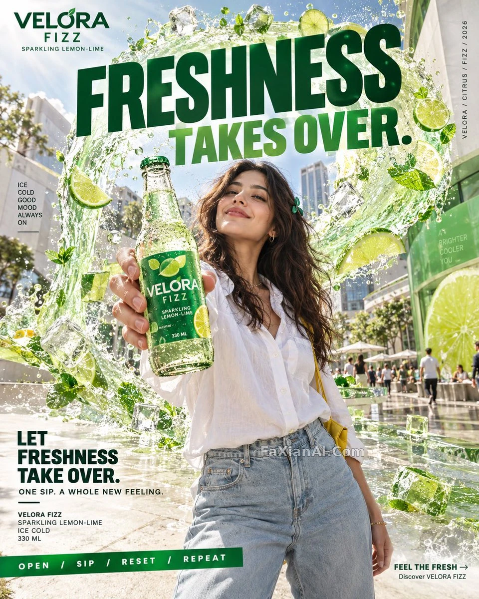
"Put the text that will be printed in its own section" is well worth learning. When copy and image description are mixed together, the model can't tell which words to draw and which to print; listed as a separate section, spelling accuracy goes up noticeably.
3. A Layout Template: Mark the Swappable Parts With Square Brackets
The pastel pop soda splash poster uses five bracket variables: [HUMAN], [BREW], [FLAVOR], [TITLE], [PALETTE]. The person, drink, flavor, title and color scheme can all be swapped while the layout stays exactly the same: a tilted, bursting can, a big spread of fruit in the foreground, diagonal geometric color blocks, a halftone dot texture.
This approach suits any case where you need a whole series: one brand launching four flavors, the layout locked down, only the brackets changing. Compared with rewriting each prompt from scratch, the series feel is much stronger. The travel poster template article covers the same idea, and you can read the two side by side for how to decide the variables and which parts must be locked.
4. Food Ads Without Text: The Light Is the Selling Point
Not every ad needs text. The plum and apricot galette in backlit steam has not a single word, and the weight of the whole prompt sits on one narrow, diffused light comes from behind and camera right, passing through the rising steam to pick out its curls and gaps, while the front of the pastry sinks into soft amber shadow. The small milk jug and the linen on the left of the frame are deliberately written as plain and unlettered, so the model doesn't print text onto the props.
This kind of image works as an atmosphere shot for an e-commerce detail page, with the title added later by the page layout, so the generation stage only has to capture the "just out of the oven" feeling. The food photography moment article goes into more detail on how steam and backlight relate.
5. Vintage Ads: Typeface and Paper Grain Matter More Than the People
The 1950s martini poster is written in Midjourney's parameter style, ending with --ar 3:4 --v 7 --stylize 450. Its headline and subtitle use two typefaces: Bold serif for "Martini Time," curved elegant script for "A Touch of Class," plus faded-paper texture with visible grain.
What vintage ads fear most is looking "new." Write the serif headline, the curved handwritten subtitle and the paper grain well enough, and whoever you swap in as the figure will look like they belong to that era. Write only "1950s style" and you often just get a yellow filter laid over the image.
6. A General-Purpose Food and Drink Ad Template
A vertical [4:5 / 3:4] commercial poster for the fictional [drink / dish] brand "[BRAND NAME]". Product zone: one [PRODUCT] placed [center / slightly right] on [SURFACE], with [condensation beads / rising steam / a fresh cut ingredient] clearly visible, lit by [a narrow side softbox / soft window light from the left]. Text zone: keep the [upper third / left side] clean for typography. Headline "[HEADLINE]" in [bold condensed sans-serif / elegant serif] at the top; a short tagline "[TAGLINE]" in small caps below it; a price tag "[PRICE]" in the [bottom right] corner. No website, no extra logos, no other text.
How to fill it in: decide which part of the frame is the product zone and which is the text zone, then give each of the three lines (headline, selling point, price) its own position. Always use a fictional brand name, and finish with a line saying no website and no other text as a backstop.
More product-photo cases are in the e-commerce category, and for how to write product lighting and materials, keep reading product light and material.