
Home › Design Assets › A 1950s Martini Poster, Mid-Century Glam
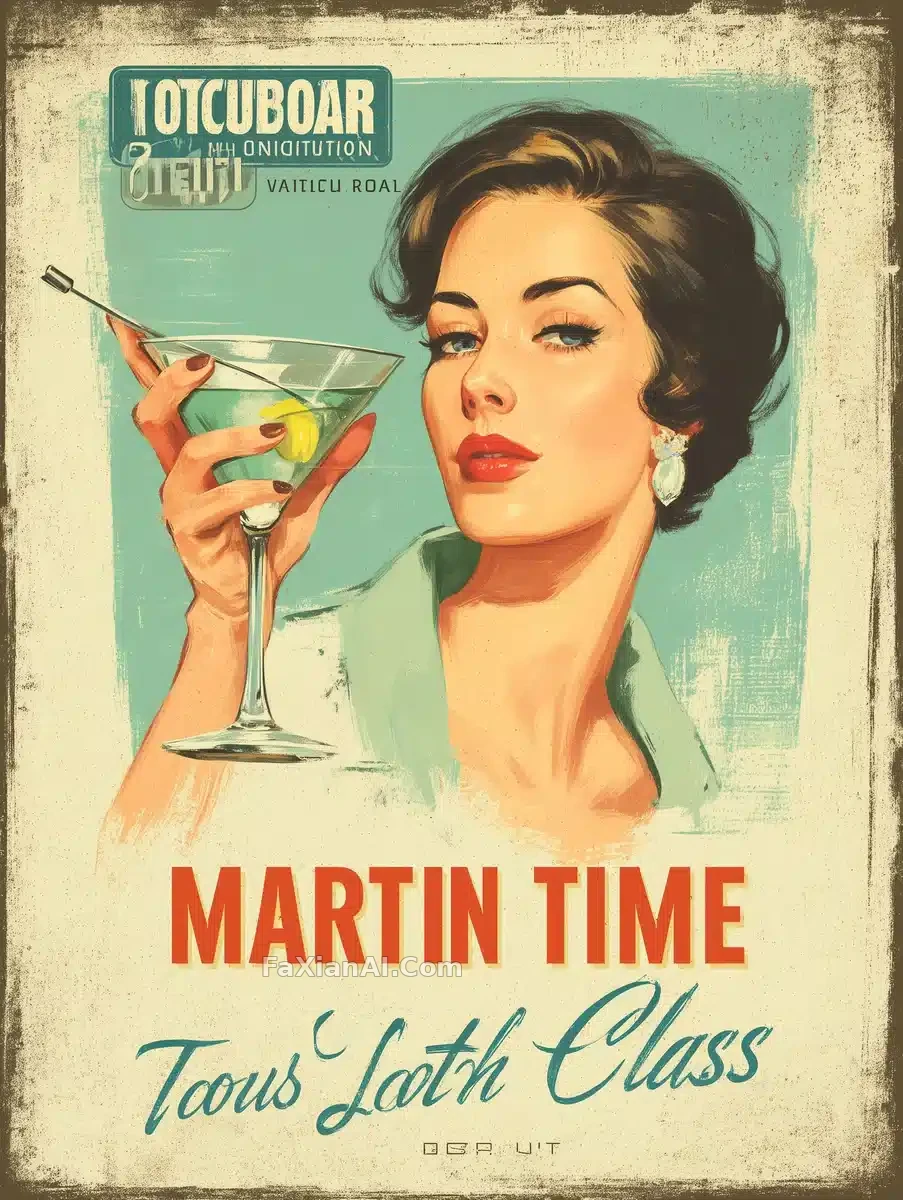
A 1950s Martini Poster, Mid-Century Glam
Key light on the face, a rim of highlight on the glass — the retro feel comes from type and layout.
Prompt notes
✍️ These retro posters live or die on typography and paper grain, not color — bend the script along a curve, push the grain, and the plastic look disappears; the portrait is really the supporting act.
Full prompt
📋 Prompt Midjourney Parameter Style
A 1950s-style advertisement poster: an elegant woman in mid-century fashion holds up a martini glass, set against a retro cocktail-lounge backdrop. Bold serif type spells out the headline "Martini Time," paired with a curved elegant script line reading "A Touch of Class." The layout stays minimalist — warm muted tones, a faded-paper texture with visible grain, and art-deco flourishes framing the composition. Mid-century modern design cues run throughout, from the stylish retro lettering to the overall vintage cocktail-bar mood. --chaos 75 --ar 3:4 --v 7 --stylize 450
Related Cases
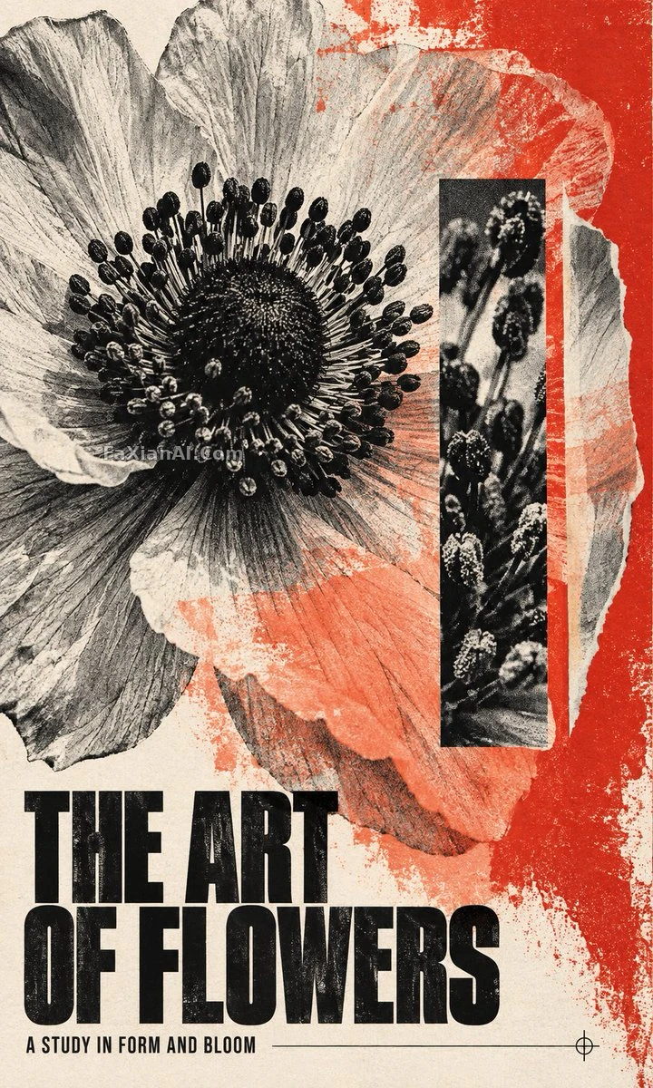 Anemone Poster Grown in a Photocopier
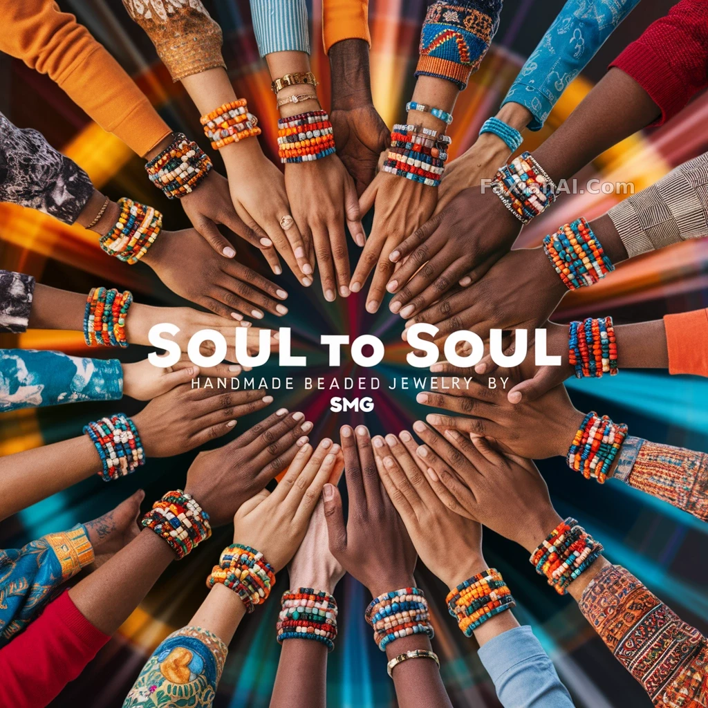 Black Backdrop Carries the Weight of the Slogan
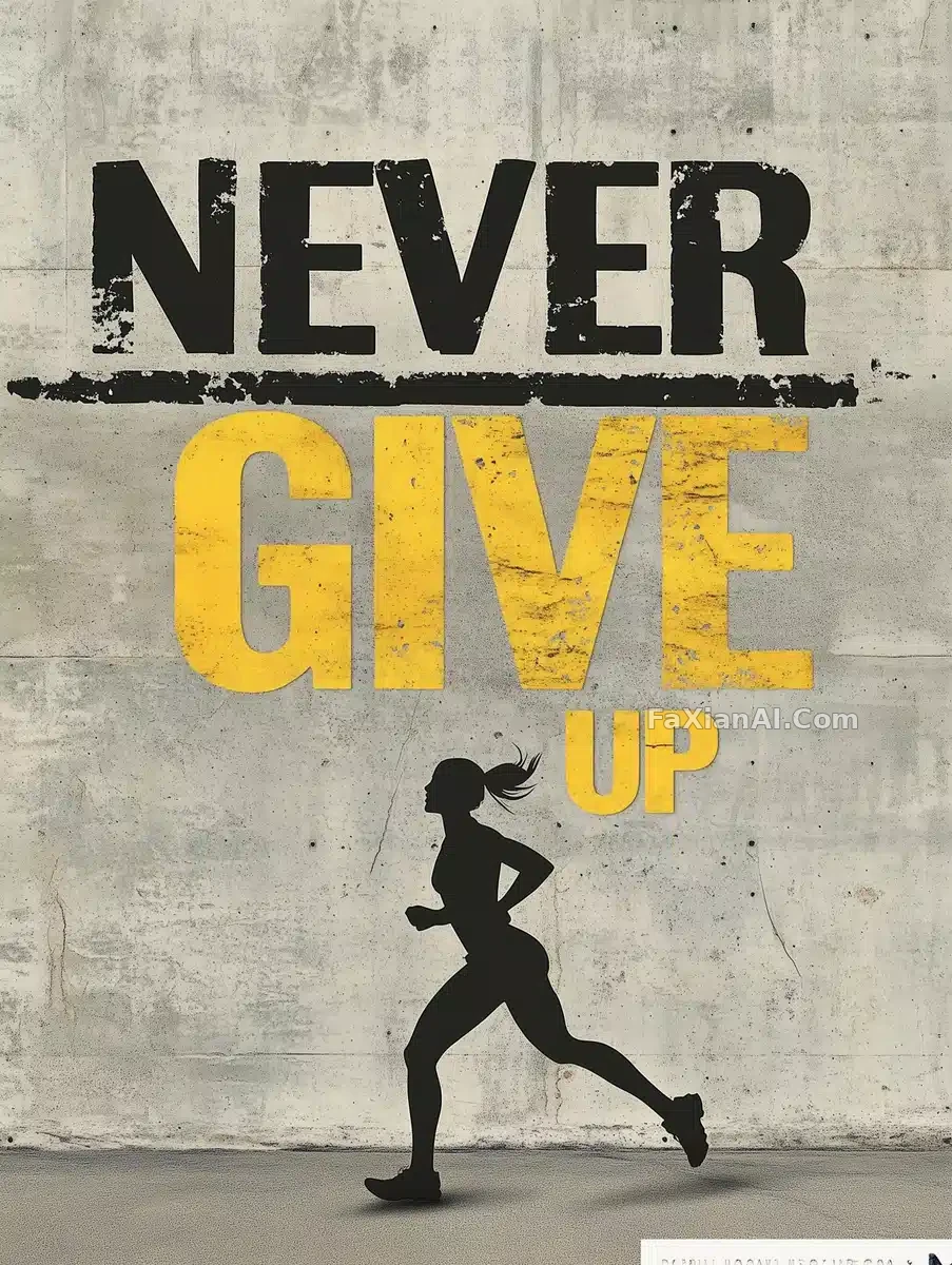 Big Yellow-Rimmed Type Against a Concrete Wall
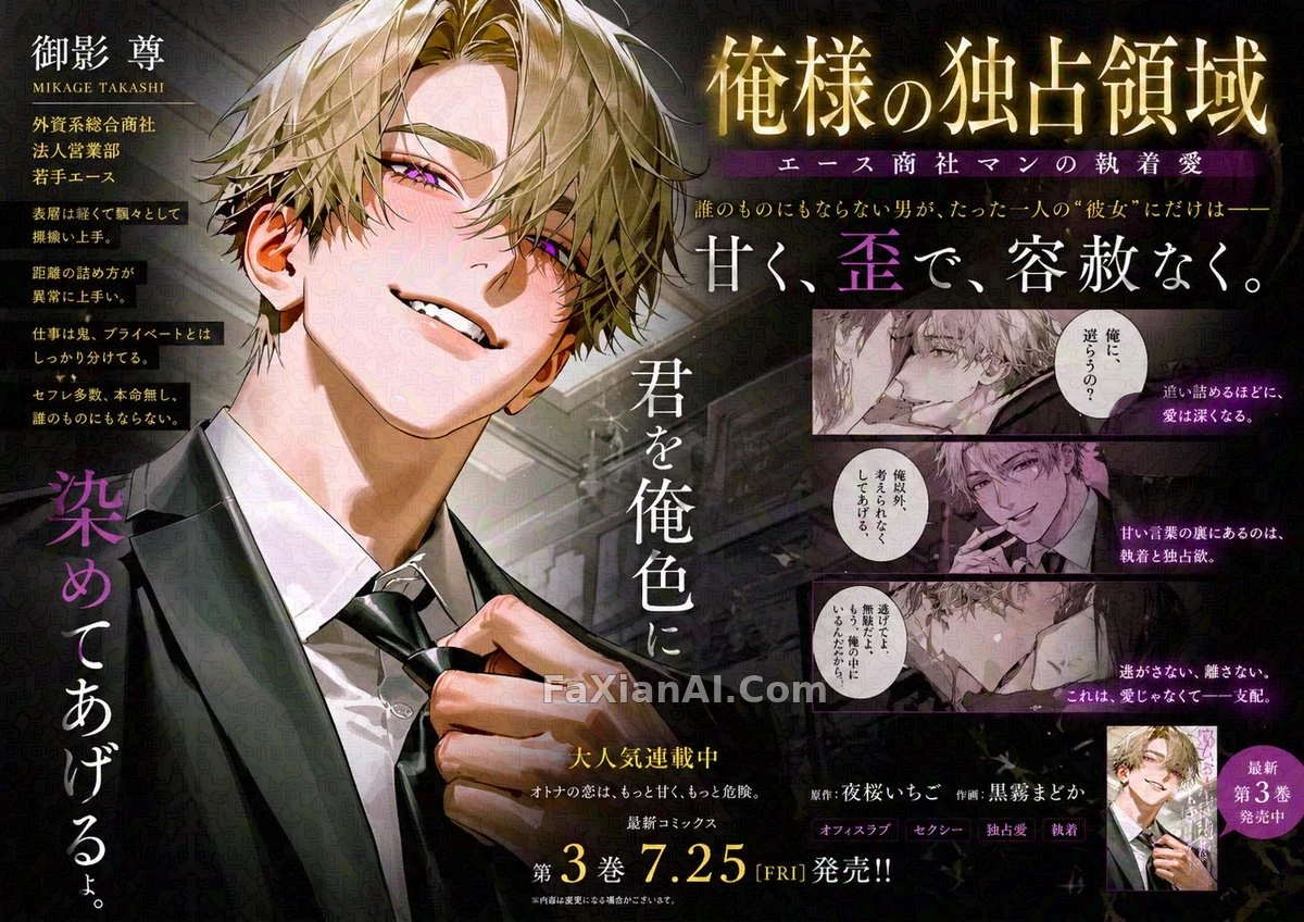 Train-Ad Comic Panel, You Fill In the Character
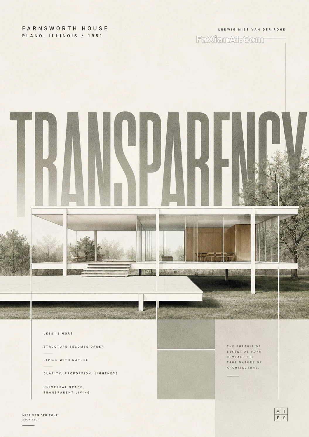 Giant-Word Layout for a Minimalist Landmark Poster
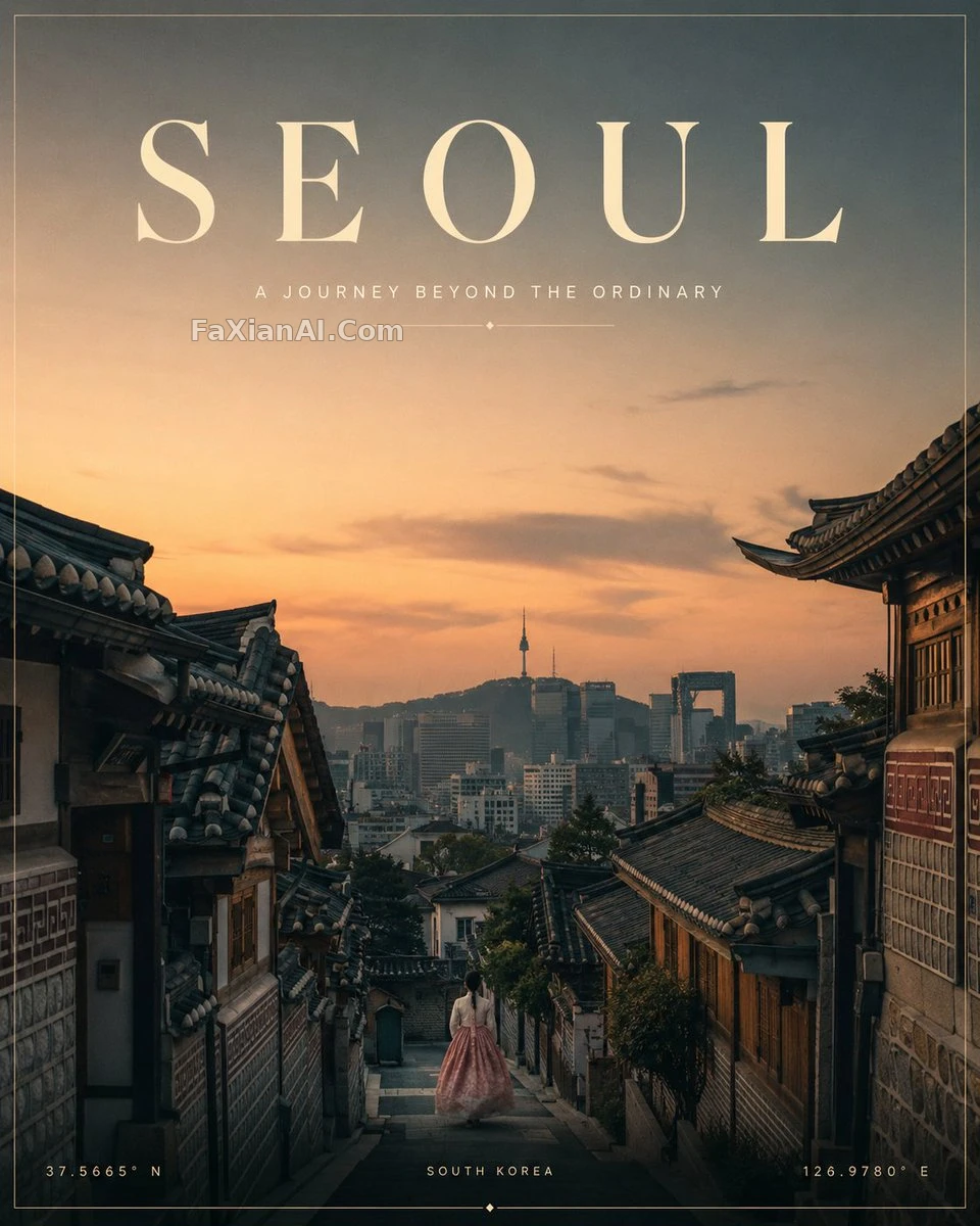 A Minimalist Travel Poster on a Four-Color Diet
More Midjourney cases
All Midjourney cases → A Horse Forged From Molten Lava
 This Tiny Suit's Tailoring Is Even More Stubborn Than Her Face
 Red Backdrop, Black Outfit — the Contrast Is No Illusion
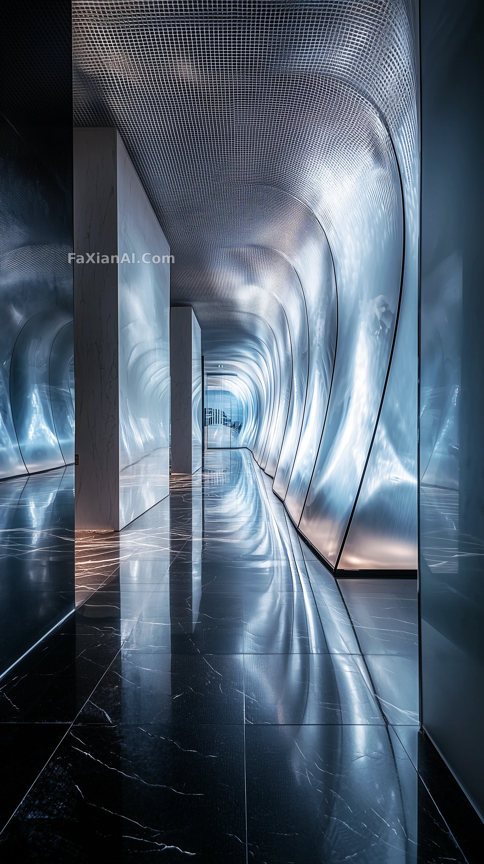 Three Structural Notes on This Tunnel of Light
 Relax — This Hallway Stays Calm Even Sunk Beneath the Sea
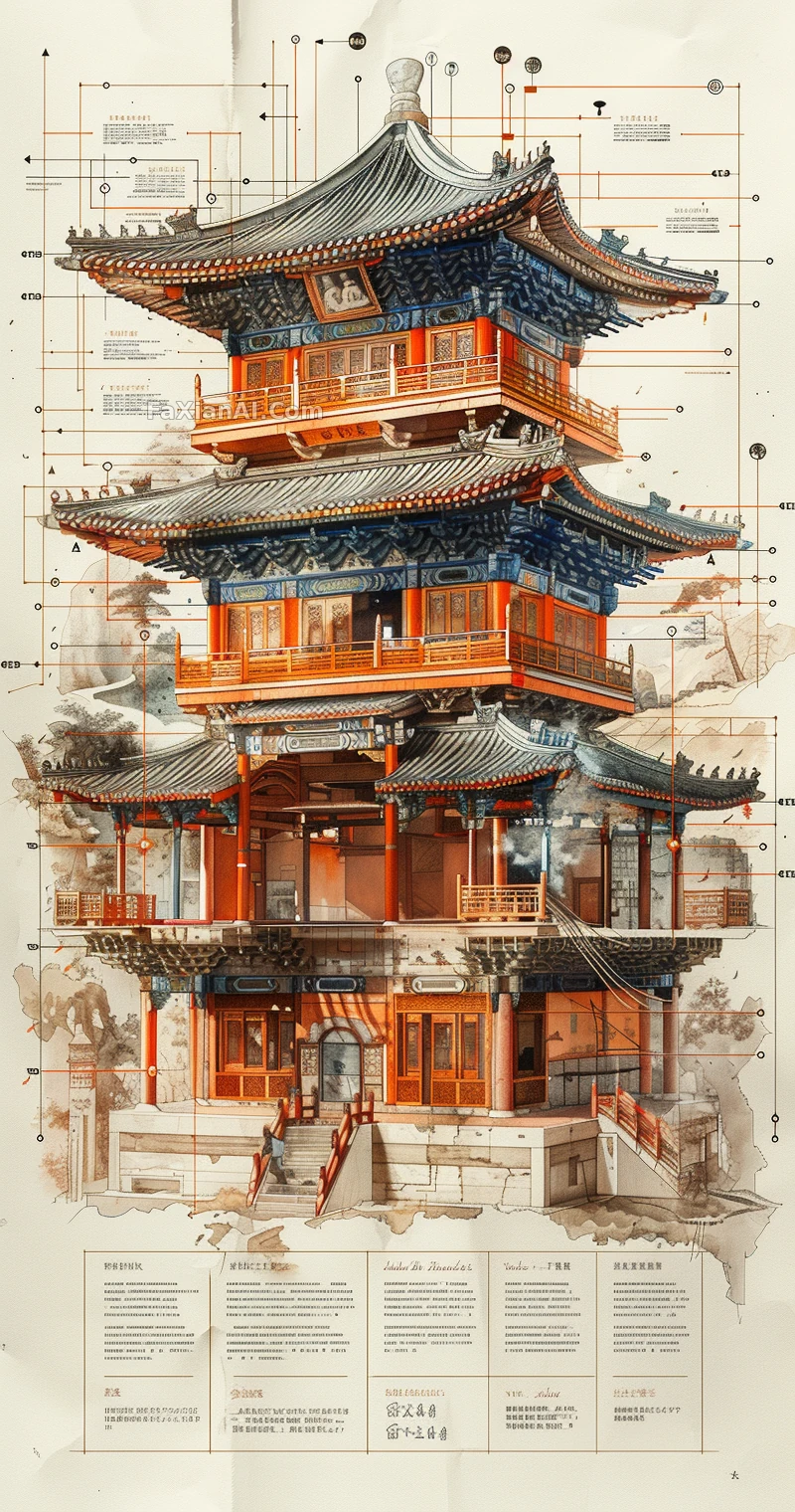 This Tower's Layer Labels Are More Granular Than a Split Workout
Related guides
Period Feel Isn't Grain: The Evidence List From 1950s Posters to Y2K FlashMaterial is not an adjective: a cue word approach to edges, reactions and lightPaper, Stone, Glass, and Linen — Make Materials Shape the Image