Home › Design Assets › This Tower's Layer Labels Are More Granular Than a Split Workout
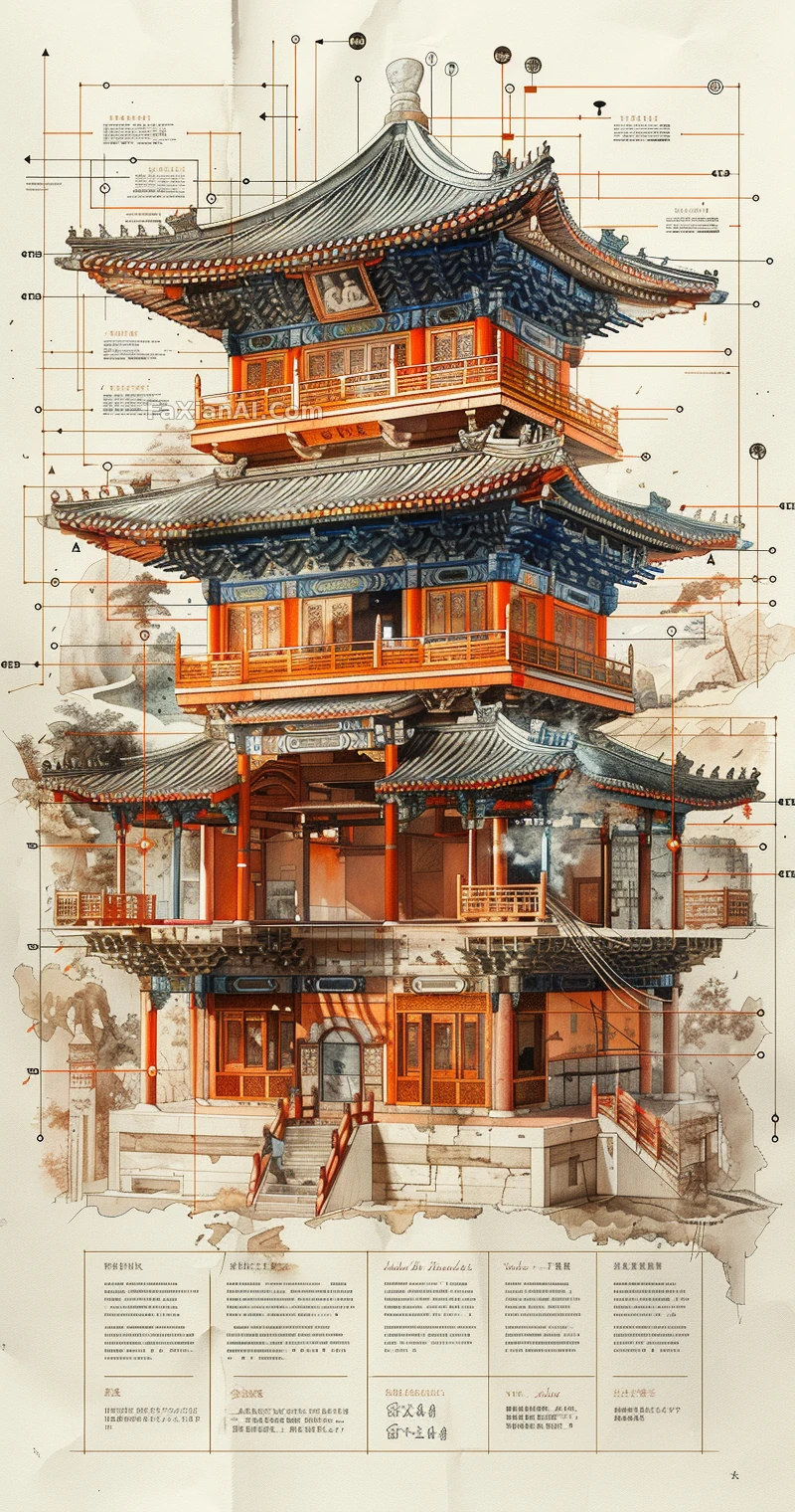
This Tower's Layer Labels Are More Granular Than a Split Workout
From foundation to spire, every single level spells out exactly what material was used.
✍️ All the real substance sits in that text panel at the bottom — dimensions, weight, technique, none of it can be skipped, or the information density collapses. Color-pencil shading paired with realistic shadow work is a counterintuitive combo, and that contrast is exactly the point of the exercise.
📋 Prompt Midjourney Parameter Style
A labeled cross-section illustration of an ancient Chinese tower, rendered in color-pencil style with realistic shadow work, cutting through every level to expose its construction techniques and design elements — rooms, bridges, structural details each called out with its own label. A text panel along the bottom lays out the tower's historical significance, frame size, dimensions, height, weight, materials, structural form, construction technology, and intended use, alongside related drip-style icons, all set against a clean white background. --ar 67:128 --stylize 750