
Period Feel Isn't Grain: The Evidence List From 1950s Posters to Y2K Flash
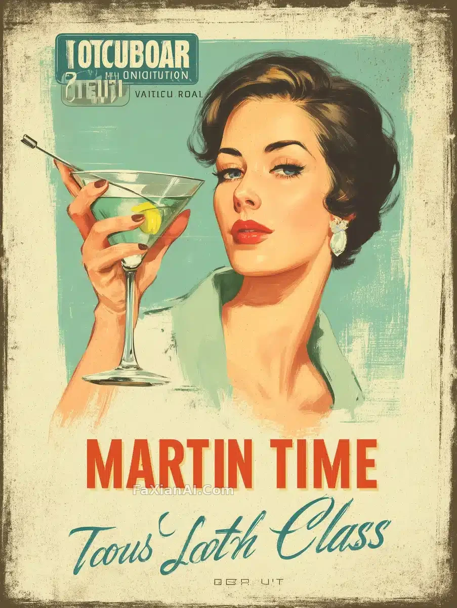
"Retro" is the most useless word you can put in a prompt. Every era is actually recognized through a handful of very specific things — printing process, lamps, lenses, cosmetics, camera bodies. Name the evidence and the period lands on its own. Write only "vintage" and the model hands you the average of every era at once.
Print Eras: The Process Is the Timestamp
The 1950s martini poster puts its whole period signal on three things: a faded printed ground, a heavy serif headline, and a script subhead. With all three present you are in that decade; add one modern smooth gradient and it collapses.
The art deco woman on the red velvet sofa looks like a simpler composition and is actually harder. Flat color shapes, a restricted palette and gold outlines all descend from the physical limits of period printing. The gold outline is the part the illustrator cannot fake past, while the angle of the martini glass and the curve of the sofa arm are what actually hold the era up.
The raven wanderer in engraving style pushes further back — monochrome cut lines, detail carried entirely by line density. Writing "black and white" is not enough here; specify the hardness of the line, no softness allowed. Realism at small display sizes is where this style leaks.
Practice: for print-era images, name the process first (faded offset / flat limited-color / copperplate engraving), then talk about content.
Film Noir: It Is Lighting, Not a Filter
The detective office in chiaroscuro proves black and white is not a desaturated color photo. Hard-edged monochrome with an extreme brightness ratio does far more than pulling saturation down — desaturation just gives you a flat grey modern photo. Leather chairs and bookshelves half-swallowed by shadow: that half-swallowed relationship is the actual grammar of noir.
The woman who will not show her hand runs the same language on a portrait — soft moody light wrapping the face, tension held under the surface. The transferable part is the line about a stare that gives away allure but withholds intent. A description carrying a psychological action beats stacking up "mysterious" and "vintage".
The Seventies: Hard Light, High Saturation, and a Piece of Fabric
The seventies editorial shot against a Persian tapestry writes the recipe out as structured fields: 85mm at eye level, hard studio light, high contrast, faint grain, saturation pushed up. Half the era comes from hair and makeup; the other half from that tapestry, whose pattern density has to be high enough to serve as a reference. Thin the background out and the hard light loses its anchor, leaving only harsh lighting.
The camel coat and the vintage Porsche goes further: four color swatches given as hex values with percentage weights, so changing era means changing the swatches. Writing color as checkable numbers is far steadier than "warm vintage tones".
Colored smoke against a black backdrop is the same studio thinking applied differently — the smoke drifts along the edge of the profile, catching the rim light to draw a contour line, and the black background exists purely to make the smoke color read.
Y2K: Here the Period Lives in the Flaws
Around the turn of the millennium the logic inverts. The Y2K direct-flash bedroom selfie gets its era from defects: the flattening on-camera flash, early CCD noise, skin blown out by the flash. Clean the image quality up and the period is gone.
The torn-paper Tokyo editorial collage poster makes a different point: the exclusion clause — no pink aesthetic — is what protects the grit. Soften the color and the whole thing slides back toward sweet. The birthday polaroid scrapbook supplies the general rule for collage work: every small photo has to sit under the same light. If the light quality is not unified, no amount of stickers will save it.
One Self-Check
When you have finished a period prompt, delete every era word in it — vintage, nostalgic, seventies, Y2K — and read it again. If someone could still guess the decade from what is left, you wrote enough evidence. If all that remains is a generic scene description, the period was never in the prompt; you only attached a label.
---
If you want to actually restore an old photograph rather than fake one, old photo restoration and colorization is the other direction; paper, printing and material handling is covered in more detail in paper cutting, origami, woodblock and cyanotype; for getting headline type rendered correctly, see making the model spell it right. More period and stylized work sits under the style category and the creative category.