Home › Design Assets › Letters Grown From Space, Not Pasted On
Letters Grown From Space, Not Pasted On
Shift the camera and the word scatters into fragments — only one angle reads clean.
✍️ Whether the word reads at all comes down to camera position — the real variable is which spatial mechanism you pick; interference versus alignment decides if other angles look chaotic or just blurred. That 35–55% frame share is for the structure to breathe, not for sizing up the letters.
📋 Prompt Natural Language1109 characters
TITLE: [your word]
PROJECT: [brand / exhibition / campaign]
MEDIUM: [threads / points / volumetric light / moiré layers / other]
SPATIAL MECHANISM: [alignment / depth / interference / optical reveal]
SUBJECT: [small human figure / none]
MAIN COLOR: [accent color]
FORMAT: 9:16 vertical poster
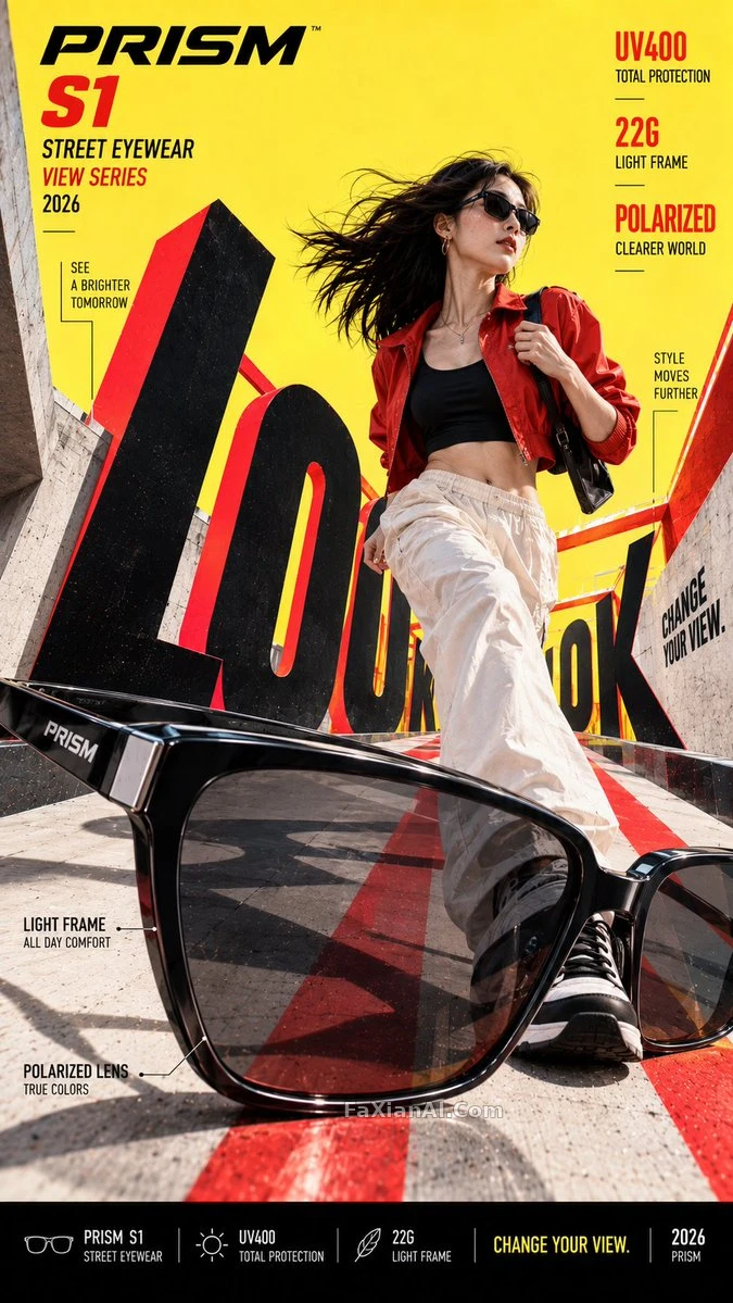
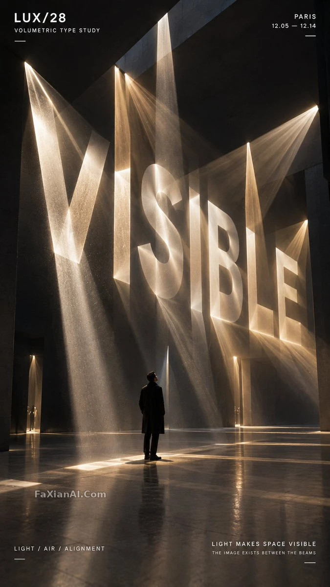
Build a contemporary volumetric-perspective typography poster where the headline word exists through elements scattered across real three-dimensional space rather than sitting flat on a surface.
Construct the word out of whichever medium is chosen — suspended threads, physical points, beams of light, layered line grids, or another spatial system. From other viewpoints the individual elements should look fragmented and abstract, but from the intended camera position they align into one bold, legible word.
Keep a clear foreground, midground and background depth. Let the typography fill roughly 35–55% of the frame while still revealing the spatial structure that builds it.
For threads, build each letter from lines sitting at different depths. For points, let suspended objects form volumetric letterforms.