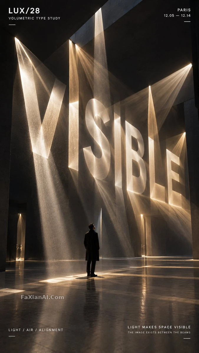
字從三維空間裡長出來,不是貼上去的
換個機位看,這個詞會散成碎片,只有一個角度能讀懂。
✍️ 字讀不讀得懂看機位——真正變數是空間機制那一項,換成干涉還是對齊,決定從別的角度看是亂的還是糊的。35%-55%佔比是留給結構喘氣,不是給字加大號。
📋 提示詞 自然語言1109 字元
TITLE: [your word]
PROJECT: [brand / exhibition / campaign]
MEDIUM: [threads / points / volumetric light / moiré layers / other]
SPATIAL MECHANISM: [alignment / depth / interference / optical reveal]
SUBJECT: [small human figure / none]
MAIN COLOR: [accent color]
FORMAT: 9:16 vertical poster
Build a contemporary volumetric-perspective typography poster where the headline word exists through elements scattered across real three-dimensional space rather than sitting flat on a surface.
Construct the word out of whichever medium is chosen — suspended threads, physical points, beams of light, layered line grids, or another spatial system. From other viewpoints the individual elements should look fragmented and abstract, but from the intended camera position they align into one bold, legible word.
Keep a clear foreground, midground and background depth. Let the typography fill roughly 35–55% of the frame while still revealing the spatial structure that builds it.
For threads, build each letter from lines sitting at different depths. For points, let suspended objects form volumetric letterforms.
📋 中文譯寫版 自然語言360 字元
標題:[你的詞語]
專案:[品牌 / 展覽 / 活動]
媒介:[線 / 點 / 體積光 / 莫爾條紋層 / 其他]
空間機制:[對齊 / 深度 / 干涉 / 光學顯現]
主體:[小型人物 / 無]
主色:[點綴色]
格式:9:16豎版海報
做一張當代體積透視字型海報,標題詞不是貼在平面上,而是靠分佈在真實三維空間中的元素才存在。
用選定的媒介去構建這個詞——懸浮的線、實體的點、光束、分層的線網格,或其他空間系統。從別的視角看,各個元素應該顯得破碎而抽象,但從預設的拍攝機位看,它們會對齊成一個清晰可讀的大字。
保持清晰的前景、中景、背景層次。讓這個字佔據畫面大約35%到55%的比例,同時還要看得出撐起它的空間結構。
如果媒介是線,就讓每個字母由不同深度的線構成。如果是點,就讓懸浮的物體拼出有體積感的字形。