影印機裡長出來的銀蓮花海報
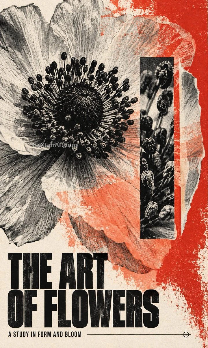
黑白半調的巨大銀蓮花被硃紅絲印壓住一角,下方兩行粗黑體標題。
✍️ 這條的成敗押在色值上:兩個十六進位制只給硃紅與珊瑚,其餘全交給黑和紙色,畫面才不會花。還有一招是讓“花朵縮成縮圖仍可辨認”,等於給構圖下了硬指標。
📋 提示詞 自然語言1911 字元
Poster brief, "The Art of Flowers": one complete flat portrait sheet, close to 3:5, printed edge to edge. Keep it image-led and dense, with the bloom filling most of the page and no mockup, wall, border or product scene.
Finish: xerox grain, offset misregistration, halftone, warm paper tooth and strong typographic contrast, with just one small crosshair and one hairline. Avoid glossy 3D, stock-photo polish, generic floral clip art, unrelated shapes, excess empty space and extra color families.
Color: ground of warm ivory paper and carbon-black ink; the only colors are vermilion and coral, #E43C32 and #FF8E78. A heavy vermilion screenprint overprint comes in from the right edge over some of the petals, while coral shows up as an irregular translucent ink pass in the lower middle. Edges stay rough and uneven, with no hard disc or circular glow.
Main image, built as a bleed interrupted by cut paper: a single enormous anemone, shown as a high-contrast black-and-white photocopy, fills the upper and middle two-thirds. The dark stamen core sits slightly left of center and the pale translucent petals fold outward past the top and left edges. Give petal veins, torn-paper whites and halftone shadows a physical, tactile feel. Cut a tall narrow rectangular window through the right-middle of the bloom to show a much closer second halftone view of the same stamens, and offset a thin petal-shaped paper sliver beside it. This is the strong secondary graphic mass, tied to the flower itself instead of decorative geometry. The flower should still read at thumbnail size.
Text: keep the title area clear. In the lower quarter put a compact, bold, extra-heavy condensed sans-serif English title in black, set on exactly two lines:
THE ART
OF FLOWERS
and below it a single small aligned line, exactly:
A STUDY IN FORM AND BLOOM
No other visible text, numbers, logos, dates, brands, coordinates or watermark.
📋 中文譯寫版 自然語言652 字元
設計一張完整、平整、滿版出血的豎版編輯藝術海報,比例接近3:5,主題為“The Art of Flowers”。以影象為主導,視覺密度高,花朵佔據大部分版面,不要樣機、牆面、邊框或產品場景。
版式:畫面出血到頁面之外,並被一塊剪紙元素打斷。一朵巨大的銀蓮花以高對比黑白影印效果呈現,佔據上部和中部三分之二。深色花蕊中心略偏左,淺色半透明花瓣向外翻折,越過頂邊和左邊。讓花瓣脈絡、撕紙的白邊和半調陰影有真實的觸感。在右側中部,從花朵上切出一個高而窄的矩形視窗,露出同一朵花花蕊的第二個、近得多的半調檢視,並在旁邊錯位放一片細長的花瓣形紙條。它們是與花朵直接相關的次級圖形塊,而不是裝飾性幾何,花朵在縮圖尺寸下仍須清晰可辨。
色彩:暖象牙色紙張與炭黑油墨,色板僅限硃紅與珊瑚紅,#E43C32和#FF8E78。一層厚重的硃紅絲網印疊印從右邊緣滲入,覆蓋部分花瓣,珊瑚紅則以不規則的半透明油墨層出現在中下部。邊緣粗糙不規整,不要硬邊圓盤或圓形光暈。保持標題區乾淨。
字型:在底部四分之一處,放置緊湊而醒目的特粗窄體無襯線英文標題,黑色,恰好兩行:
THE ART
OF FLOWERS
其下一行對齊的小字,原樣為:
A STUDY IN FORM AND BLOOM
不出現其他文字、數字、標誌、日期、品牌、座標或水印。
收尾質感:施樂影印顆粒、套印偏移、半調網點、暖色紙張紋理和強烈的字型對比,僅有一個小十字準線和一條髮絲線。避免光澤3D、相簿照片式的精修感、通用花卉剪貼畫、無關形狀、過多空白和額外的色系。