
Eight New Models Landed at Once, Here's What Each One's Like
This batch of collecting brought the site's model roster from eight up to sixteen. Doubling the count isn't the point — the real headache is that the same prompt handed to different models can produce results so different they're useless as reference for each other. So it's worth going through these eight newcomers one by one and calling out what each is actually like.
The Commercial Closed-Source Tier: GPT Image 1.5 and Seedream 4.x
GPT Image 1.5 has the most cases in this batch. Its strength is holding onto original faces and logos during edits, and it renders faster than the previous generation — but what actually makes it stand out in the site's cases is how well it digests long, detailed descriptions.
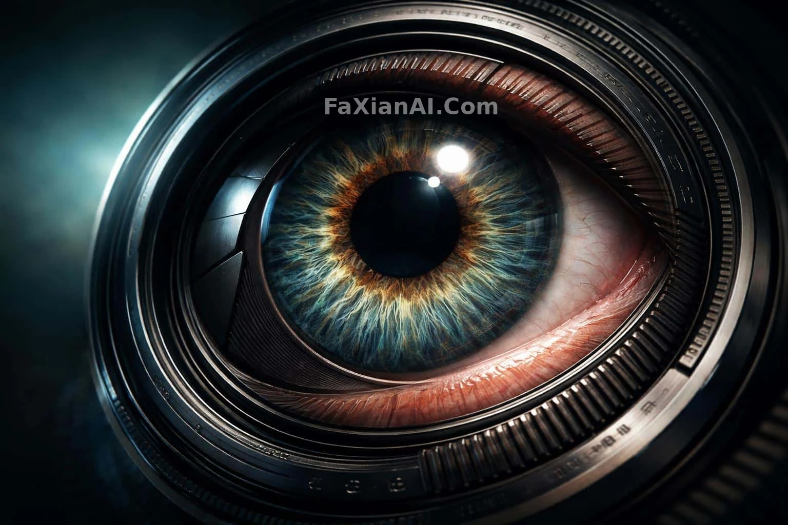
Take the one with the lens turning into an eye as an example: the seam where metal meets skin was deliberately placed off-center, sliding diagonally toward the lower right. That kind of "shift it slightly" instruction is exactly the sort of thing short-prompt models tend to ignore outright, and yet it followed through. The glowing cracked 3D lettering works on the same principle — the cracks run through the internal structure rather than the outline, and it actually understands the difference when you say so.
Seedream 4.0 and Seedream 4.5 are two separate models, not one. 4.5 is the December 2025 upgrade, and the clearest gains are in rendering speed and holding onto subject detail during edits. The site's cases actually split along that line: 4.0 tends to handle realistic work that needs precise color temperature, like sunset light on a curved glass arc or an albino bison portrait in a storm-swept prairie; 4.5 clusters around subjects that live or die by focus choices, like a cat peeking out of a cardboard box or a macro shot of raindrops on a window.
One more thing worth calling out on its own: the Seedream line handles in-image text more reliably than most models. The pie-crust lettering spelling out a Thanksgiving greeting, with little details tucked into the base of each stroke, relies on exactly that.
The Typography Specialist: Ideogram 4
Ideogram 4 has a narrow, clear-cut positioning — posters, title text, character sheets, anything where "the letters need to be right and the layout needs to be straight" is less of a hassle with it than with a general-purpose model.
What's interesting is that this batch of Ideogram cases on the site skews toward portraits instead. In the infinity-pool shot, the variable that actually matters isn't the "infinity" edge — it's getting the pool water and the ocean to near-zero color difference; the shoreline full-body portrait glancing back depends on the swing of the skirt and hair matching the stride. That says its grasp of spatial relationships and motion logic is just as solid — typography is simply the side people remember it for.
The Open-Weight Batch: Z-Image Turbo, HiDream I1, Krea 2
All three are open-weight, but they each take a different approach.
Z-Image Turbo is Alibaba's Tongyi Lab's 6B model, rendering with very few sampling steps — speed is its standout trait. In the bounty hunter in neon rain, puddles on the ground double up the neon reflections, doubling the color information without spending any extra budget — it can pull off that kind of shortcut composition. The claw beside the ancient scroll goes the opposite way: the whole scene rests on one faint glow of gold ink, with shadow eating up most of the frame. Fewer sampling steps means the more specific your prompt, the better it pays off — it doesn't have the steps to spare guessing at vague adjectives.
HiDream I1 is HiDream.ai's 17B sparse diffusion model, capable of both realism and illustration. Its cases on the site actually lean surreal: a pizza pushing a stroller across a crosswalk, lava spilling out of a painting into a living room. But the pearl tiara on a white backdrop and the cat-eye sunglasses product shot came from the same model, which proves "handles anything" isn't just talk.
Krea 2 is going for aesthetics — all four of its cases are illustrations: a weightless moment amid falling cherry blossom petals, a warrior in pearlescent armor, an elven city carved into ancient trees. Its strength is blending two styles into a smooth transition — when writing a prompt for it, describing "what setting this image would belong in" works better than listing off a string of style terms.
The Loud One: Grok Imagine
Grok Imagine renders fast with a loud, expressive style, which suits visualizing an idea first and refining it with another model afterward. The six-character select screen and four weapons displayed on velvet both fall into that "just see the direction" use case — the latter even exposed a real problem: the four weapon silhouettes were all fairly similar, and what actually separated them was the engraved lettering, not the shapes. That kind of feedback only shows up once you've actually generated the image.
How to Use These Pages
Every model page has all of that model's cases hanging underneath it — if you want reference writing from the same model, just flip through the model overview. As for which one to pick for a new project, the site's model selection guide has a more systematic comparison; if you want to know how to structure a prompt, the prompt-writing formula piece is more practical; and since this batch of cases spells out aspect ratio more clearly than before, it's worth also checking where to put the aspect ratio in a prompt.
One thing has become increasingly clear over the past six months: the gap between models is shifting from "how realistic can it draw" to "does it actually understand what you're saying." Given the same description, some models only latch onto the nouns, while others will follow through on something as specific as "slide it diagonally toward the lower right." Picking a model is starting to feel less like choosing a tool and more like finding a collaborator whose comprehension you click with.