
How to Write Wallpaper Prompts: Lock the Ratio First, Then Write Where the Icons and Text Go
The biggest difference between a wallpaper and a poster or an illustration is that a wallpaper never appears on its own. A desktop has a grid of icons laid over it, and a phone lock screen has the clock and notifications pressed on top. However complete the image is, if those things land exactly on the best part, the image is wasted. So a wallpaper prompt isn't really solving "what to draw" — it's solving "where everything outside the image will land."
The cases under the site's wallpaper category are written very differently from one another, but almost every one locks down three things up front: the aspect ratio, where the empty area sits, and where the bright areas go. Here's a breakdown along those three lines.
1. Put the Ratio in the First Sentence, and Match It to the Use
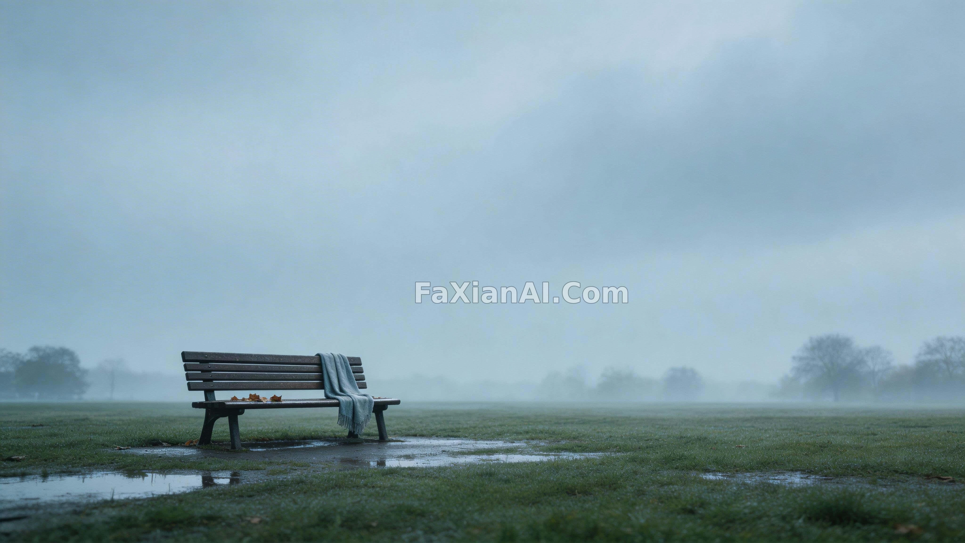
The deep crimson wallpaper fading to near-black opens with in a 16:9 widescreen frame, the bench after the rain opens with 16:9 widescreen wallpaper format, the pine forest with light shafts says 2:3 vertical wallpaper-format, and the moose in the reed marsh uses vertical 9:16 frame.
These numbers aren't picked at random. 16:9 maps to monitors, 2:3 is closer to posters and some tablets, and 9:16 is the phone lock screen. Get the ratio wrong and every later description about "leaving the top third empty" shifts out of place, because the same "top third" is not the same region in a landscape image and a portrait one. For which sentence is the most reliable spot for the ratio, see which sentence of the prompt should carry the aspect ratio — for wallpapers, just put it in the first sentence.
2. Empty Space Isn't "Leave a Bit" — It's Assigned to Someone
The most effective kind of sentence in a wallpaper prompt is the one that says what the empty space is for. Here are the original lines from several cases:
- Gradient wallpaper: leaving wide, clean negative space for icon placement — it says outright that this blank area is for icons;
- Matte black scratched surface: the lower third stays quieter, followed by ready for overlaying text or UI elements;
- Purple wave lines: Reserve a large empty zone across the upper area for titles or overlays;
- Coffee cup in morning light: Reserve generous negative space on the right third for potential text or overlay.
Spelling out the purpose makes a practical difference compared with writing negative space alone. Once the model knows that area will later hold text or icons, it renders it flatter, darker and with less detail, instead of just "a background with fewer things in it." The thinking is the same as for holiday background images — the copy space approach from the holiday background prompts post carries over directly.
Which side to leave empty needs thought too. Desktop icons run down from the top-left corner by default, so the safe zone of a landscape wallpaper is usually the left side or the top; on a phone lock screen the clock sits at the top and notifications stack downward, so the subject of a portrait wallpaper is best pushed to the lower-middle part. The moose case says positioned slightly above center — the subject sits a little above the middle, so the clock won't cover the moose's face, and the reed stalks in the lower half make a natural backdrop for notification cards.
3. How Low the Horizon Sits Decides How Much Sky You Can Keep
The most common problem with landscape wallpapers is a horizon dead in the middle, half sky and half ground, so once icons land on it they block both. The bench after the rain handles it with a low horizon line that hands most of the frame to a heavy overcast sky: the horizon is pushed very low, the whole upper half is overcast sky, and the small bench sits off in one corner.
What's really valuable in this image is the overcast itself. An overcast sky has no hard shadows; it's one even slab of gray-blue, so icons sitting on it never collide with a highlight. Swap in sunny-day clouds and the cloud edges will chop up the icon labels. So when writing a landscape wallpaper, the weather isn't just mood — it directly determines whether the empty zone stays clean.
The same logic carries over to portrait images. The pine forest with light shafts writes the trunks as rising out of the lower quarter and continuing past the top edge, so the trunks start in the lower quarter and run right off the top of the frame, and the last line adds generous negative space in the upper third. In a portrait image the empty space is at the top, and the vertical lines of the trunks happen to serve as a quiet backdrop for the clock digits without stealing attention.
4. Where the Bright Area Goes Matters More Than the Color Itself
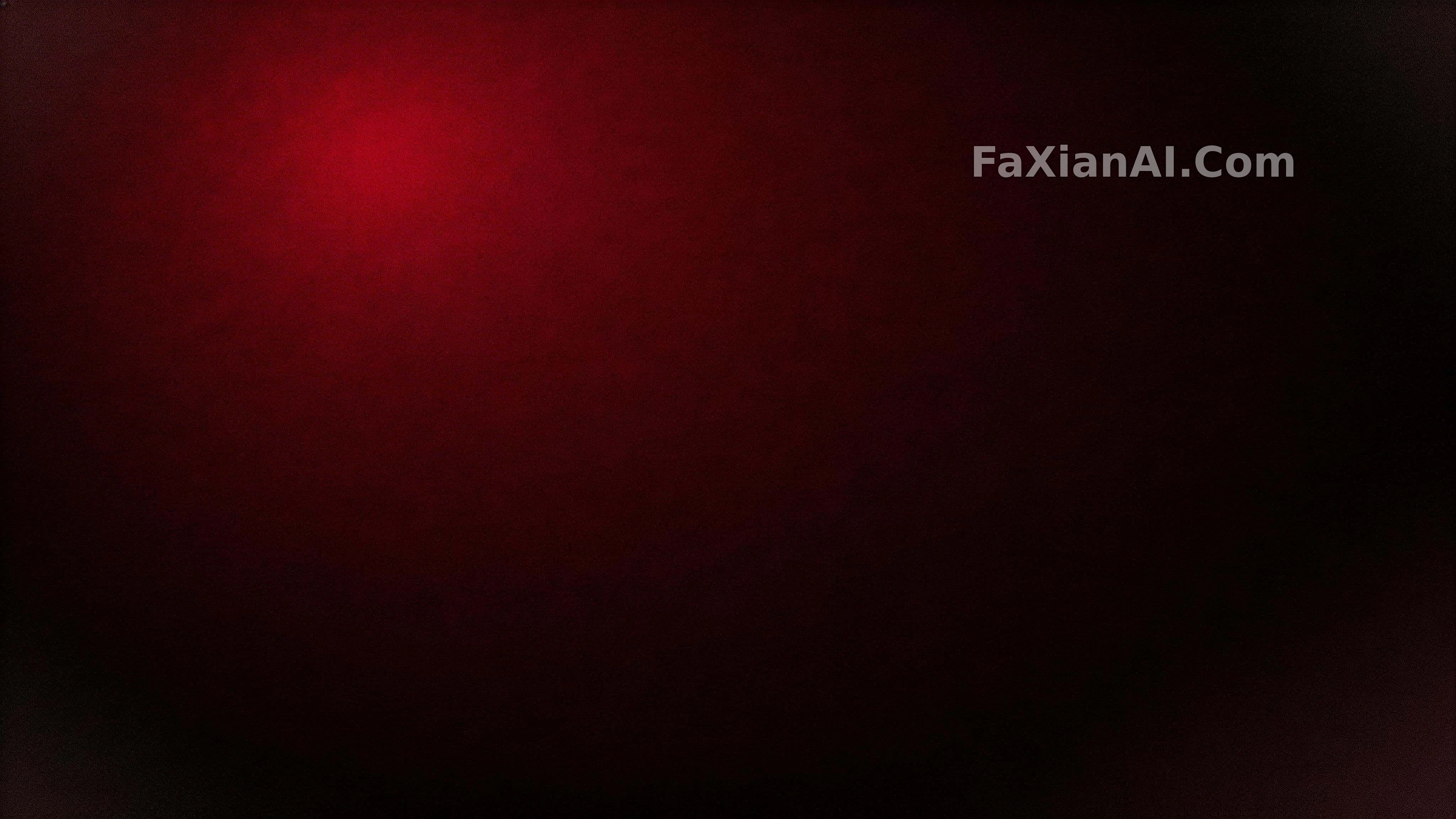
With gradient and texture wallpapers you can swap the colors freely and it still works; what you really have to decide is where the brightest patch goes. The deep crimson gradient says Position the brightest crimson low and off-center — the bright area is off-center (in the finished image it landed at the upper left, which doesn't match "low", but the part about avoiding the center was honored). The gold leaf in the pink and gold marble is pools and flakes low, clustering along the bottom-left quadrant, so all the gold is piled into the lower left.
With the bright area off-center, icons land on dark areas however you arrange them, and white icon labels stay readable. This rule is more useful than a vague "make it a dark wallpaper," because an image that is dark overall but has a highlight in the dead center still ends up with icons sitting right on that highlight and becoming hard to read.
Texture wallpapers also need attention to the angle of the light. The matte black surface uses Low-angle diffuse light skims the plane — light sweeping low across the surface is what makes the scratches show; with straight-on lighting, the whole image is just flat black. For a more direct look at how light position changes the same scene, see the comparison set not moving a single piece of furniture, only changing the light.
5. A Wallpaper Template You Can Adapt Directly
A [16:9 / 2:3 / 9:16] [desktop / phone] wallpaper. [MAIN SUBJECT or TEXTURE] sits [low and off-center / in the lower third / slightly above center], occupying no more than a third of the frame. The [upper third / right two-thirds / left half] stays clean and quiet, reserved as negative space for app icons, clock and notification overlays; keep it low in detail and low in contrast. Place the brightest area [low-left / low-right], away from the reserved zone. [LIGHT: soft overcast / low-angle side light / morning light from upper right]. Restrained palette of [2-3 COLORS], subtle film grain, no lettering, no logo, no watermark. High resolution.
A Few Common Ways This Goes Wrong
1. Writing "wallpaper" without a ratio. The model defaults to a square or 4:3 image, and once it's cropped to 16:9 the empty space is gone.
2. Centering the subject. The leaf shadow on a wall confines the shadow to the left third and lower two-thirds, leaving the right side and the top entirely empty — that kind of off-center placement is the composition a wallpaper should have.
3. Detail in the empty zone. Distant trees, cloud edges and material highlights all fight with icon labels. For the empty zone, write "low detail, low contrast" — not just "empty."
4. Using a good landscape image directly as a phone wallpaper. After a portrait crop the subject is mostly gone; a portrait version has to be generated separately, with the ratio changed from the very first sentence.
For a more systematic look at what empty space does in different kinds of images, see negative space isn't an unfinished image. Wallpapers just make it a bit more utilitarian: the blank area is the place for icons and text, and however good the image is, it has to make way for them.