Home › Design Assets › Giant Typography as the Frame, With the Figure Stepping Out of the Letters
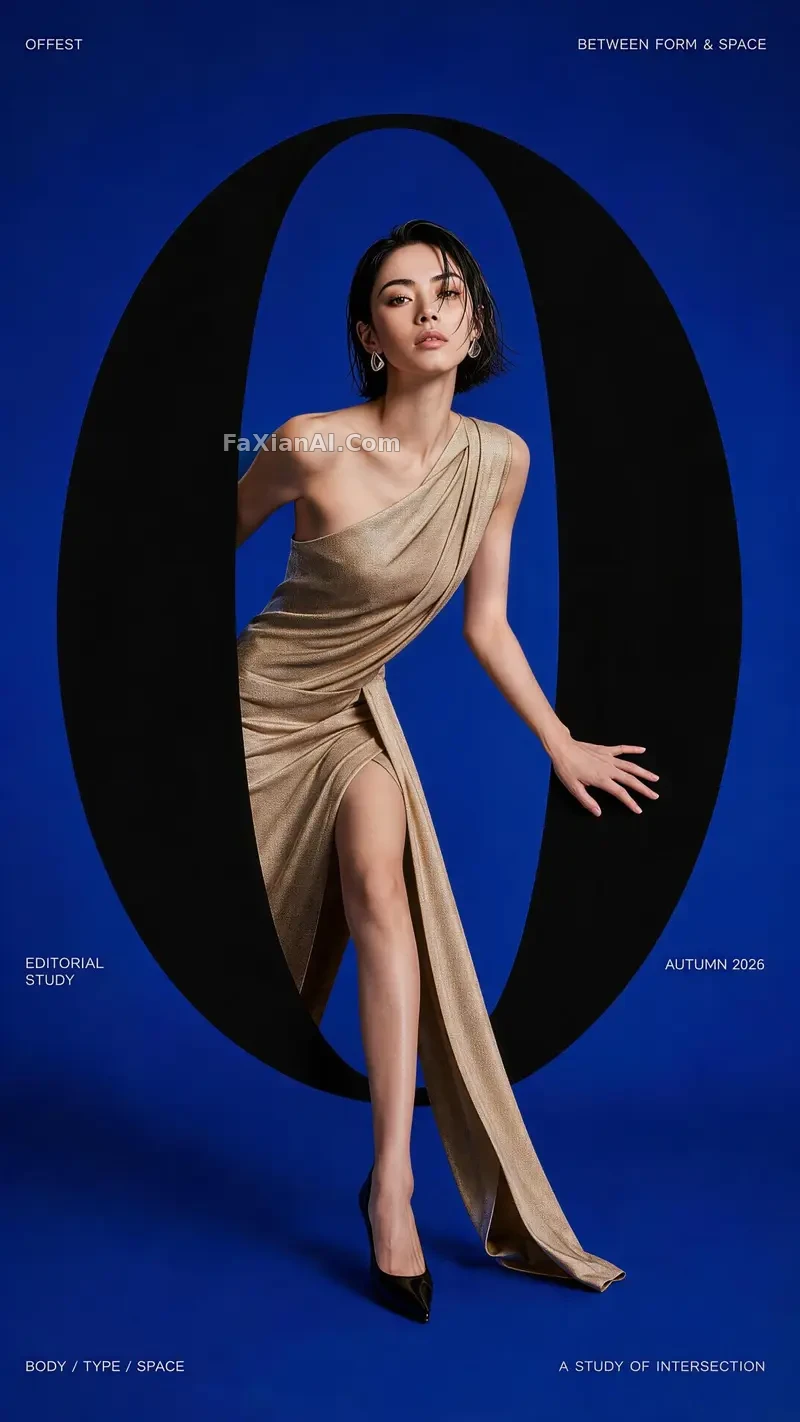
Giant Typography as the Frame, With the Figure Stepping Out of the Letters
These four typographic treatments work like four different ways of trimming flowers — each one leaves its own kind of space.
✍️ Portal, fold, frame, and motion are really four cuts of the same underlying logic — type can serve as decoration or as structure, and used well, it holds up better than simply slapping on a decorative typeface.
📋 Prompt Numbered Sections
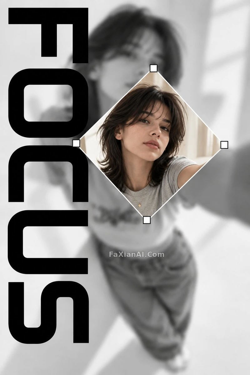
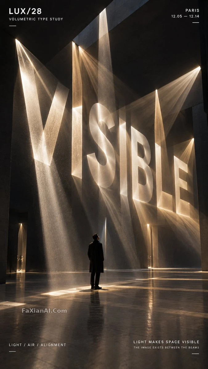
Use giant typography to add visual impact to a fashion feature layout: the type takes on four functions within the frame — framing, layering, intersecting, and moving with the figure — broken down into four directions:
1. OFFSET: type as a portal
2. FOLD: type as a layered, folding structure
3. NOCTURNE: type as the frame of the image
4. VELO: type as a trail of motion
This approach works well for fashion posters, feature-layout design, and typography reference material, generated with GPT-Image2.