Home › Design Assets › Can This Spread Actually Fit Six Features?
Can This Spread Actually Fit Six Features?
Two columns, six feature points crammed in — check if the hierarchy holds before judging the looks.
✍️ Lock the information architecture before worrying about beauty — once the grid and margins are set, images and icons have somewhere to go. Blue and cyan are just the final accent, and this logic works for any feature poster.
📋 Prompt Natural Language2717 characters
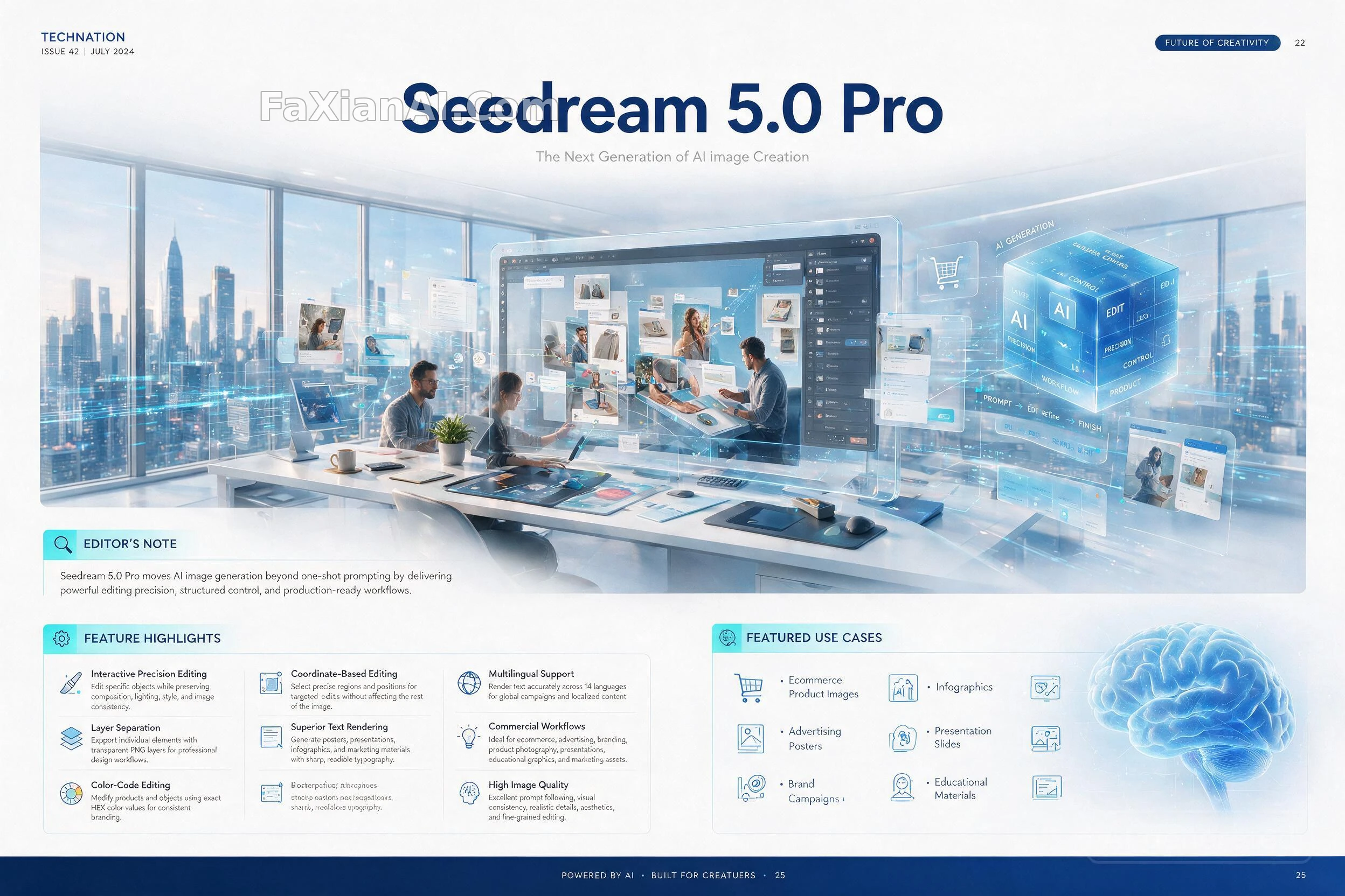
Lock the information architecture before touching aesthetics: a two-page technology-magazine spread built on a rigid editorial grid, generous margins, a disciplined type scale, crisp vector iconography, and a print-quality finish. Base palette: white stock lifted by blue and cyan accent bars, luxury print-magazine paper feel, every line of copy rendered with correct spelling and legible small-point type.
Cover headline, largest weight on the page: "Seedream 5.0 Pro"
Directly beneath it, a lighter-weight line: "The Next Generation of AI Image Creation"
Top-of-spread hero illustration: a single continuous scene blending a futuristic studio, floating transparent edit layers, interface HUD panels, workflow-diagram overlays, and a designer working alongside AI-generated artwork.
Running down the left column, an EDITOR'S NOTE block carries this exact line: "Seedream 5.0 Pro moves AI image generation beyond one-shot prompting by delivering powerful editing precision, structured control, and production-ready workflows."
The right two-thirds hold a FEATURE HIGHLIGHTS grid of numbered cards — same eight capabilities as the source material, order and card layout may shuffle, each card pairing a short bold name with one explanatory line:
1) Coordinate-Based Editing — click a precise region or position and edit only that zone, everything else stays untouched.
2) Color-Code Editing — swap a product's or object's color using an exact HEX value for brand-perfect consistency.
3) Layer Separation — pull individual elements out as transparent PNGs, ready for a professional design pipeline.
4) Interactive Precision Editing — retouch one object at a time while composition, lighting, style and overall consistency hold steady.
5) Multilingual Support — render accurate on-image text across 14 languages for localized, global campaigns.
6) Superior Text Rendering — posters, decks, infographics and marketing collateral all keep sharp, legible type.
7) High Image Quality — strong prompt-following, consistent visual identity, realistic detail, fine-grained edits.
8) Commercial Workflows — built for ecommerce, advertising, branding, product shoots, decks and teaching materials.
Bottom strip, FEATURED USE CASES, laid out as a compact icon row rather than a plain bullet list: ecommerce product images, advertising posters, brand campaigns, social creatives, infographics, presentation slides, portrait edits, educational materials.
Finish the spread with elegant supporting charts, a workflow diagram, comparison callout boxes, an editorial pull-quote, and numbered card frames — all rendered in a print-ready CMYK aesthetic with razor-sharp typography and a mature technology-magazine design language.