這本雜誌跨頁的功能選單擺得下嗎
兩欄排版塞進六個功能點,先看資訊層級壓不壓得住,別管好不好看
✍️ 資訊架構先鎖死再談好看,網格和留白定了,配圖和圖示才有地方擺,藍色青色只是最後一步的點綴,這套邏輯換成任何功能海報都通用。
📋 提示詞 自然語言2717 字元
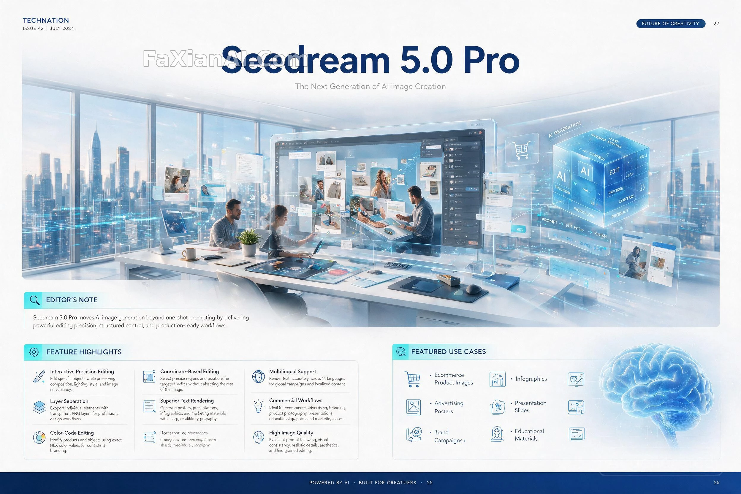
Lock the information architecture before touching aesthetics: a two-page technology-magazine spread built on a rigid editorial grid, generous margins, a disciplined type scale, crisp vector iconography, and a print-quality finish. Base palette: white stock lifted by blue and cyan accent bars, luxury print-magazine paper feel, every line of copy rendered with correct spelling and legible small-point type.
Cover headline, largest weight on the page: "Seedream 5.0 Pro"
Directly beneath it, a lighter-weight line: "The Next Generation of AI Image Creation"
Top-of-spread hero illustration: a single continuous scene blending a futuristic studio, floating transparent edit layers, interface HUD panels, workflow-diagram overlays, and a designer working alongside AI-generated artwork.
Running down the left column, an EDITOR'S NOTE block carries this exact line: "Seedream 5.0 Pro moves AI image generation beyond one-shot prompting by delivering powerful editing precision, structured control, and production-ready workflows."
The right two-thirds hold a FEATURE HIGHLIGHTS grid of numbered cards — same eight capabilities as the source material, order and card layout may shuffle, each card pairing a short bold name with one explanatory line:
1) Coordinate-Based Editing — click a precise region or position and edit only that zone, everything else stays untouched.
2) Color-Code Editing — swap a product's or object's color using an exact HEX value for brand-perfect consistency.
3) Layer Separation — pull individual elements out as transparent PNGs, ready for a professional design pipeline.
4) Interactive Precision Editing — retouch one object at a time while composition, lighting, style and overall consistency hold steady.
5) Multilingual Support — render accurate on-image text across 14 languages for localized, global campaigns.
6) Superior Text Rendering — posters, decks, infographics and marketing collateral all keep sharp, legible type.
7) High Image Quality — strong prompt-following, consistent visual identity, realistic detail, fine-grained edits.
8) Commercial Workflows — built for ecommerce, advertising, branding, product shoots, decks and teaching materials.
Bottom strip, FEATURED USE CASES, laid out as a compact icon row rather than a plain bullet list: ecommerce product images, advertising posters, brand campaigns, social creatives, infographics, presentation slides, portrait edits, educational materials.
Finish the spread with elegant supporting charts, a workflow diagram, comparison callout boxes, an editorial pull-quote, and numbered card frames — all rendered in a print-ready CMYK aesthetic with razor-sharp typography and a mature technology-magazine design language.
📋 中文譯寫版 自然語言1051 字元
先把資訊架構釘死,再談美觀:一張雙跨頁科技雜誌排版,建立在嚴謹的編輯網格上,留白充裕,字號層級剋制統一,向量圖示銳利,整體是印刷級質感。基礎配色:白色紙感底色疊加藍色與青色的強調色條,奢華印刷雜誌的質地,每一行文字拼寫正確、小字也清晰可讀。
封面標題,頁面上字重最大的一行:"Seedream 5.0 Pro"
緊接其下,字重更輕的一行:"The Next Generation of AI Image Creation"
跨頁頂部主視覺:一個連續場景,把未來感工作室、漂浮的透明編輯圖層、介面HUD面板、流程圖疊層,以及正在與AI生成作品並肩工作的設計師融合在一起。
左欄往下是 EDITOR'S NOTE 文字塊,原文照錄:"Seedream 5.0 Pro moves AI image generation beyond one-shot prompting by delivering powerful editing precision, structured control, and production-ready workflows."
右側三分之二版面是 FEATURE HIGHLIGHTS 編號卡片網格——功能點和原素材一致共八項,順序與卡片排布可以重新洗牌,每張卡片是一個加粗短名加一句說明:
1) 座標定點編輯——點選精確區域或位置,只改那一小塊,其餘畫面原封不動。
2) 色值編輯——用精確的HEX色值替換產品或物體顏色,品牌色分毫不差。
3) 圖層分離匯出——把單個元素單獨匯出成透明PNG,直接進專業設計流程。
4) 互動式精準編輯——逐個物體修改,同時保持構圖、光線、風格和整體一致性不變。
5) 多語言支援——在圖片裡準確渲染14種語言文字,服務本地化的全球投放。
6) 更強的文字渲染——海報、簡報、資訊圖和營銷物料的字型都保持清晰銳利。
7) 高畫質表現——高度貼合提示詞、視覺一致性強、細節真實、編輯顆粒度精細。
8) 商用工作流——面向電商、廣告、品牌、產品拍攝、簡報和教學素材而生。
底部條帶 FEATURED USE CASES,用緊湊的圖示行呈現而非單純的專案符號列表:電商產品圖、廣告海報、品牌campaign、社交媒體素材、資訊圖、演示幻燈片、人像精修、教學素材。
收尾配上精緻的輔助圖表、一張流程示意圖、對比說明框、一句編輯體引用金句,以及編號卡片邊框——整體統一在印刷級CMYK質感上,字型極其銳利,呈現成熟的科技雜誌設計語言。