治癒插畫配政務級資訊密度
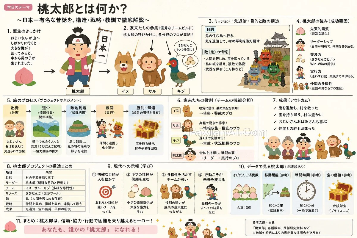
把可愛插畫的軟和公務簡報的擠揉在一張說明圖裡,反差感就是看點。
✍️ 這條prompt真正的變數是兩種氣質的配比——Irasutoya負責讓畫面軟下來,霞關簡報負責把資訊塞滿,配比偏了要麼太空要麼太擠,沒有中間態。
📋 提示詞 自然語言
Build an explanatory slide — [format: ponchi-e diagram] — themed around [theme: Momotaro], blending Irasutoya's soft, approachable illustration mood with the dense, everything-crammed-in information layout typical of Kasumigaseki-style government slides.
📋 中文譯寫版 自然語言
做一張說明性幻燈片——[format: ponchi-e diagram]格式——主題定為[theme: Momotaro],把Irasutoya那種柔和親切的插畫氣質,和霞關風格政府簡報那種資訊量爆滿的排版密度融合在一起。