Home › Design Assets › Airport Window Photo and Ink Sketch Spread
Airport Window Photo and Ink Sketch Spread
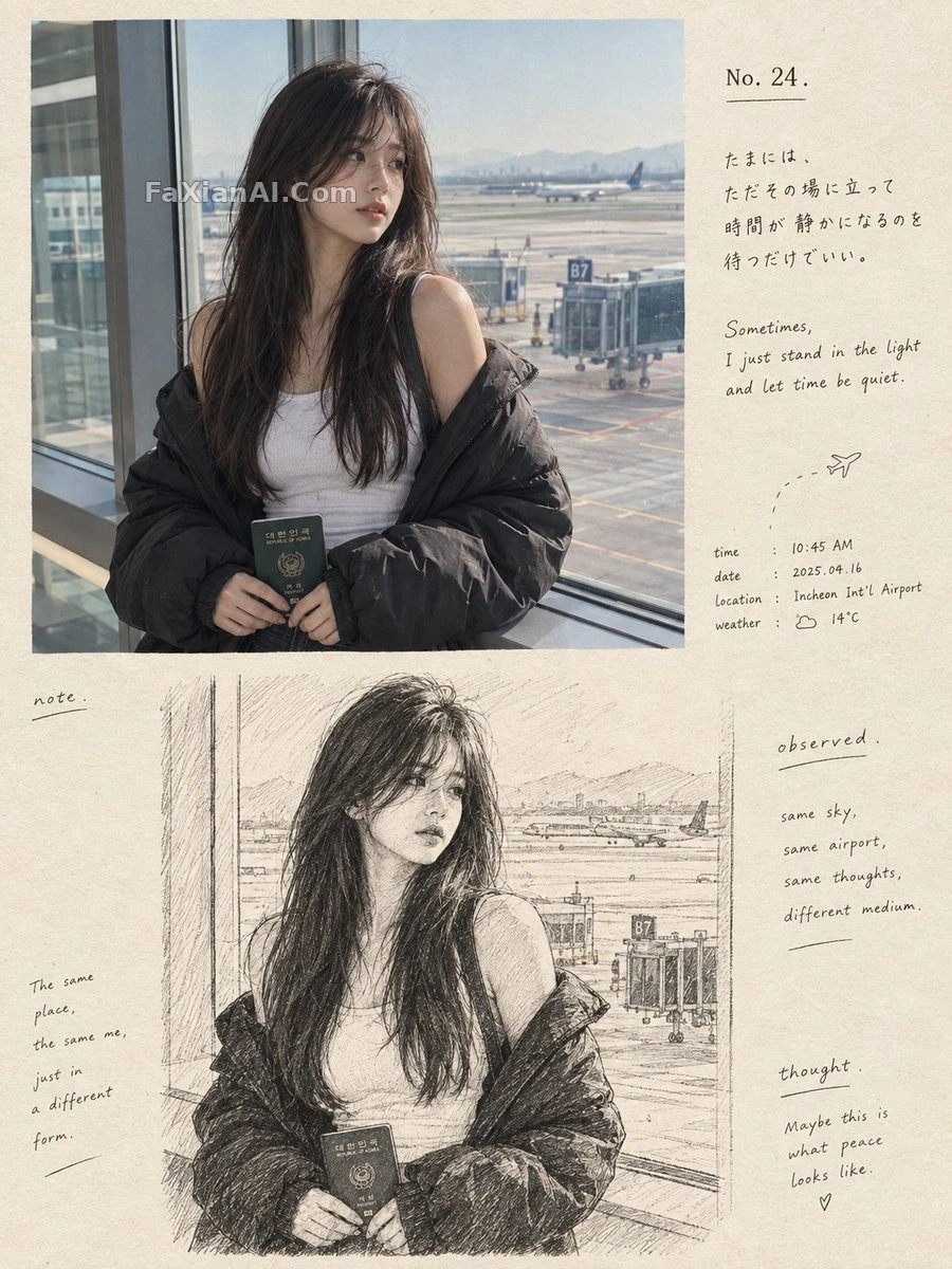
The top half is a snapshot, the bottom is an ink-line hand drawing of the same scene, with the beige margins crammed with handwritten notes.
✍️ The key phrase is 'convert as is': the bottom half must be the same person, pose and composition as the top, or the side-by-side doesn't hold (otherwise it's two images forced together, which is what you do at deadline). Don't fill the beige margins with too much small text, since the whitespace is what makes it feel like a page.
📋 Prompt Natural Language2204 characters
Format: a portrait 3:4 artbook spread, upscale and wistful, set in two stacked halves, a photograph above and an ink drawing below. Heroine: a young East Asian woman at an airport terminal.
Upper half. Hyper-real, unposed photo. She waits next to an enormous terminal window, wearing a snug sleeveless white top; over it a black puffer jacket droops carelessly down off both shoulders. Her dark-brown hair is long and drapes naturally on one side. Low by her waist, both hands softly hold a passport from Korea, dark green in color. She looks unhurried. Face turned away to the side, she gazes dreamily at the runway outside.
Backdrop: lifelike airport architecture, panes of glass, the runway, painted ground lines, a boarding gate, so the scene feels like real travel. Illumination: mellow natural daylight coming through the window. Details to include: faint film grain, true skin texture, authentic colors, a shallow depth of field, an up-close candid-camera intimacy.
Lower half. Take that identical woman, the same clothes, same stance, same airport and same framing, and re-render her as a loose, richly detailed black-and-white ink drawing made by hand on warm cream paper with texture. Strokes are expressive and imperfect; add delicate cross-hatching and subtle shading from the sketch. Anatomy is true to life. The vibe: a handmade visual diary with a Japanese-inspired sensibility.
Typography goes into the cream negative space around the artwork, elegant and minimalist, in editorial taste:
- a small “No. 24.” as title
- subtle text imitating Japanese handwriting
- a short poetic caption reading “Sometimes, I just stand in the light and let time be quiet.”
- tiny documentary-style notes covering time, date, location, weather
- understated words “note.”, “observed.” and “thought.” placed here and there
Mood and finish: a warm off-white paper texture, ink printing that is a touch imperfect, sophisticated contemporary photography-journal design, analog nostalgia, generous negative space, a cohesive transition from the realistic photograph to the sketch illustration, emotionally warm, highly detailed, premium artbook aesthetic. No watermark, no logos, vertical 3:4 aspect ratio.