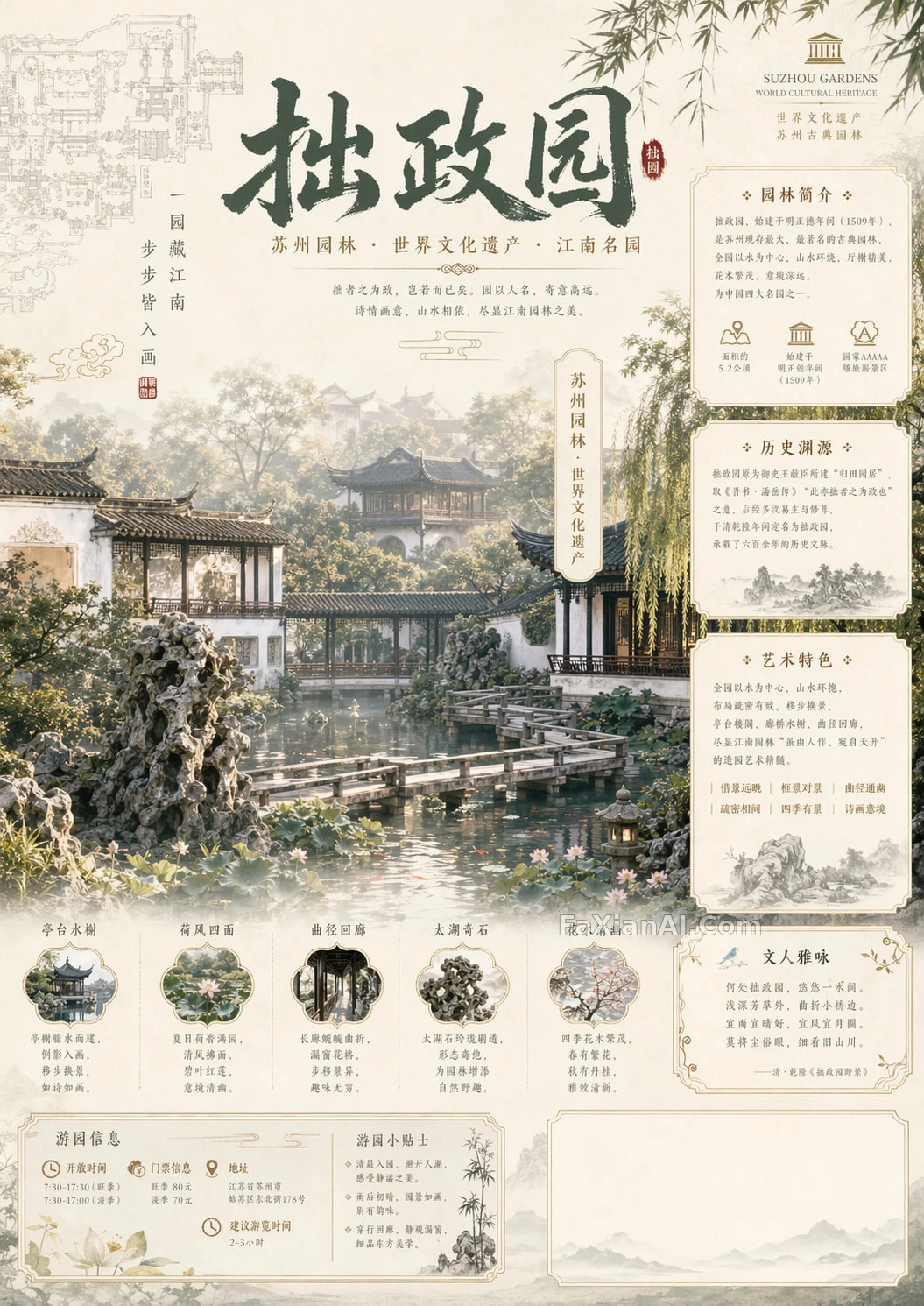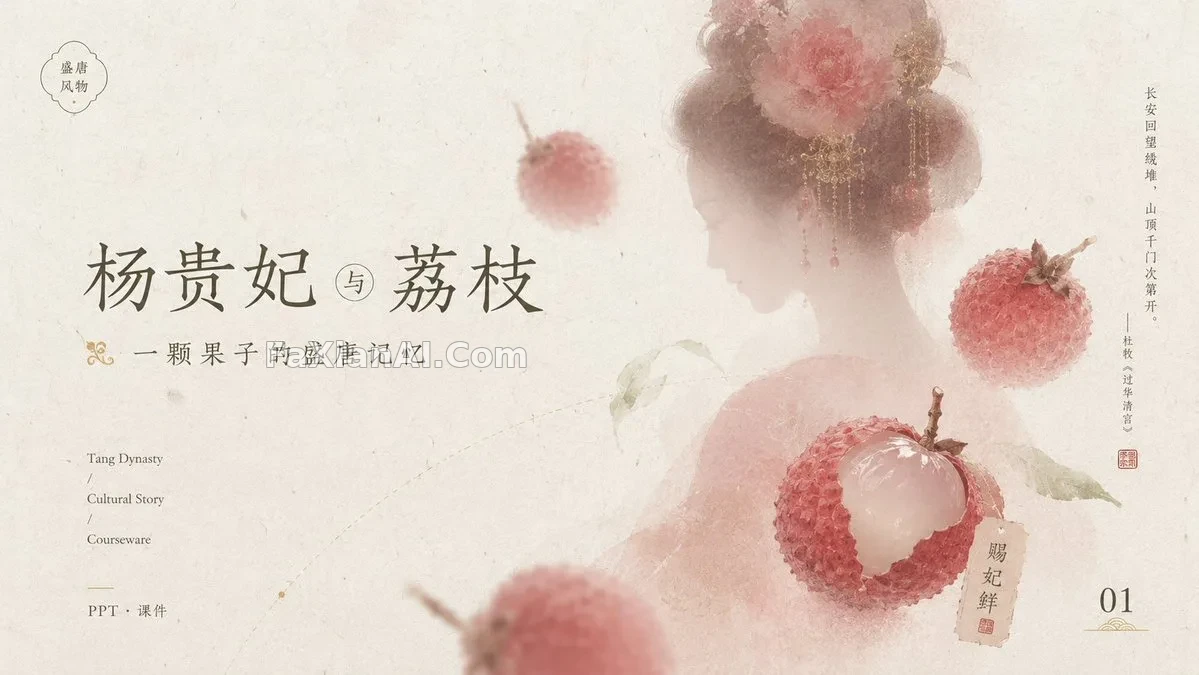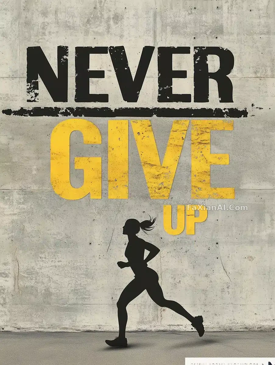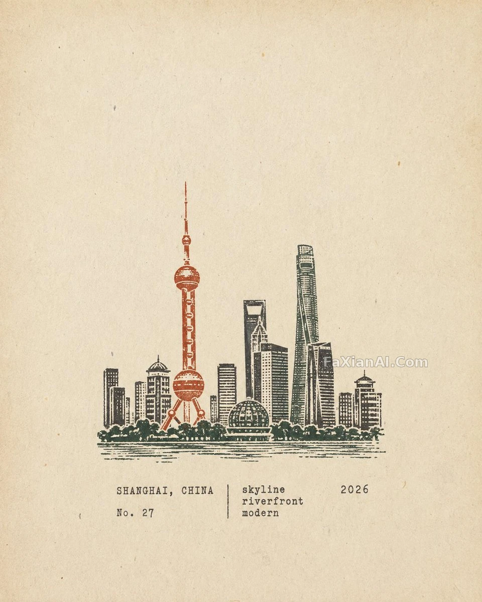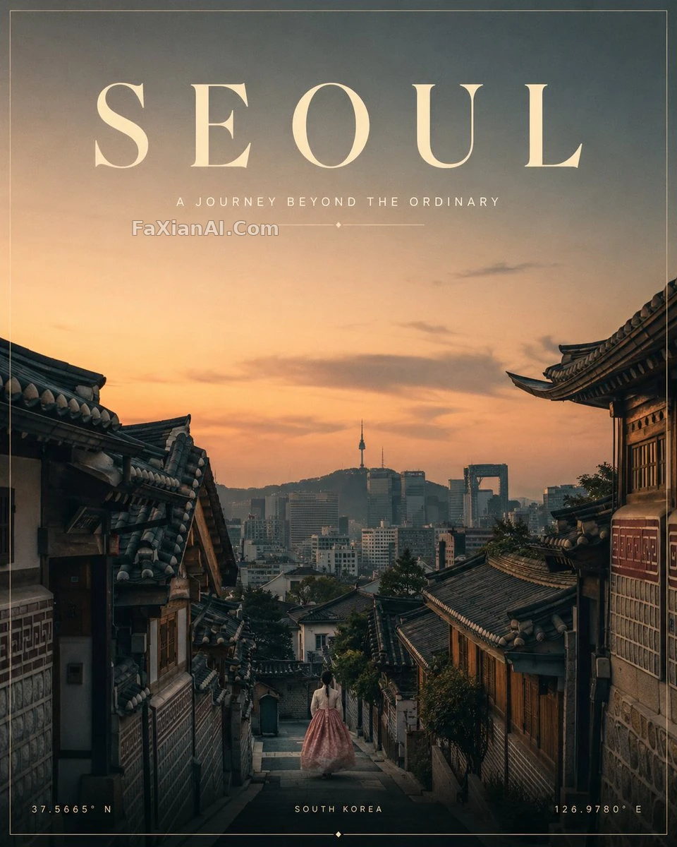
極簡旅行海報,色板剋制到只剩四色
地標一個焦點,配色不超四種,這種剋制感印出來才不會翻車。
✍️ 留白多的構圖最考驗印刷——負空間大,色差和髒點在紙面上比螢幕上明顯得多。2到4色的剋制配色說白了就是少踩色彩管理的坑,出血位和排版留量該留還得留。
📋 提示詞 自然語言1757 字元
Design a premium cinematic minimalist travel poster for [LOCATION], strict 4:5 vertical aspect ratio, with the scene automatically adapted to that destination's authentic geography, architecture, culture, climate, history, natural landmarks, colors and atmosphere.
Build the composition around one strong cinematic focal point -- the most iconic, visually defining view of [LOCATION] -- supported by subtle local details, in a sophisticated editorial layout with generous negative space, balanced geometry, atmospheric depth, refined perspective and minimal clutter. Every landmark, structure, terrain type, plant, person, garment and cultural element must be authentic to the place; never mix in unrelated regional styles.
Light the scene with cinematic natural light suited to the destination -- sunrise, sunset, blue hour, mist, tropical light, desert dusk, alpine daylight and the like -- and hold to a restrained 2-4 color palette drawn from the location, muted and sophisticated with natural contrast.
Set elegant Swiss/modern editorial typography reading [LOCATION] "A JOURNEY BEYOND THE ORDINARY", with optional small touches -- coordinates, fine-line borders, map motifs, or subtle editorial labels.
Render it as ultra-realistic cinematic travel photography for a premium destination campaign: 35mm aesthetic, realistic textures, atmospheric haze, soft film grain, sophisticated color grading, photorealistic yet minimalist. Mood: elegant, authentic, cinematic, aspirational, quietly luxurious. Avoid generic stock imagery, inaccurate cultural elements, mixed architecture, distorted landmarks, clutter, oversaturation, cheesy tourism graphics, excessive text, fake-looking people, CGI/plastic appearance, watermarks, logos, or misspelled text.
📋 中文譯寫版 自然語言
為[目的地]設計一張高階電影級極簡旅行海報,嚴格4:5豎版比例,場景自動依據該地真實的地理、建築、文化、氣候、歷史、自然地標、色彩與氛圍來適配。
圍繞一個強烈的電影級視覺焦點構建構圖——呈現[目的地]最具標誌性、最能代表其視覺特徵的一面——輔以恰當的本地細節,採用精緻的編輯級佈局,留出充足的負空間,幾何均衡,氛圍有層次,透視考究,畫面乾淨不雜亂。所有地標、建築、地形、植被、人物、服飾與文化元素都必須真實對應當地,絕不混入不相關的地域風格。
用契合目的地的電影級自然光——日出、日落、藍色時刻、薄霧、熱帶光、沙漠黃昏、高原日光等——並堅持一套剋制的2到4色調色盤,取自當地,色調低調精緻、自然對比。
加入優雅的瑞士風/現代編輯排版,文字為[目的地]“A JOURNEY BEYOND THE ORDINARY”,可選配小細節——座標、細線邊框、地圖元素或不顯眼的編輯級標籤。
以超寫實電影級旅行攝影的方式呈現,作為高階目的地宣傳:35mm美學,真實質感,大氣霧感,柔和膠片顆粒,精緻調色,照片級寫實卻依舊極簡。氛圍:優雅、真實、電影感、令人嚮往、低調奢華。避免通用相簿感、文化元素失真、建築混搭、地標變形、畫面雜亂、色彩過飽和、廉價旅遊海報感、文字過多、人物失真、CGI塑膠感、水印、логo或拼寫錯誤。