關於這座拱門,先說清三個材質
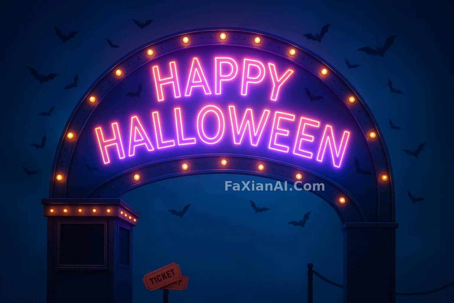
字是鐳射寫的,燈是暖琥珀的,負空間留給標題——三件事分開說才準確。
✍️ 這張的邊界很清楚:霧幕負責柔,金屬負責脆。冷調打光和暖色燈泡不是矛盾,是刻意的兩套色溫並置,才撐出那圈夜景輪廓光。
📋 提示詞 自然語言1189 字元
A 3:2 horizontal, eye-level composition, centered on a carnival entry arch that spells out 'HAPPY HALLOWEEN' in mid-air on a fine fog screen — the phrase rendered by laser split-beams that trace crisp strokes and bloom softly at their edges, playful with a slight eerie undertone. Generous negative space above the arch leaves a clear sky and copy-safe area.
Materials read as photoreal, staged-advertising craft: the uprights are perforated metal with visible rivets and a matte finish, cabochon bulbs dotting the arch with tiny points of sparkle, and confetti bats fluttering through the air catching those highlights. A small, unlettered ticket-booth marquee sits below-left, clean and ready for headline placement, with a couple of paper tickets and a rope barrier as supporting props.
Focus reads near-to-mid distance at moderate depth: the fog screen stays slightly soft while the metal and bulbs stay crisp. Lighting follows a cool, low-contrast grade with calm separation and a cool night outline glow for depth. Color leans neon and futuristic — neon orange accents, electric purple mid-tones, cyan highlights, near-black shadows, neon magenta glints, and warm amber bulb tones.
📋 中文譯寫版 自然語言
這是一張3:2橫幅、平視視角的構圖,畫面中心是一座嘉年華入口拱門,“HAPPY HALLOWEEN”幾個字懸浮在半空的霧幕上——用鐳射分束勾出筆畫,筆觸清晰,邊緣柔和暈開,氣氛帶點俏皮,也帶點詭異。拱門上方留出大片負空間,保留乾淨的天空與預留文案的安全區。
材質呈現為寫實的商業廣告級手法:立柱是帶鉚釘痕跡的穿孔金屬,啞光質感,弧面小燈泡點綴在拱門上閃著細碎光點,紙質蝙蝠彩紙在空中飄飛,接住那些高光。畫面左下方是一塊小小的售票亭招牌,乾淨無字,留給標題使用,配幾張紙質門票和一道攔繩作為陪襯道具。
焦點落在中近景,景深適中:霧幕略虛,金屬和燈泡保持銳利。燈光走冷調低對比的調性,分離感剋制,配一圈冷調夜景輪廓光強化縱深。色彩偏向霓虹未來感——霓虹橙色點綴、電紫色中間調、青色高光、近黑色陰影、霓虹品紅微光,還有暖琥珀色的燈泡色調。