線描配色塊,留白留得有態度
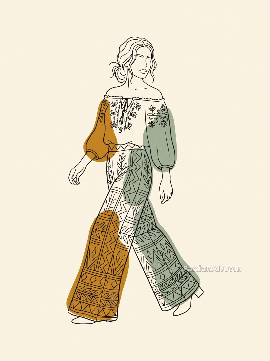
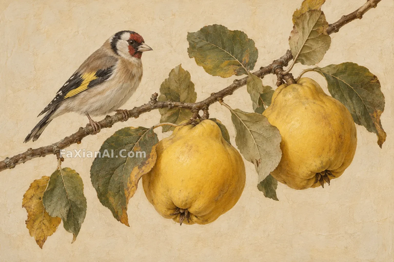
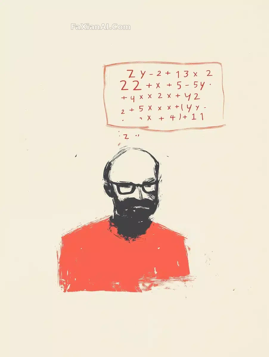
輪廓線勾人,色塊砸得準,留白的地方才是真講究。
✍️ 能換的只有[SUBJECT],線描的密度和色塊的位置才是這張圖立住的關鍵——多一塊顏色就膩,少一筆線條就散。這套該畫的畫滿、該留的留白的分寸感,換成人像插畫照樣能用。
📋 提示詞 自然語言
On a plain white background, [SUBJECT] takes shape through delicate contour drawing paired with one or two bold solid-color shapes -- a contemporary art-magazine aesthetic built on restraint. Certain areas are left intentionally unfinished, holding a refined balance between rendered detail and open emptiness.
📋 中文譯寫版 自然語言
畫面在純白背景上展開,[SUBJECT]的輪廓靠細膩的線描與一兩塊大膽的純色色塊勾勒而成——這是一種剋制感十足的當代藝術雜誌美學。部分割槽域刻意留白未完成,讓細節的刻畫與畫面的空白之間保持精緻的平衡。