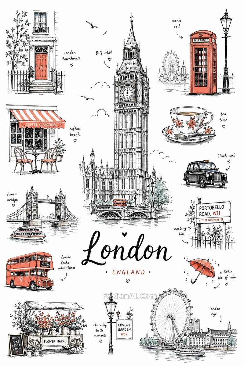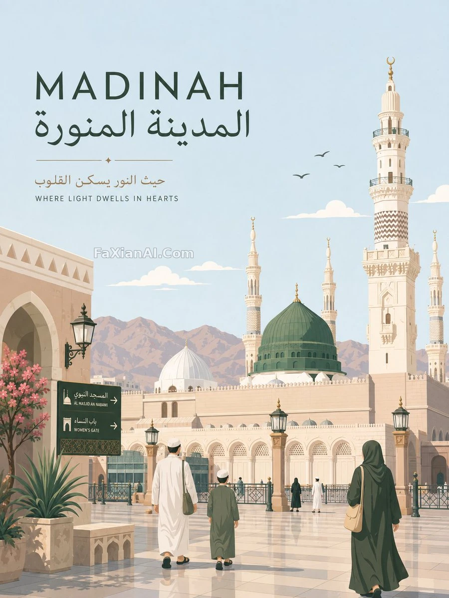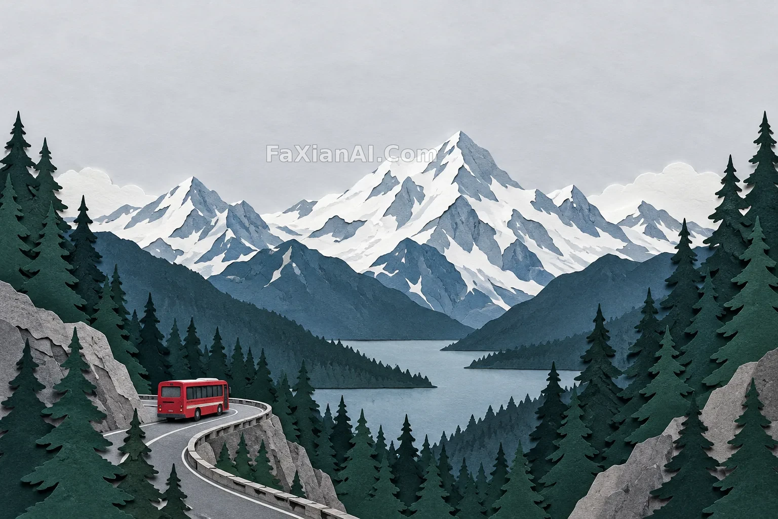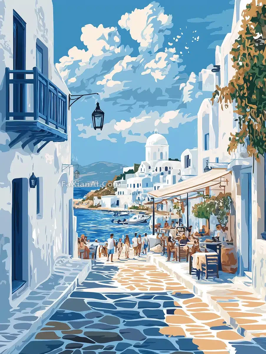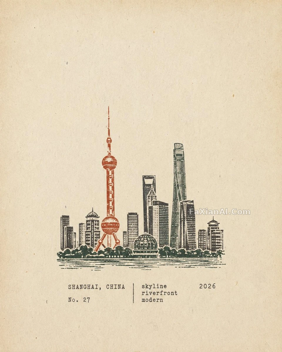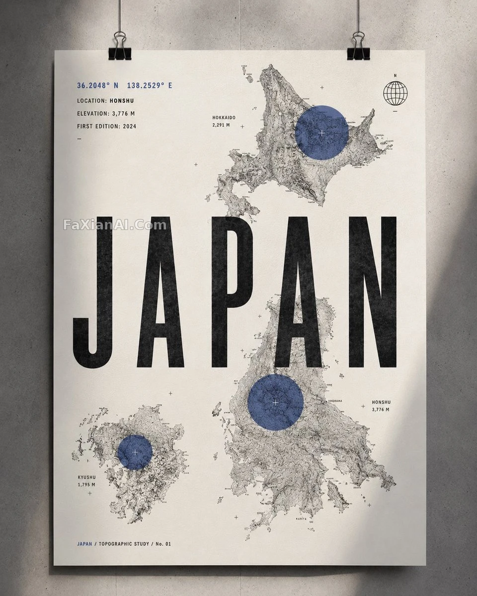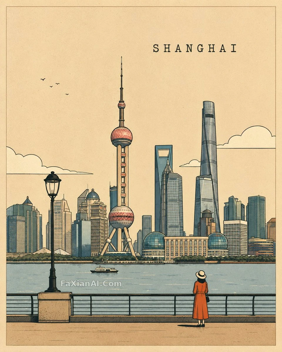
4:5鎖死,不接受別的比例
居中對稱構圖圍繞地標展開,黑色手繪輪廓配幾何簡化形狀。
✍️ 限定色板[COLOR_PALETTE]是唯一的可變材質引數,其餘描邊粗細、留白比例全是固定值。比例鎖在4:5不接受別的,這條比選什麼地標更硬。
📋 提示詞 自然語言1113 字元
Around the destination's most iconic landmark, landscape, or cultural feature — adapting naturally to wherever [PLACE] is — build a centered, balanced composition for a premium minimalist illustrated travel poster, strict 4:5 vertical, no other ratio. Strong black hand-drawn outlines carry the scene, paired with simplified geometric shapes, a refined limited [COLOR_PALETTE], subtle paper grain, and clean flat color fills; a clear horizon line and atmospheric depth sit behind a few tiny human figures or local details added purely for scale and character. The look blends a vintage travel-poster spirit with modern editorial illustration — elegant, playful, sophisticated, instantly recognizable — while negative space stays generous, the visual hierarchy clean, edges crisp, detail restrained, and the overall feel handcrafted like a printed poster. Skip clutter, photorealism, heavy gradients, and anything unnecessary. Set "PLACE_NAME" in uppercase, simple typewriter-style lettering, tucked subtly into the composition without overpowering the art. Strict 4:5 vertical composition — no other aspect ratio.
📋 中文譯寫版 自然語言
圍繞該目的地最具標誌性的地標、景觀或文化特色,構建一幅居中均衡的高階極簡插畫旅行海報,主題為[PLACE],並自然適應該地點的特點,嚴格4:5豎版——不接受其他比例。使用粗實的黑色手繪輪廓、簡化的幾何形狀、精煉剋制的[COLOR_PALETTE]配色、細膩紙張紋理與乾淨的平塗色彩,加入清晰的地平線、富有層次的空氣透視感,以及幾個微小的人物或當地細節用來表現比例與地域特色。將復古旅行海報美學與現代編輯插畫相融合——優雅、俏皮、精緻且極具辨識度,同時保持充裕留白、清晰視覺層次、利落邊緣、剋制細節與手工印刷海報質感。避免雜亂、照片寫實、過多漸變與不必要元素。用簡潔的打字機風格字型,以全大寫形式設定"PLACE_NAME",位置低調融入構圖,不壓過主體畫面。嚴格4:5豎版構圖——不接受其他比例。