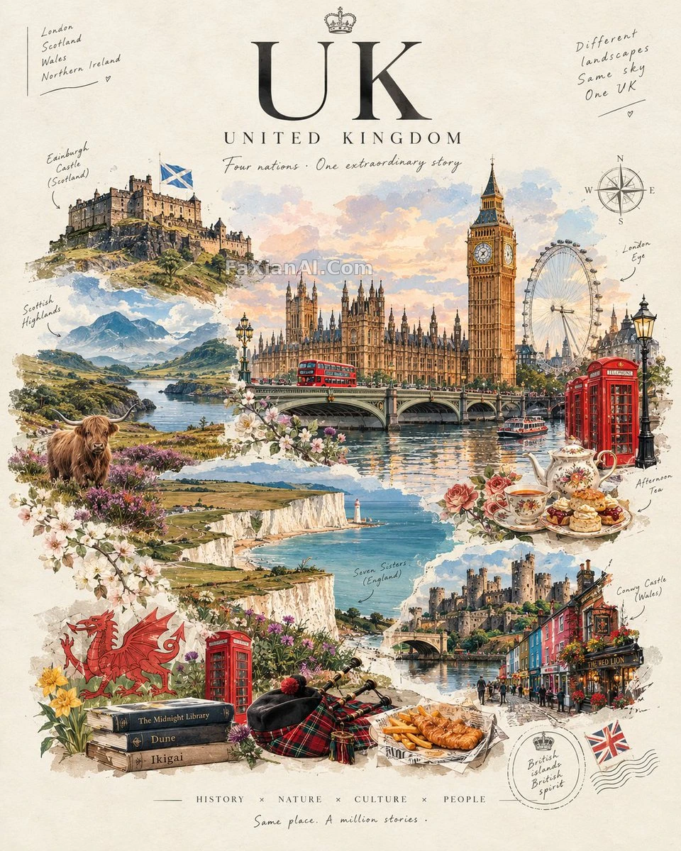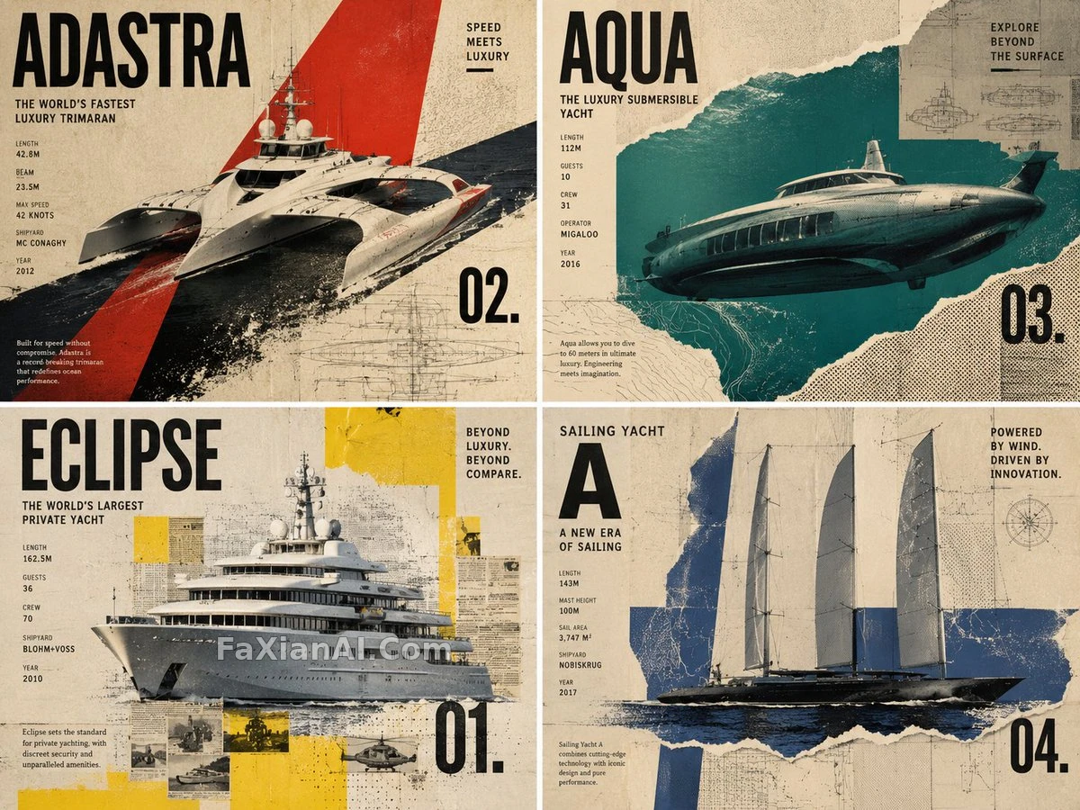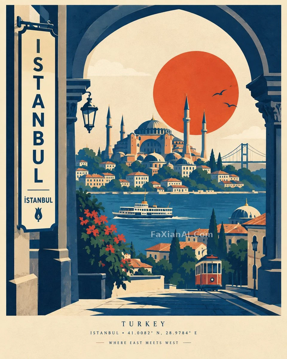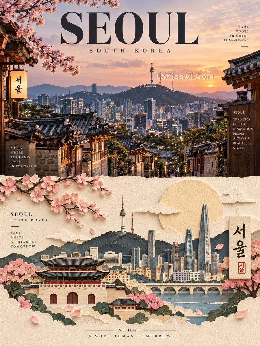
構圖鎖死的系列旅行海報模板
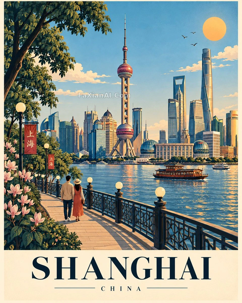
換地點不換骨架:左側植被、弧形步道、中央地標,底部留奶油色字板。
✍️ 末尾那串用圓點串起來的“構圖鎖定”清單,是系列化的真正鑰匙,它讓模型把前面的長段落壓縮成一行不許動的骨架。想出系列圖,先把可變數(地標)與不變數(位置關係)分家,再往裡填。
📋 提示詞 YAML 分段式2624 字元
Make a premium illustrated travel poster of [LOCATION] in an exact 4:5 vertical format. It belongs to a cohesive global poster series, so the composition stays fixed for every destination; only the landmarks, architecture, landscape, vegetation and cultural details change.
COMPOSITION
The illustration fills 82–85% of the sheet, and the bottom is reserved for a warm cream typography panel.
- Dense vegetation frames the left edge, with one tall natural anchor in the upper-left.
- A curved promenade sweeps from the lower-left toward the center, with globe lamps, dark decorative railing and a small strolling couple.
- A broad water or open-space field fills the lower-middle; use authentic boats where appropriate.
- The single most iconic landmark of [LOCATION] is the central hero, with the clearest silhouette and strongest focus.
- One major horizontal landmark sits behind or beside it for balance.
- Behind them, a simplified layered local skyline or landscape built from 6–12 major forms.
- One distinctive tall local landmark near the upper-center acts as a vertical counterweight.
- The upper sky stays open, bright and uncluttered, with 2–4 soft clouds, a few birds and a warm sun in the upper-right.
VISUAL FLOW
Vegetation → promenade/couple → water/open space → central landmark → horizontal landmark → sky/sun → typography. Secondary elements must never compete with the hero.
STYLE
A sophisticated, contemporary travel-poster illustration: clean vector shapes with a subtle gouache or screen-print texture, crisp dark-navy outlines, softly shaded color blocks and slight organic imperfection, with a refined editorial feel and premium collectible quality. No photorealism, 3D, CGI, glossy rendering or generic clip-art.
COLOR
A harmonious, destination-specific palette of dark navy outlines, natural greens, cool environmental tones, warm architectural tones and one restrained warm accent.
AUTHENTICITY
Use only genuinely recognizable features of [LOCATION]. Favor iconic silhouettes and accuracy over excess detail, and do not invent landmarks.
TYPOGRAPHY
In the bottom cream panel:
[LOCATION] — large, elegant uppercase serif
a thin horizontal rule
[COUNTRY / REGION] — small, widely spaced uppercase text.
COMPOSITION LOCK
4:5 • left vegetation • upper-left anchor • curved promenade • couple • globe lamps • railing • lower-middle water/open space • central hero • horizontal anchor • layered background • upper-center vertical counterweight • open sky • upper-right sun • bottom typography.
Hold this structure identical for every destination: adapt the content, never the composition.
📋 中文譯寫版 自然語言920 字元
為[LOCATION]製作一張精緻的插畫旅行海報,畫幅嚴格為4:5豎版。它屬於一個統一的全球海報系列,因此每個目的地的構圖保持固定,只替換地標、建築、地貌、植被和文化細節。
構圖
插畫佔畫面的82–85%,底部留給一塊暖奶油色的文字面板。
- 左側邊緣用茂密植被構成框景,左上方有一棵高大的自然錨點。
- 一條弧形步道從左下向中央延伸,配球形路燈、深色裝飾欄杆和一對漫步的小情侶。
- 下方中部是一片開闊的水面或空地;合適時放入真實的船隻。
- [LOCATION]最具標誌性的單一地標作為中央主角,輪廓最清晰,視覺重心最強。
- 在它身後或身旁放一座主要的橫向地標以求平衡。
- 後方是由6–12個主要形體構成的簡化層疊式當地天際線或景觀。
- 畫面上方中部放一座有特色的當地高聳地標,作為豎向的配重。
- 上方天空保持開闊、明亮、不雜亂,有2–4朵柔和的雲、幾隻鳥,右上角有一輪溫暖的太陽。
視覺動線
植被 → 步道/情侶 → 水面/空地 → 中央地標 → 橫向地標 → 天空/太陽 → 文字。次要元素絕不能與主角爭奪視線。
風格
精緻的當代旅行海報插畫:乾淨的向量形狀,帶淡淡的水粉或絲網印刷質感,深海軍藍的利落輪廓線,色塊柔和漸變,略帶有機的不完美,編輯感考究,具有高階收藏品質。不要照片寫實、3D、CGI、光滑渲染或千篇一律的剪貼畫。
色彩
和諧的目的地專屬配色:深海軍藍輪廓線、自然綠、冷調環境色、暖調建築色,以及一個剋制的暖色點綴。
真實性
只使用[LOCATION]真正可辨認的特徵。優先保證標誌性輪廓和準確性,而不是過多的細節,不要虛構地標。
字型排印
底部奶油色面板中:
[LOCATION] —— 大號、優雅的大寫襯線字型
一條細橫線
[COUNTRY / REGION] —— 小號、字距寬的大寫文字。
構圖鎖定
4:5 • 左側植被 • 左上錨點 • 弧形步道 • 情侶 • 球形路燈 • 欄杆 • 下方中部水面/空地 • 中央主角 • 橫向錨點 • 層疊背景 • 上方中部豎向配重 • 開闊天空 • 右上角太陽 • 底部文字。
對每個目的地保持這一結構完全一致:替換內容,不改構圖。