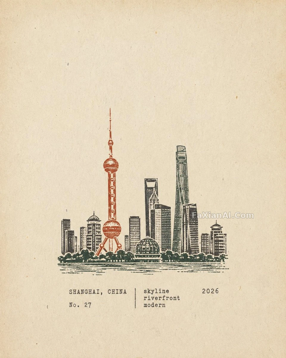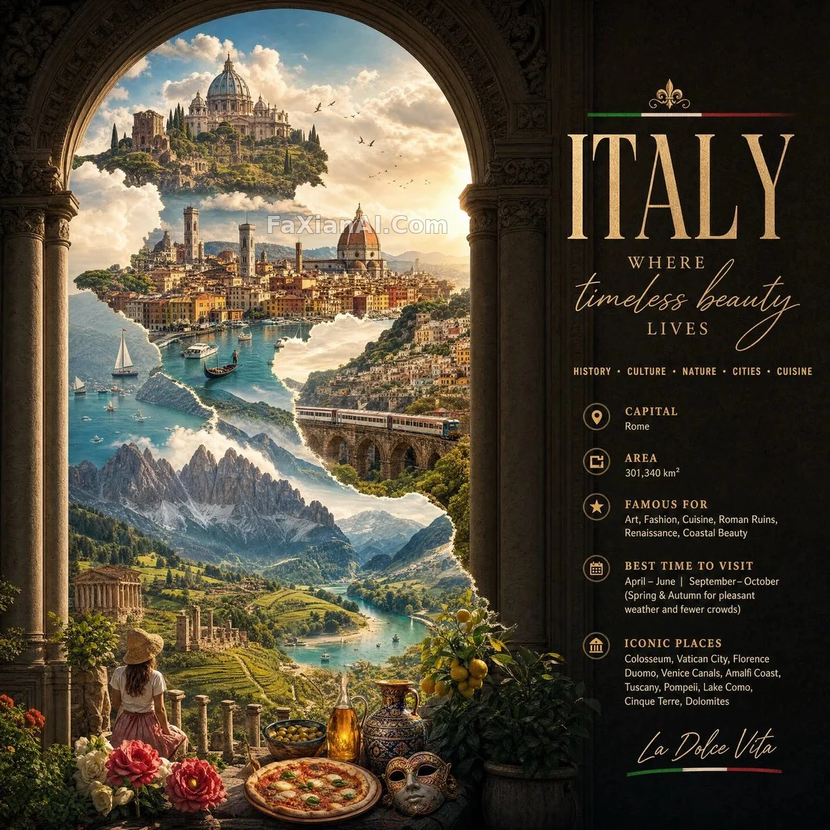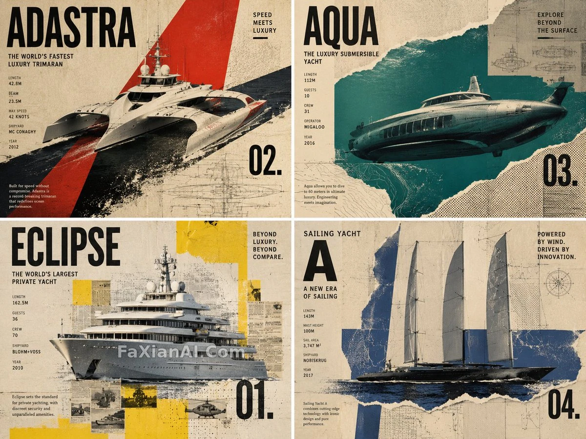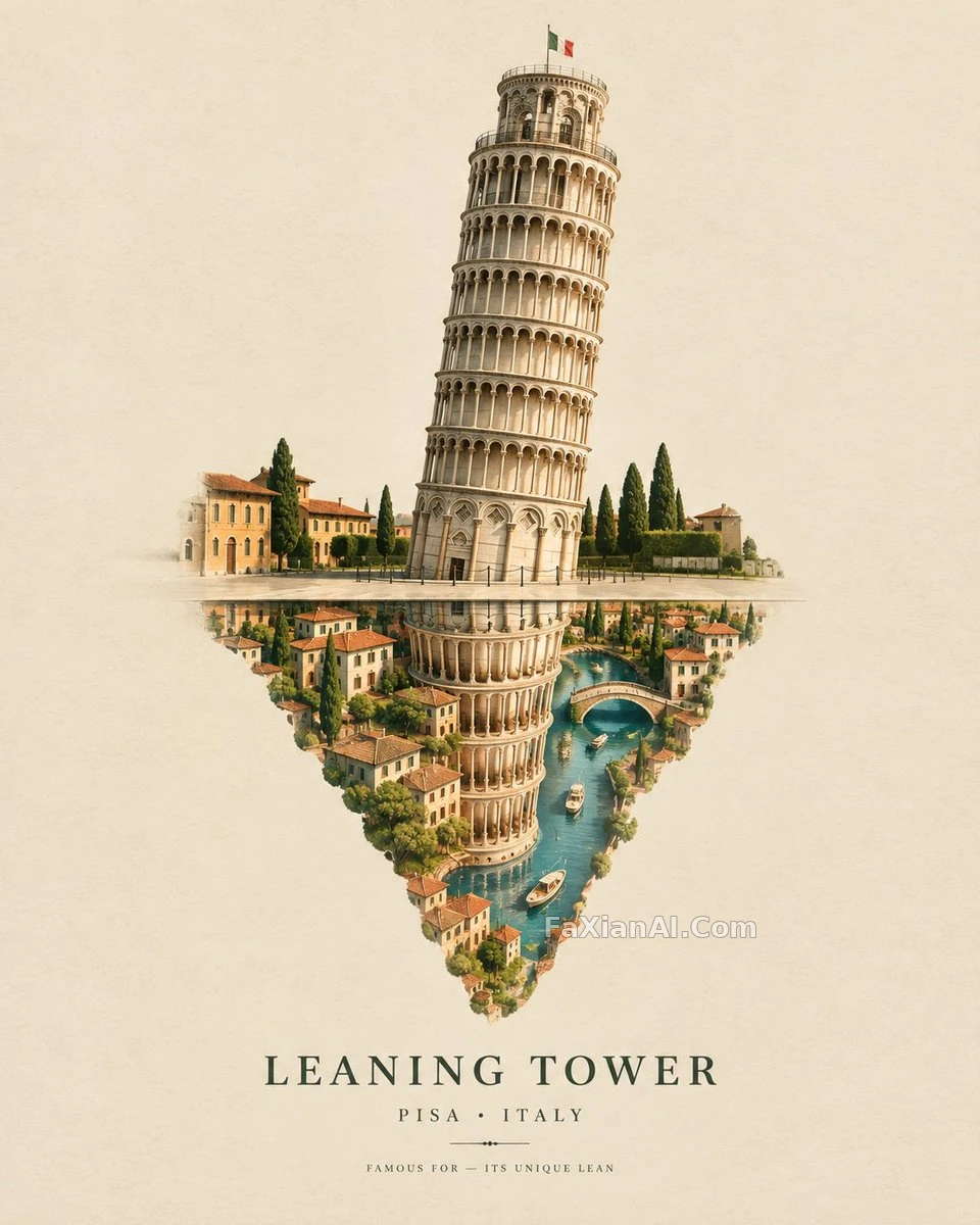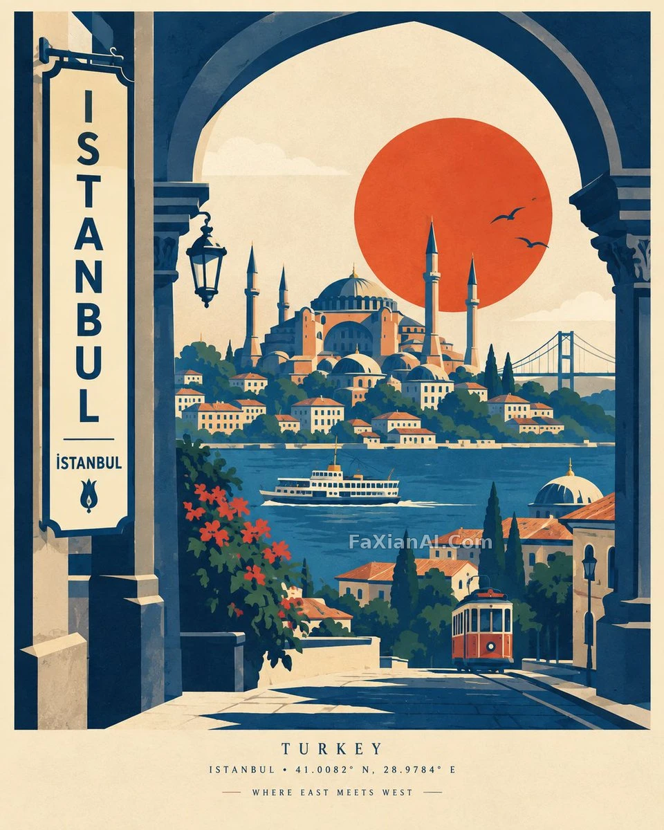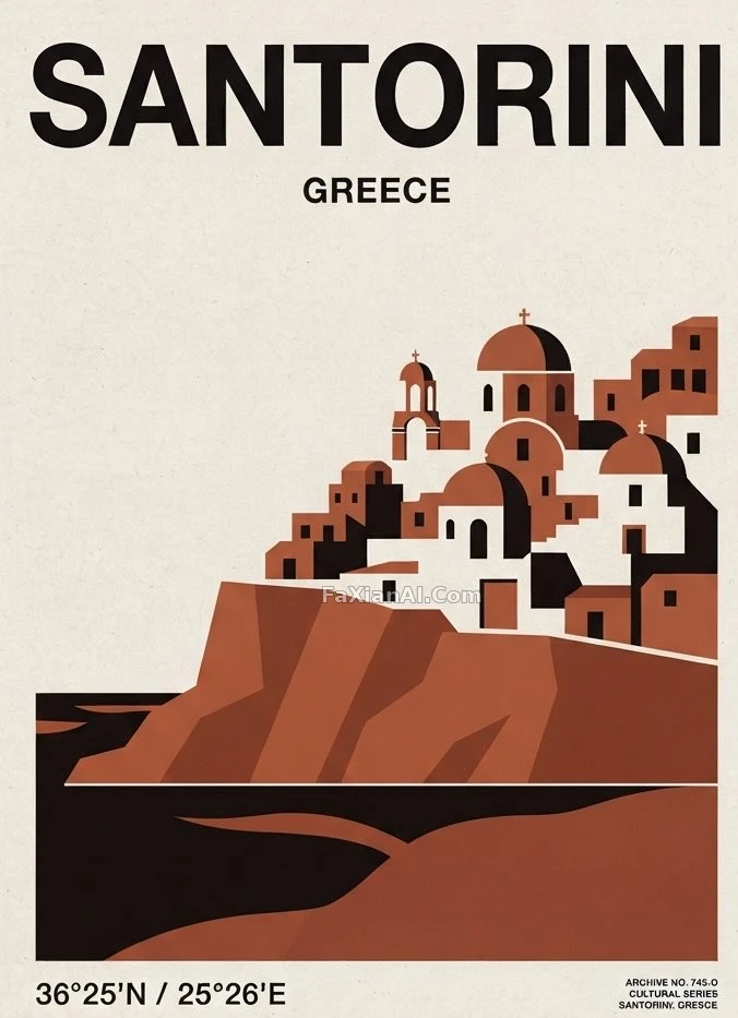
地標被拆成幾塊幾何形狀貼出來
連檔案編號都配齊了,像真的從博物館檔案庫裡翻出來的。
✍️ 檔案編號和座標這兩個細節才是讓它像真檔案而不是插畫的關鍵,裝飾性反而最少。地標被砍成幾個幾何形狀,剩下的留白全讓位給色塊本身,這是瑞士風格的老辦法。
📋 提示詞 自然語言717 字元
A minimalist cultural travel poster for [CITY, COUNTRY], vertical 4:5. Rather than a realistic illustration, turn [ICONIC LANDMARK] into a bold graphic symbol built from a handful of elegant geometric shapes and architectural lines. Set it over a simplified, abstract read of the city — a river curve, a skyline, hills, streets, or coastline.
Background: warm ivory, carrying one dominant heritage color and deep black typography. Add an oversized “[CITY]”, a smaller “[COUNTRY]”, coordinates, and a tiny archival catalog number.
Aim for Swiss editorial design meeting a vintage European travel poster: sophisticated negative space, precise composition, a subtle paper texture, premium museum-grade graphic quality.
📋 中文譯寫版 自然語言
一張極簡主義文化旅遊海報,主題[CITY, COUNTRY],豎版4:5。不用寫實插畫,而是把[ICONIC LANDMARK](標誌性地標)轉化成由幾處優雅幾何形狀和建築線條構成的大膽圖形符號。再把它疊在城市的簡化抽象表現上——河流曲線、天際線、山丘、街道或海岸線。
背景:暖象牙色,帶一種主導的傳承色調,配深黑色字型。加一個超大的"[CITY]",一個小一些的"[COUNTRY]",座標數字,以及一個微小的檔案編號。
整體追求瑞士編輯設計風格撞上覆古歐洲旅行海報:精緻的留白,精確的構圖,淡淡的紙張質感,博物館級別的圖形品質。