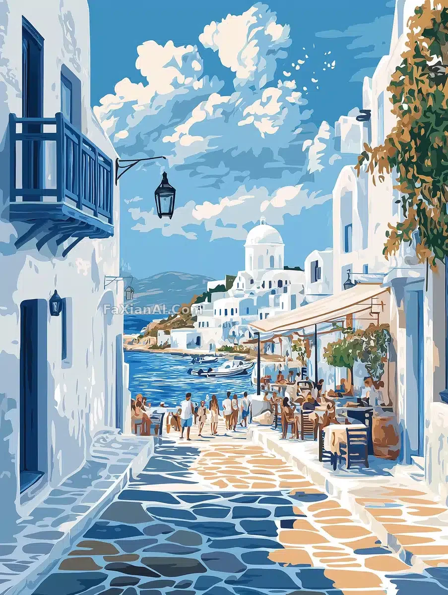
帕羅斯海報,藍白配色整挺正
白房子藍邊兒,配色整挺地道,看著就想買機票。
✍️ 這條較真的地方是no flowers trees or vegetation,刪了這句海報邊上準得塞點綠植,反倒破壞那種乾淨的地中海調調。色板鎖死冷藍加沙色,別的暖色一律不許進。
📋 提示詞 自然語言
A travel poster illustration for Paros, Greece, built around its coastal charm and scenic beauty under a bright, crisp sky with a few scattered clouds. White-washed, blue-accented buildings frame the waterfront in classic Cycladic style, while locals stroll narrow alleyways, browse bustling markets, and linger at seaside cafés—capturing the island's lively, welcoming spirit. The design stays modern: clean lines, bold typography, and a cohesive palette of cool blues, sandy neutrals, and muted grays. No flowers, trees, or vegetation anywhere in frame.
📋 中文譯寫版 自然語言
一幅希臘帕羅斯島的旅行海報插畫,圍繞其海岸風情與秀麗景緻展開,天空明亮清澈,點綴著幾朵雲。白牆藍飾的經典基克拉迪風格建築環繞著海濱,當地人漫步在狹窄小巷、逛著熱鬧的集市、在海邊咖啡館流連——展現出小島生機勃勃、熱情好客的氛圍。設計風格保持現代感:線條簡潔、字型醒目,色調統一採用冷調藍色、沙質中性色與柔和灰色。畫面中不出現任何花卉、樹木或植被。