外灘變卡通,粉調地圖有梗
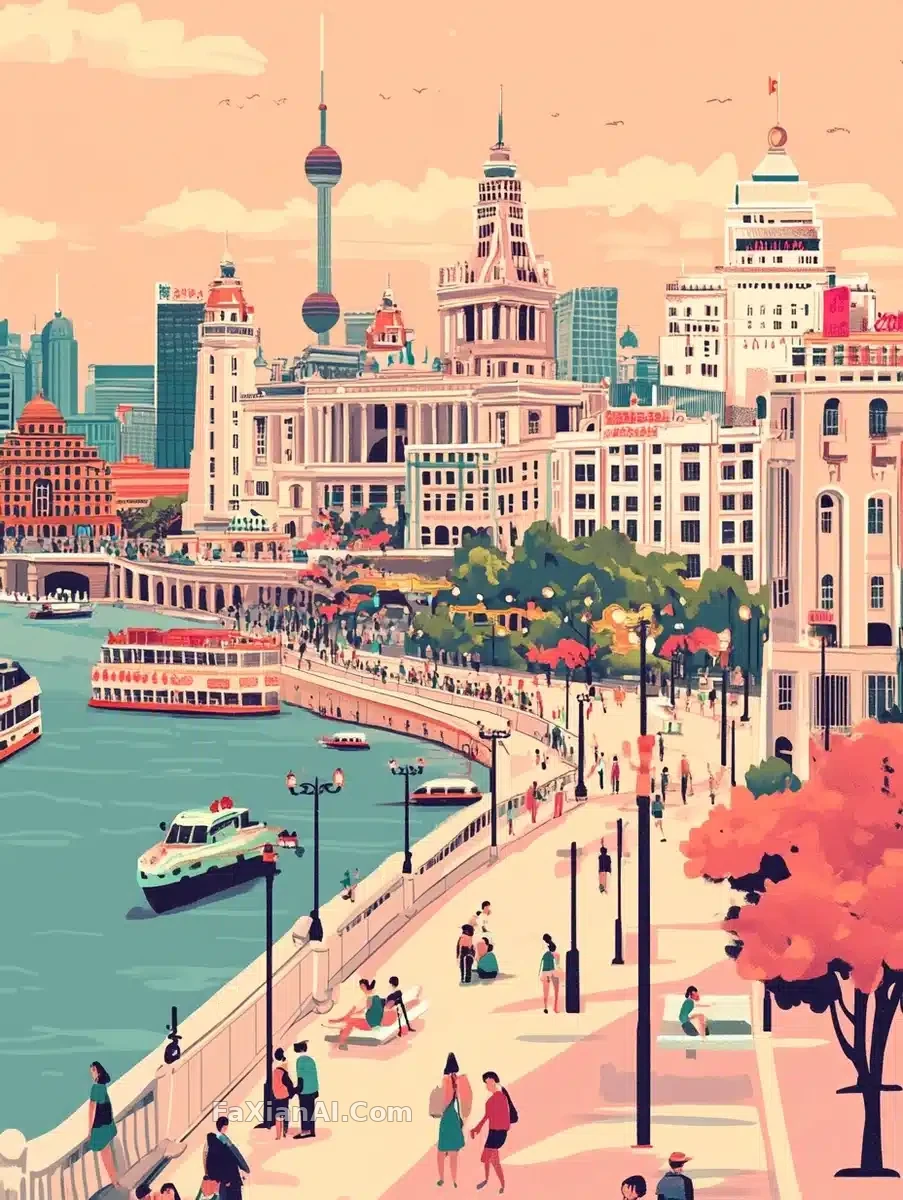
把地標畫成地圖,粉色調一壓,老建築瞬間變得好玩起來。
✍️ 文字要清楚可讀,這條靠clear fonts鎖死排版邏輯,不然地標堆一起就成了亂碼。粉色調是唯一的情緒開關,換成灰調整個基調就從可愛變嚴肅。
📋 提示詞 自然語言
A vibrant cartoon illustration of the Bund, packed with iconic landmarks, bustling streets, and vivid cultural symbols—retro Baroque architecture, people sunbathing on benches, and more. Laid out like an informational map, with clear typography spelling out 'Shanghai'. Rendered in cartoon style with high quality and complete detail, a light pink tone throughout, careful attention to architectural detail, and a high-resolution 250 style.
📋 中文譯寫版 自然語言
一幅色彩明快的外灘卡通插畫,畫面塞滿標誌性地標、熙攘街道和鮮活的文化符號——復古巴洛克建築、長椅上曬太陽的人們等等。整體佈局像一張資訊地圖,清晰的字型拼出'Shanghai'字樣。以卡通風格呈現,畫質高、細節完整,通篇採用淺粉色調,對建築細節精心刻畫,呈現250風格的高解析度效果。