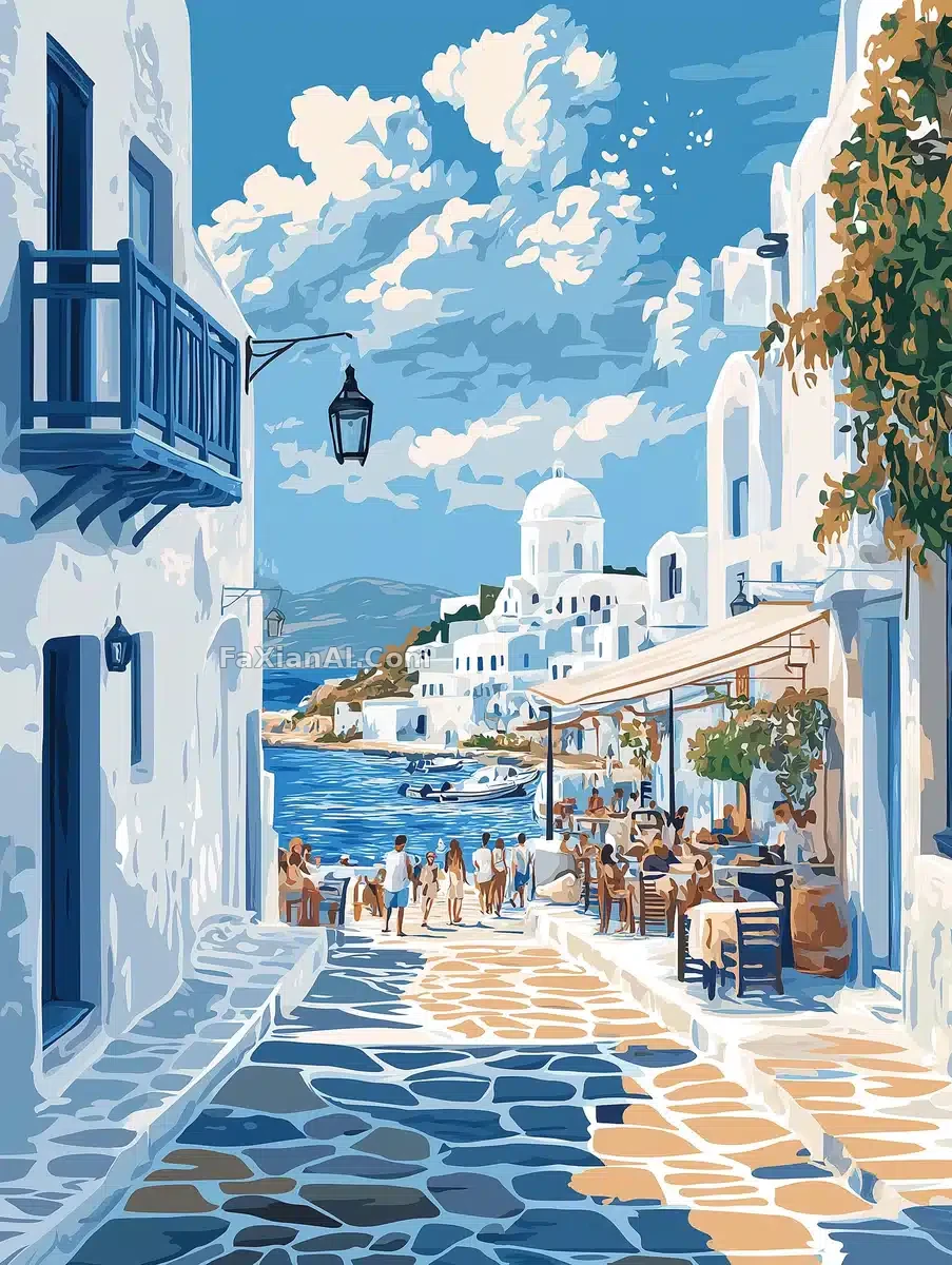
帕罗斯海报,蓝白配色整挺正
白房子蓝边儿,配色整挺地道,看着就想买机票。
✍️ 这条较真的地方是no flowers trees or vegetation,删了这句海报边上准得塞点绿植,反倒破坏那种干净的地中海调调。色板锁死冷蓝加沙色,别的暖色一律不许进。
📋 提示词 自然语言
A travel poster illustration for Paros, Greece, built around its coastal charm and scenic beauty under a bright, crisp sky with a few scattered clouds. White-washed, blue-accented buildings frame the waterfront in classic Cycladic style, while locals stroll narrow alleyways, browse bustling markets, and linger at seaside cafés—capturing the island's lively, welcoming spirit. The design stays modern: clean lines, bold typography, and a cohesive palette of cool blues, sandy neutrals, and muted grays. No flowers, trees, or vegetation anywhere in frame.
📋 中文译写版 自然语言
一幅希腊帕罗斯岛的旅行海报插画,围绕其海岸风情与秀丽景致展开,天空明亮清澈,点缀着几朵云。白墙蓝饰的经典基克拉迪风格建筑环绕着海滨,当地人漫步在狭窄小巷、逛着热闹的集市、在海边咖啡馆流连——展现出小岛生机勃勃、热情好客的氛围。设计风格保持现代感:线条简洁、字体醒目,色调统一采用冷调蓝色、沙质中性色与柔和灰色。画面中不出现任何花卉、树木或植被。