三色等距城市海报模板
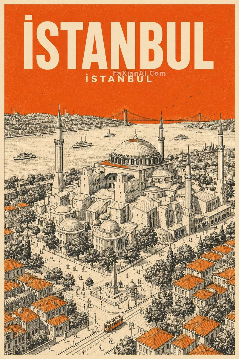
奶油纸、黑线稿加一个强调色,等距鸟瞰的复古旅行海报。
✍️ “三色+无渐变”是这类海报能稳住的原因,限制越死,每次换城市的版面越统一。强调色大面积铺天空,是让建筑线稿保持黑白的小心机。做系列时只换三处变量,一套模板能出一整面墙。
📋 提示词 自然语言611 字符
Mid-century travel poster, vertical format, with [landmark: [LANDMARK]] of [city: [CITY NAME]] as the hero. Typography first: the name "[city: [CITY NAME]]" sits at the top in bold cream sans-serif, with its local-language rendition set smaller in cream directly beneath. Visual language: minimalist isometric bird's-eye view, ultra-fine hatching, screen-print grain. Hold to a strict three-color palette of cream paper, black technical linework and [accent color: [COLOR]], where the accent fills the entire sky as one flat solid tone and appears again in tiny touches on roofs or streets, never as a gradient.
📋 中文译写版 自然语言
设计一张竖版的二十世纪中叶复古旅行海报,主题是[city: [CITY NAME]]的[landmark: [LANDMARK]]。配色严格限定三色:奶油色纸张、黑色技术线稿、[accent color: [COLOR]]。风格:极简等距鸟瞰视角,超细排线,丝网印刷质感。整片天空用纯色平涂的[accent color: [COLOR]],屋顶或街道上可点缀少量同色,全程不用渐变。文字:顶部用粗体无衬线奶油色写“[city: [CITY NAME]]”,下方用更小的奶油色字写出当地语言的城市名。