国家不靠地标,靠等高线
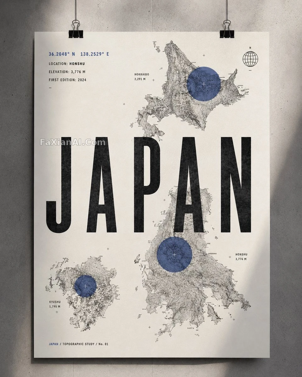
2到3块地形等高线拼贴,压一个圆形定位点,中央压着国家大字。
✍️ 等高线密度是唯一的技术门槛——线条稀疏就露怯,必须密到成为画面主纹理。强调色只留给那个圆形定位点,黑白灰占了九成画面,这个比例不能倒。
📋 提示词 自然语言2162 字符
Represent [COUNTRY] through its topography, coordinates, and geographic identity rather than landmarks or tourist imagery, in a sophisticated 4:5 vertical contemporary country art print inspired by Swiss graphic design, topographic maps, modern editorial posters, and premium outdoor cartography. Start from a clean warm-white / very light ivory paper background with subtle tactile grain, then arrange 2–3 cropped sections of highly detailed black-and-gray topographic contour maps representing important geographic regions of [COUNTRY] asymmetrically across it, leaving generous white space. Place one large translucent circular accent over the most significant geographic location — it should read as a modern cartographic location marker rather than an ordinary map pin. Across the center, set an enormous bold condensed sans-serif title, [COUNTRY], partially overlapping the contour maps for a striking editorial composition. Around the poster, add small technical geographic information: [LATITUDE]° [LONGITUDE]°, LOCATION: [CITY / REGION], ELEVATION: [ELEVATION] M, FIRST EDITION: [YEAR]; tuck a tiny minimalist globe / compass / coordinate symbol into one corner, plus a very small secondary line reading [COUNTRY] / TOPOGRAPHIC STUDY / No. 01. Keep the palette mostly black, white, and soft gray with one bold muted accent color — deep red, burnt orange, forest green, cobalt blue, or ochre — reserved only for the circular geographic markers. Design language: Swiss International Typographic Style × contemporary cartography × vintage topographic survey × minimalist editorial design × luxury outdoor magazine. The contour lines must stay dense, organic, geographically believable, and beautifully detailed, becoming the artwork's main visual texture. No flags, no tourist landmarks, no illustrations, no photographs, no decorative borders, no excessive text, no gradients, no clutter. Mood: intelligent, geographic, modern, adventurous, architectural, collectible, premium. Present the final print as a clean gallery/product photograph, pinned or hanging against a simple architectural wall, with soft directional lighting and a subtle natural shadow.
📋 中文译写版 自然语言706 字符
用地形、坐标与地理身份来呈现[COUNTRY],而不是地标或旅游意象,做成一幅精致的4:5竖版当代国家艺术海报,灵感来自瑞士平面设计、地形图、现代编辑海报与高端户外制图风格。从洁净暖白/极浅象牙色纸张背景开始,带细腻触感纹理,再不对称地排布2-3处裁切的黑灰地形等高线地图局部,代表[COUNTRY]的重要地理区域,留出充足留白。在最重要的地理位置上叠加一个大型半透明圆形强调元素——它应呈现为现代制图式定位标记,而非普通地图图钉。画面中央放置一个巨大、粗体、压缩型无衬线主标题[COUNTRY],部分与等高线地图相互叠压,形成强烈的编辑式构图。海报周围添加小巧技术性地理信息:[LATITUDE]° [LONGITUDE]°、LOCATION: [CITY / REGION]、ELEVATION: [ELEVATION] M、FIRST EDITION: [YEAR];角落嵌入一个极简小巧的地球仪/指南针/坐标符号,再加一行很小的辅助文字[COUNTRY] / TOPOGRAPHIC STUDY / No. 01。配色以黑、白、柔灰为主,搭配一种大胆而克制的强调色——深红、烧橙、森林绿、钴蓝或赭石,只用在圆形地理标记上。设计语言:瑞士国际主义字体风格×当代制图×复古地形测绘×极简编辑设计×奢华户外杂志。等高线必须密集、有机、符合地理逻辑且极为细致,成为整幅作品的主视觉纹理。避免旗帜、旅游地标、插画、照片、装饰边框、过多文字、渐变、杂乱堆砌。整体情绪:理性、地理感、现代、探险、建筑感、收藏级、高端。最终以简洁的画廊/产品摄影方式呈现这幅印刷品,钉起或挂在简约建筑墙面上,配柔和定向光与细腻自然投影。