Home › Design Assets › A Japanese Travel Poster Built From Geometric Blocks
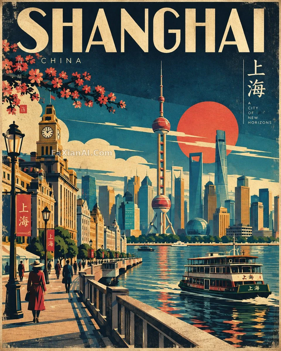
A Japanese Travel Poster Built From Geometric Blocks
The print-grain texture and slight color misregistration are the final switch that decides whether this reads real
✍️ The city and country in brackets are the only variable meant to be swapped out — the palette, the geometric shapes, the print texture are all a fixed skeleton; changing cities only changes the landmark, never the style. That "avoid" list is essentially an anti-AI-look guide, and it arguably matters more than the positive description does.
📋 Prompt Natural Language1955 characters
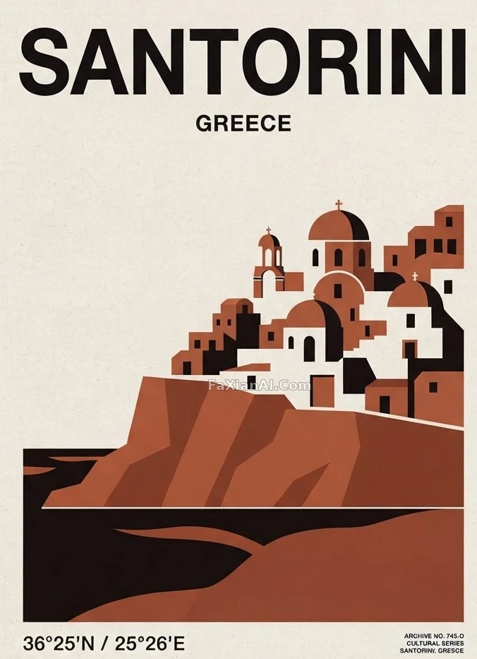
A mid-century Japanese travel-poster homage for [CITY, COUNTRY], locked to a 4:5 vertical frame.
Lean on flat-vector craft: bold geometric blocks, an editorial sense of composition, buildings reduced to their essentials, storytelling carried by shape rather than detail. Scan [CITY, COUNTRY] for its single most recognizable landmark plus the streets, transit, landscape and cultural notes that go with it, then fuse them into one original scene.
Layer the depth deliberately — foreground, middle ground, background — around a single dominant focal point. Perspective should feel decisive: geometric streets, architectural silhouettes, pared-down greenery, an atmospheric sky, and only a handful of human figures just to set the scale.
Palette stays tight and retro: deep navy, indigo, teal, turquoise, warm cream, mustard, ochre, coral, vermillion, forest green. Push color blocking hard and light the scene graphically — shadows and highlights built from geometry, never a realistic lighting rig or a smooth gradient.
Finish the surface like it actually came off a press: faint vintage paper grain, screen-print texture, a little ink drift, restrained halftone.
The landmark and cultural cues must stay recognizable even after the simplification — clean shapes, crisp edges, a composition that balances, a perspective under control, legible at a glance from across the room.
Steer clear of: photorealism, 3D render, glossy finish, over-detailing, complex gradients, neon, visual clutter, heavy grunge, over-inked outlines, bokeh, lens flare, warped architecture, skewed perspective, stray objects, unreadable type, or any generic AI-art look.
Target: a museum-shop-worthy Japanese tourism poster — bold, elegant, atmospheric, distinctly tied to its culture, built as one coherent, professional piece.
Hold the line on the 4:5 vertical frame. Make the artwork entirely original and specific to [CITY, COUNTRY] — never a copy of an existing piece.