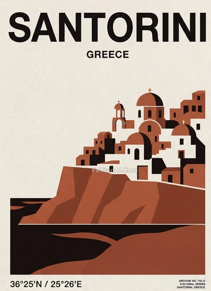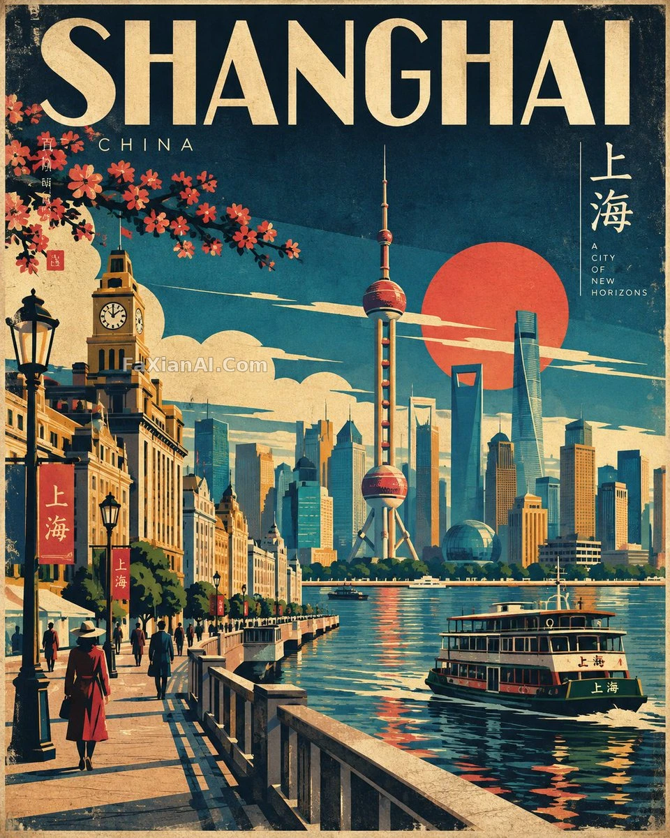
几何块面拼出的日式旅行海报
印刷纹理和轻微套色误差,是这张海报最后一道真假开关。
✍️ 方括号里的城市和国家是唯一要替换的变量,其余配色、几何形状、印刷纹理都是固定骨架,换城市只改地标不改风格。那条'避免清单'其实是反AI味指南,比正面描述还重要。
📋 提示词 自然语言1955 字符
A mid-century Japanese travel-poster homage for [CITY, COUNTRY], locked to a 4:5 vertical frame.
Lean on flat-vector craft: bold geometric blocks, an editorial sense of composition, buildings reduced to their essentials, storytelling carried by shape rather than detail. Scan [CITY, COUNTRY] for its single most recognizable landmark plus the streets, transit, landscape and cultural notes that go with it, then fuse them into one original scene.
Layer the depth deliberately — foreground, middle ground, background — around a single dominant focal point. Perspective should feel decisive: geometric streets, architectural silhouettes, pared-down greenery, an atmospheric sky, and only a handful of human figures just to set the scale.
Palette stays tight and retro: deep navy, indigo, teal, turquoise, warm cream, mustard, ochre, coral, vermillion, forest green. Push color blocking hard and light the scene graphically — shadows and highlights built from geometry, never a realistic lighting rig or a smooth gradient.
Finish the surface like it actually came off a press: faint vintage paper grain, screen-print texture, a little ink drift, restrained halftone.
The landmark and cultural cues must stay recognizable even after the simplification — clean shapes, crisp edges, a composition that balances, a perspective under control, legible at a glance from across the room.
Steer clear of: photorealism, 3D render, glossy finish, over-detailing, complex gradients, neon, visual clutter, heavy grunge, over-inked outlines, bokeh, lens flare, warped architecture, skewed perspective, stray objects, unreadable type, or any generic AI-art look.
Target: a museum-shop-worthy Japanese tourism poster — bold, elegant, atmospheric, distinctly tied to its culture, built as one coherent, professional piece.
Hold the line on the 4:5 vertical frame. Make the artwork entirely original and specific to [CITY, COUNTRY] — never a copy of an existing piece.
📋 中文译写版 自然语言670 字符
一张致敬中世纪日式旅行海报风格的作品,主题是[CITY, COUNTRY](城市,国家),锁定4:5竖版画幅。
靠扁平矢量功底说话:大胆的几何色块,编辑式的构图感,建筑被简化到只剩骨架,叙事靠形状而不是细节堆砌。先锁定[CITY, COUNTRY]最具辨识度的那一个地标,再配上与它相关的街道、交通、风景和文化线索,融进同一个原创场景里。
刻意分出景深层次——前景、中景、背景——围绕一个主导视觉焦点展开。透视要够果断:几何化的街道,建筑剪影,简化到极致的植被,有氛围的天空,再加几个人物形象只是为了交代尺度。
配色收得紧、带复古味:深海军蓝、靛青、蓝绿、松石绿、暖奶油色、芥末黄、赭色、珊瑚红、朱红、森林绿。色块对比拉满,用图形化的方式打光——阴影和高光都由几何形状本身决定,不要真实布光,也不要柔和渐变。
表面质感要做得像真的印出来的:淡淡的复古纸张颗粒,丝网印刷的质地,一点墨色漂移,克制的半调网点。
地标和文化元素简化之后依然要认得出来——干净的形状,锐利的边缘,均衡的构图,可控的透视,隔着房间一眼就能看懂。
避开:照片写实、3D渲染、光面质感、过度刻画细节、复杂渐变、霓虹色、画面杂乱、重磨损感、描边过重、散景、镜头光斑、建筑变形、透视歪斜、无关物件、看不清的文字,以及任何一眼就能认出的AI生图味。
目标:一张配得上放进博物馆商店卖的日本旅游海报——大胆、优雅、有氛围、文化属性鲜明,整体做成一件专业作品。
4:5竖版画幅不能让步。为[CITY, COUNTRY]做一张完全原创的作品——不要照搬任何现成画作。